THE CRITICAL ILLUSTRATOR
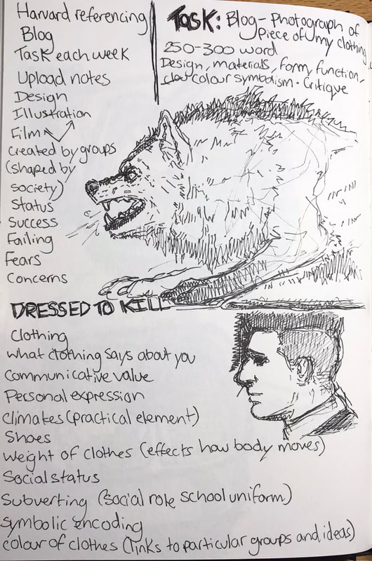
DRESSED TO KILL
Notes.
|
|

Although, as much as a piece of clothing like this has its own intended purpose as to, why it was created, how it functions, and the reasons for why and when it is worn when you look back to its origin, that may not necessarily be the same with my chosen piece (e.g. the intentions of the creator may be different). |
This piece of clothing from my wardrobe has a somewhat vibrant and colourful design, obviously and intentionally targeted towards those who like to involve playful aesthetics into their everyday life (e.g. me). Having worn this hoodie many times since buying, I can give my own opinion/review and say that personally, it’s a very comfortable and warming piece of apparel (despite not being entirely made out of cotton, but a mixture of polyester also).
A hoodie such as this was definitely created to be worn casually - not only because of its design, but its thickness also. Knowing the background of why hoodies were created and when they are typically worn, the time of year to wear something like this would be closer towards winter and just generally in colder climates. 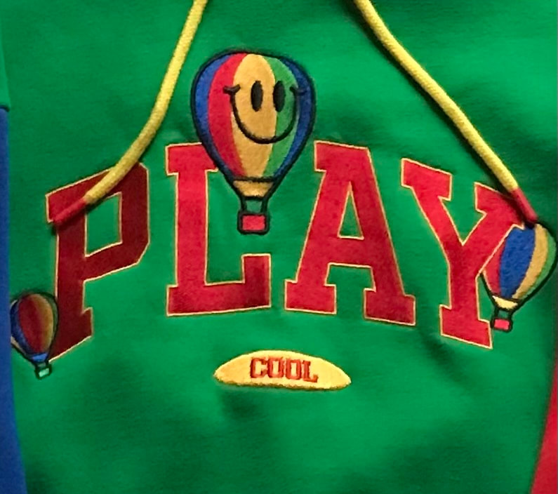
|
In the 21st century clothing can be designed with its function kept in mind, but it can also be designed with just the sole intention to show off that design and nothing else. So in relation to my chosen piece, with its material, and the fact that it’s a hoodie, could just be because the pattern and colours looked best on this instead of something such as a cardigan or coat, etc. Different types of matter can also sit on the body in many different ways, hoodies are typically baggier in appearance, so that could also be another reason as to why it was chosen to be the base for the art.
YEAR 1
Multi-Dimensional illustration
For my research with helping towards the design of my logo, I have decided to look into a small range of different subject matters and themes in which I hope will help contribute to potential ideas - as well as to help me with further developing any existing workings that I already have.
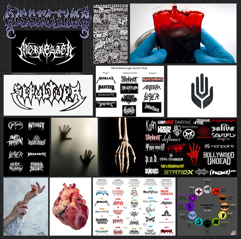
The band name in which I was given is ‘Strangled Sexual Elements’. Going off of the words used in this title, I have decided to have the genre of music that this fictional band creates be that of metal; not exactly a specific type, more so just the different kinds which can be found in this area, like death metal, nu metal, groove metal, etc.
The reason for this, would be because of the word ‘Strangled’ being involved, which comes across as being quite aggressive by itself. That being paired with the ‘sexual elements’ part, makes me think of the violent yet almost romantic themes that are brought up and set within the lyrics which would usually come from these kind of bands.
What immediately came to mind after being given this name, were bands like Slipknot, Marilyn Manson, Flyleaf, Papa Roach, Type O Negative, and System Of A Down, all of those which in some way sing about or relate to things like death, murder, love, sex and similar things of that matter. Despite their focus on that as such, their band logos don’t have much of a relation to anything like that at all (appearance wise). However, even though it isn’t so diverse in that sense, all of their emblems, symbols and writing fonts are usually unique to them and their music - but also, in appearance, some of them make it clear as to the genre in which they work in.
Usually with most metal bands, it is common to see a lot of type and font being used for their logos, however, I want to have the logo for my made up band to be that of imagery also; the reason for that, being related to my research into the ‘element’ side of ‘Strangled Sexual Elements’.
Elements of our home, like earth, water and fire, are a lot of the time shown and displayed as symbols - those which would be very basic in appearance, although, after looking into the complexity of some of the band logos in which I viewed, I think it could be interesting to mix that simpleness in with the more elaborate looks in which these modern metal logos have.