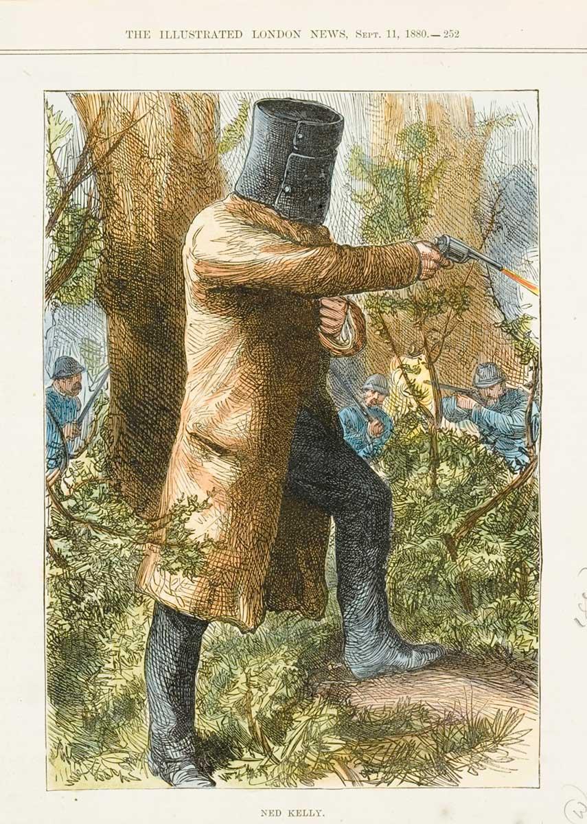
NED KELLY
BOOK ILLUSTRATION
-A collection of illustrations to feature in a book about subject
-Target audience (mature/adults, as I want to depict the violent side of what happened)
-To view him as a hero or villain? (I went with Hero)
Brief intro
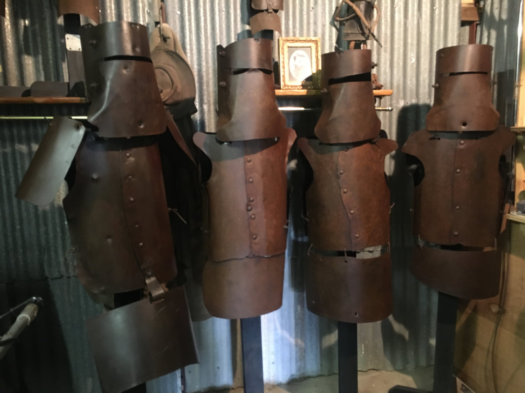
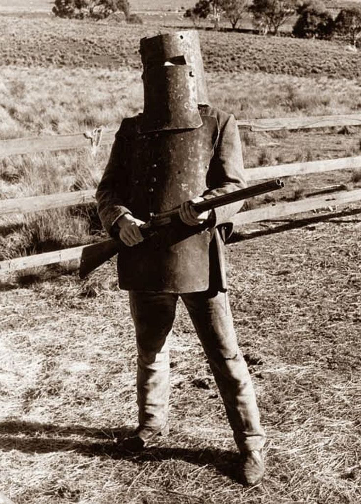
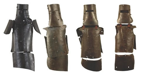
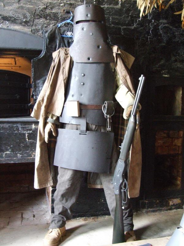
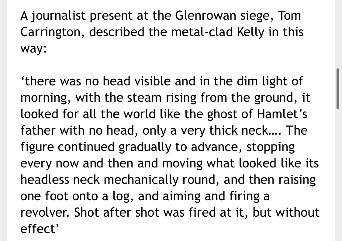
Known bushrangers and outlaws, Ned Kelly and his gang (the Kelly gang-made up of 4 individuals including Ned) were known for wearing suits of armour (as protection from the bullets) during shootings between them and the police. They ended up in these situations as a result of stealing (usually large amounts) horses (plough horses)/cattle and robbing banks. At one point they ended up killing 3 police officers.
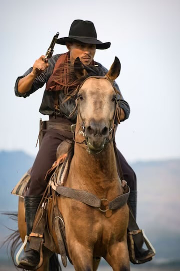
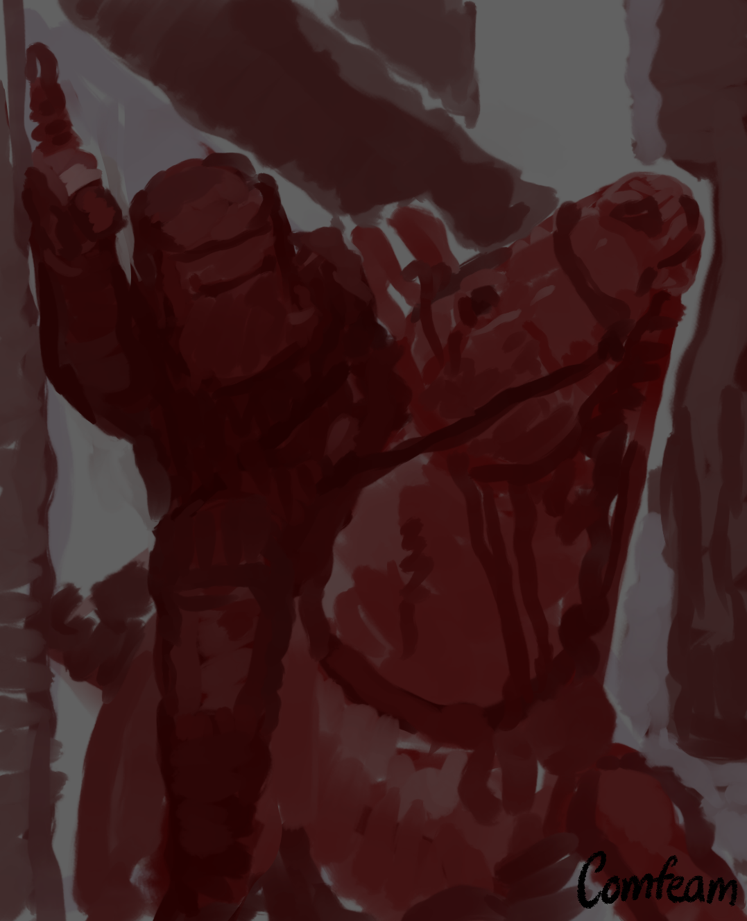
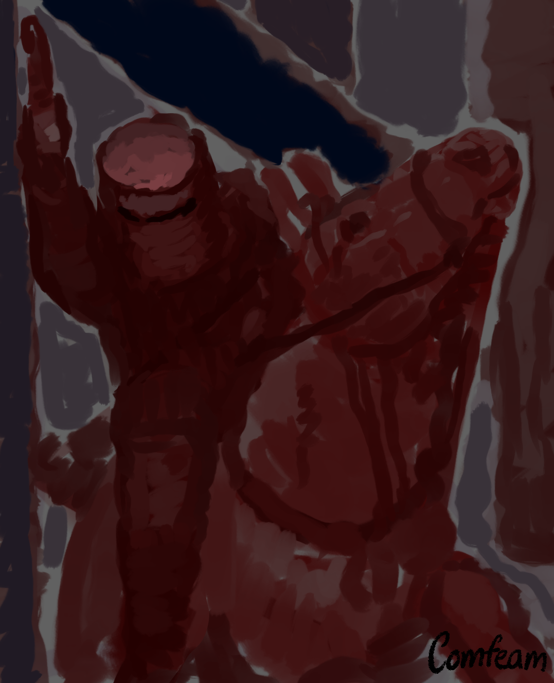
Ned with his armour, appeared larger than than the others, and more unsettling.
Some view Ned and the gang as villains, for obvious and understandable reasons, but others see him as a kind of hero, as he was a working class individual who stood up against the British colonial authority. For these illustrations, I chose to depict him as a hero.
-Target audience (mature/adults, as I want to depict the violent side of what happened)
-To view him as a hero or villain? (I went with Hero)
Brief intro
Known bushrangers and outlaws, Ned Kelly and his gang (the Kelly gang-made up of 4 individuals including Ned) were known for wearing suits of armour (as protection from the bullets) during shootings between them and the police. They ended up in these situations as a result of stealing (usually large amounts) horses (plough horses)/cattle and robbing banks. At one point they ended up killing 3 police officers.
Ned with his armour, appeared larger than than the others, and more unsettling.
Some view Ned and the gang as villains, for obvious and understandable reasons, but others see him as a kind of hero, as he was a working class individual who stood up against the British colonial authority. For these illustrations, I chose to depict him as a hero.
RESEARCH
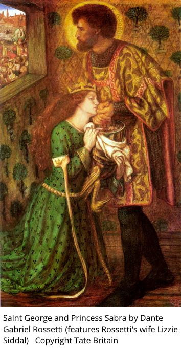
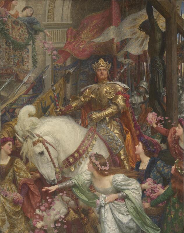
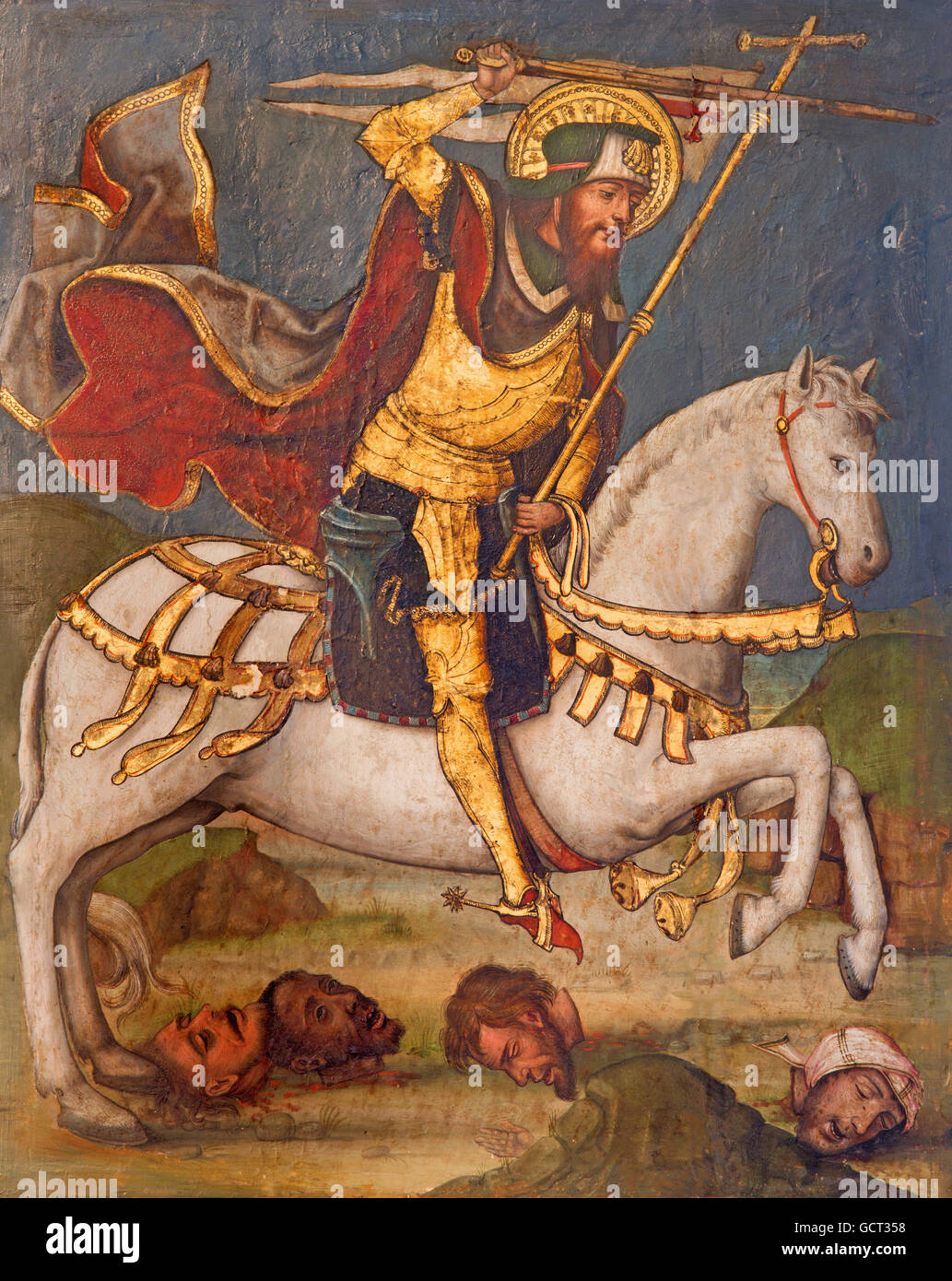
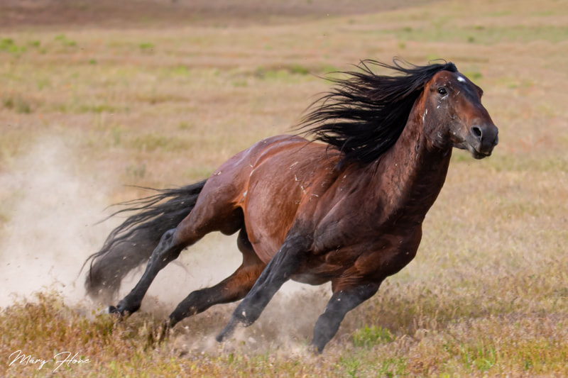
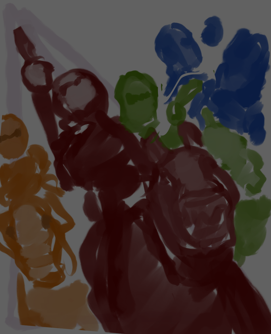
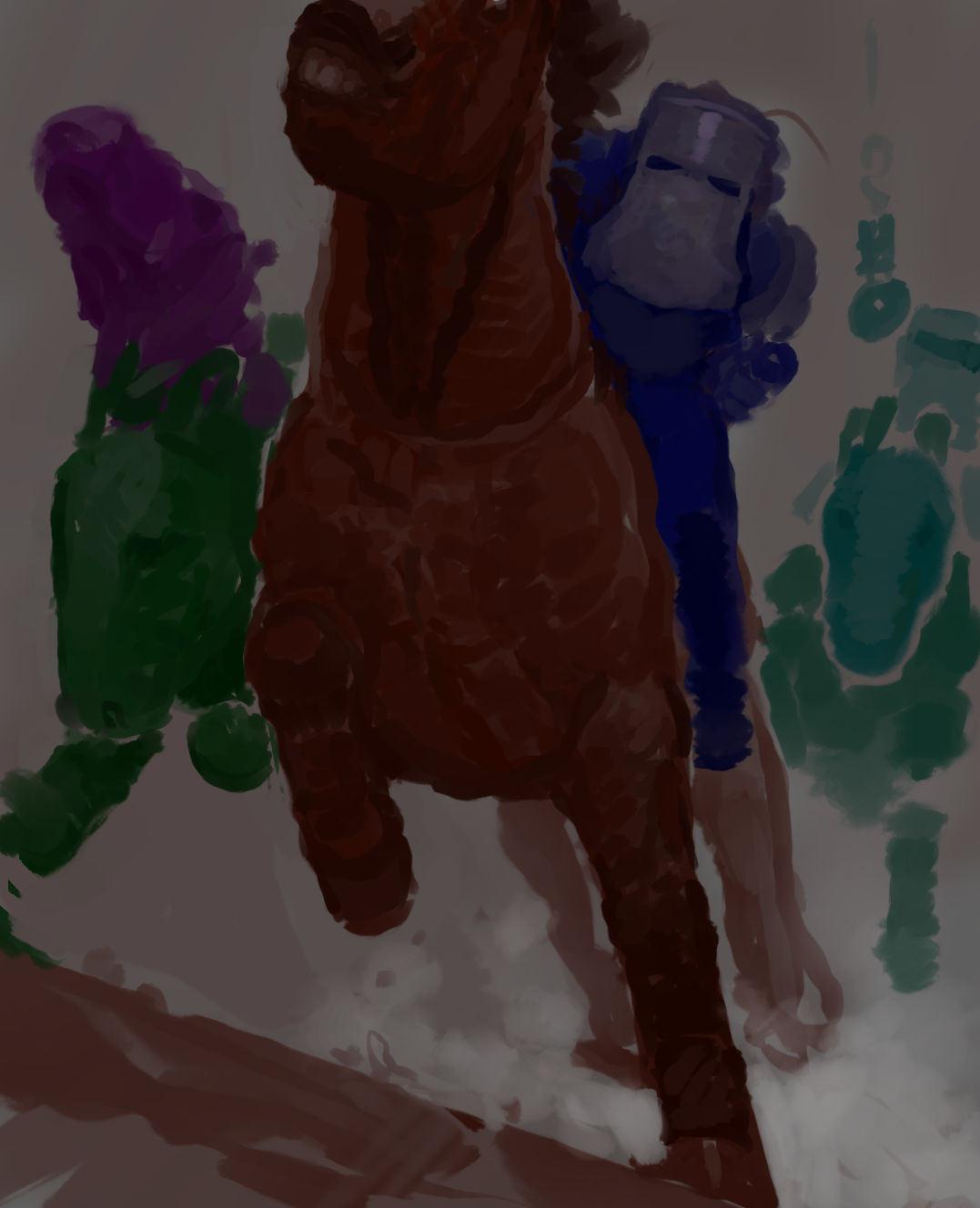
Originally I tried taking inspiration from knights, as Ned himself was a catholic, but there’s obviously that visual connection- through the armour the Kelly gang wore, and the horses they’d steal.
|
|
|
ROUGH IDEAS (for illustrations within the book)
|
|
|
ROUGH IDEAS (for the illustration on the front cover)
Ideas
-main focus in Ned
-green/green sash of bravery from childhood?
-some link to Robin Hood (he was compared to him)
-main focus in Ned
-green/green sash of bravery from childhood?
-some link to Robin Hood (he was compared to him)
|
|
|
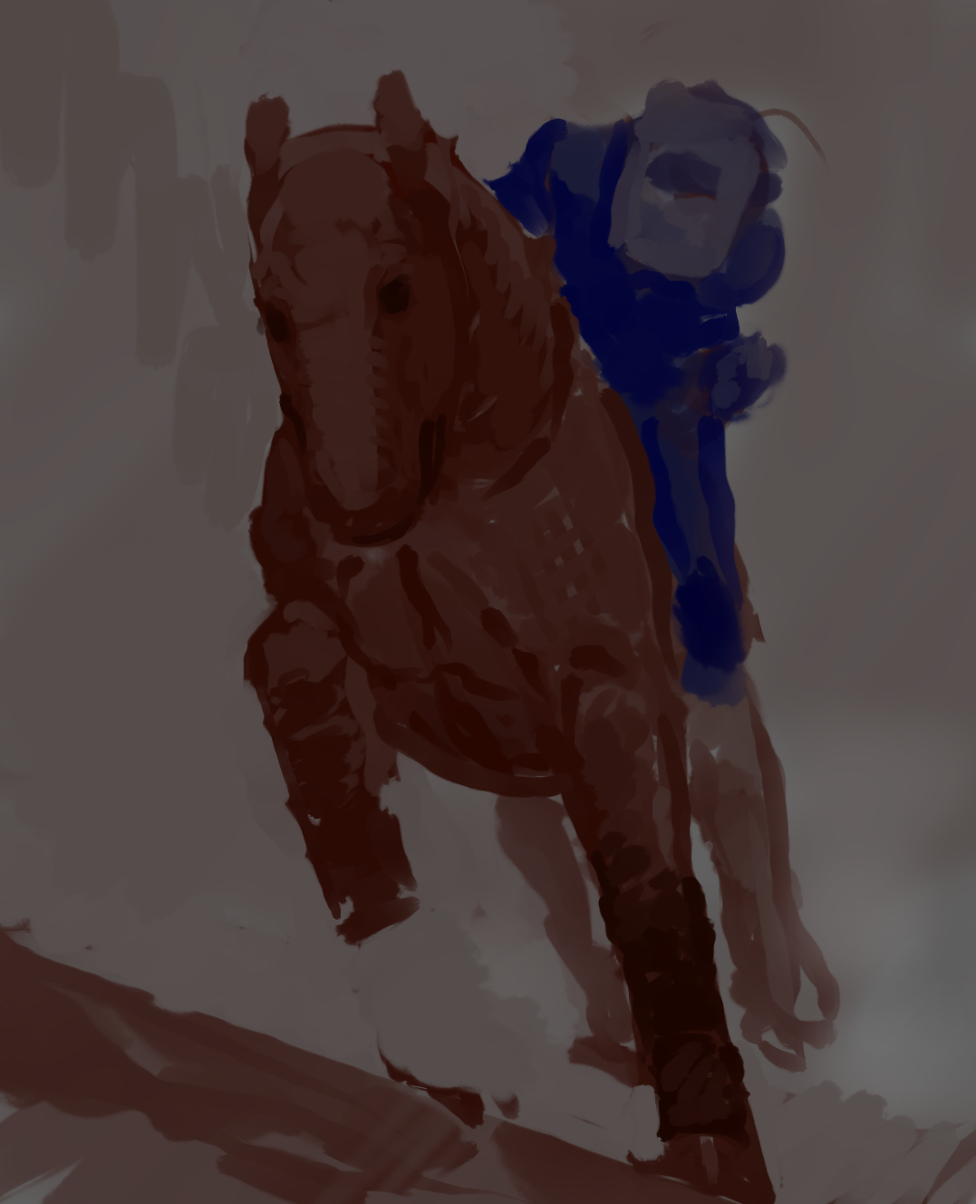
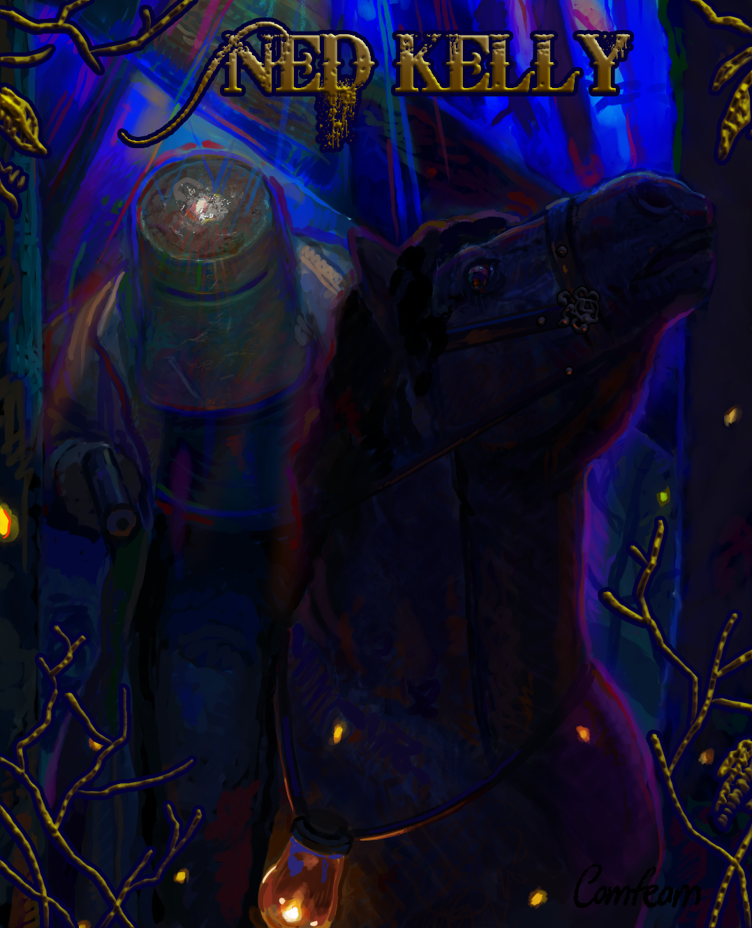
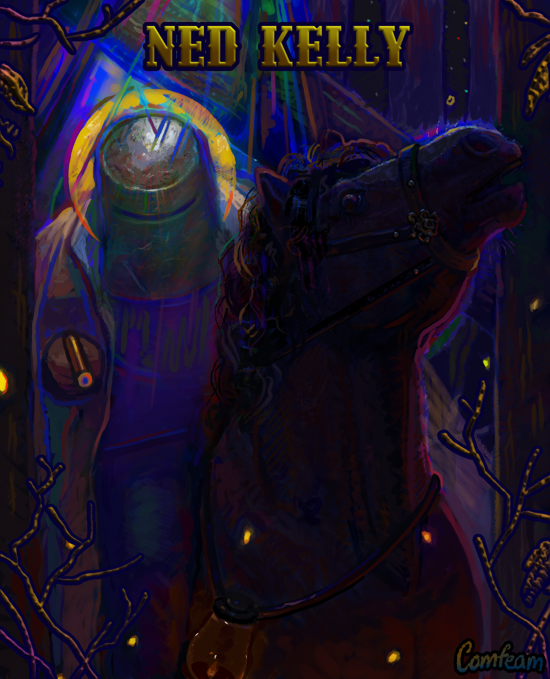
The Midnight Forest look I was trying to go for, and the colour usage definitely gave this first pass way too much of a ‚royal knight‘ look, rather than the Australian outback look that was needed.
|
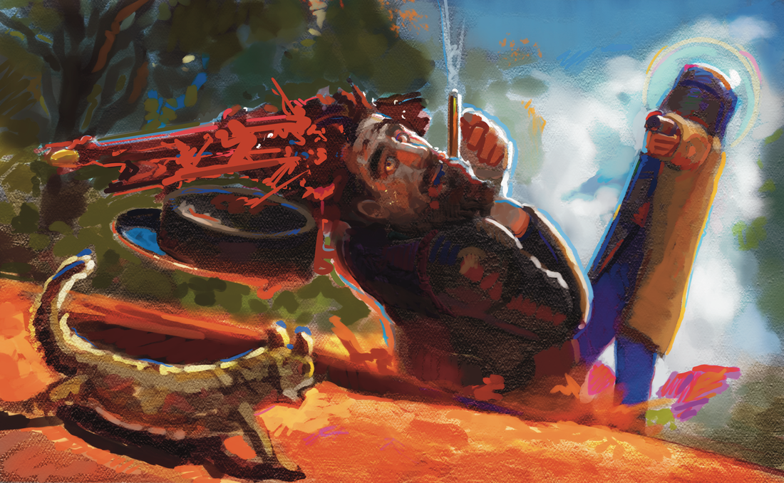
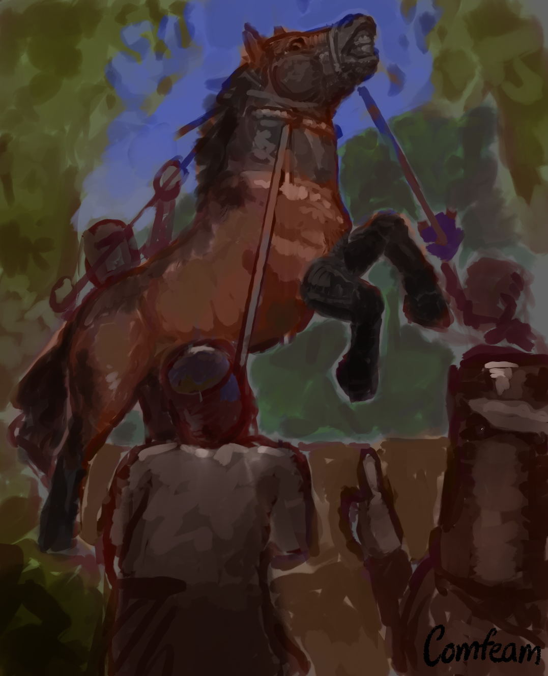
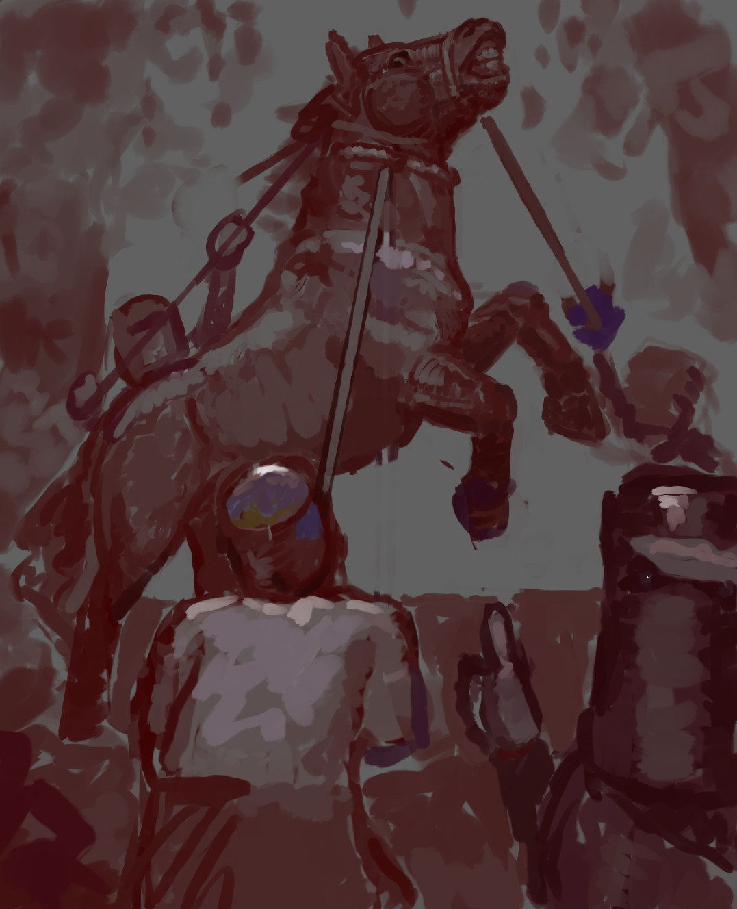
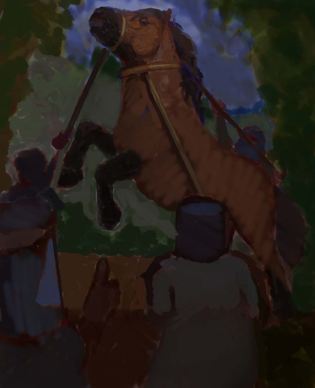
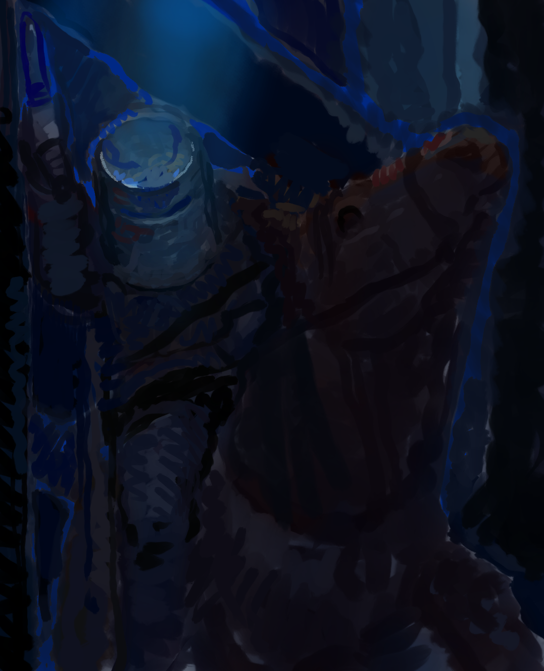
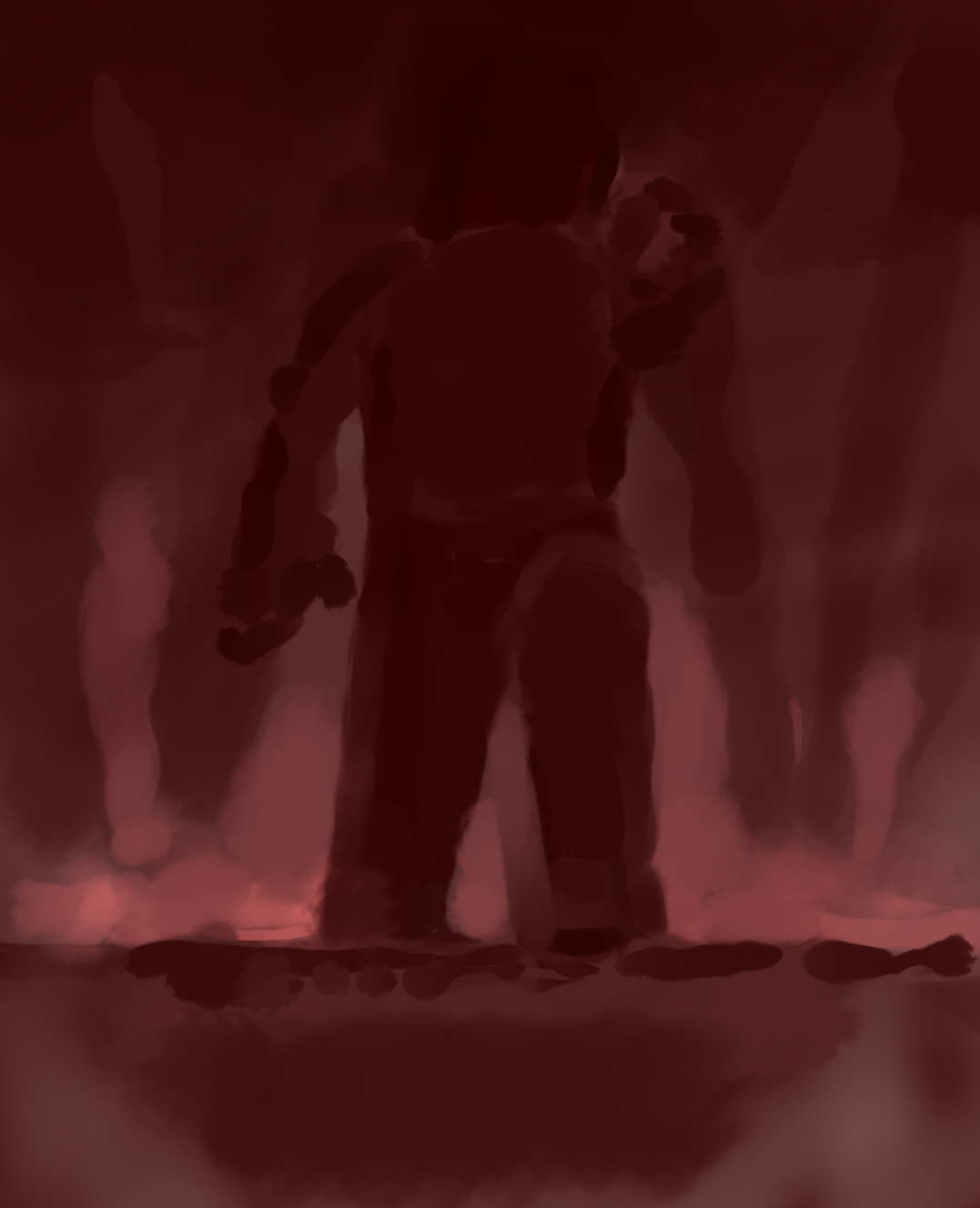
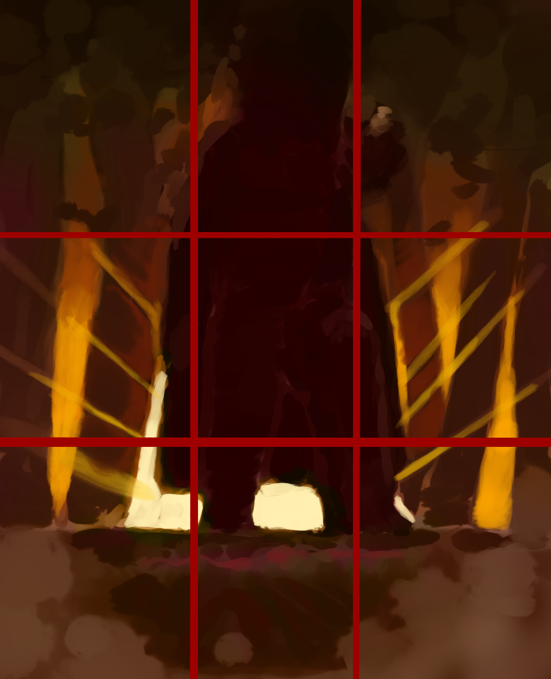
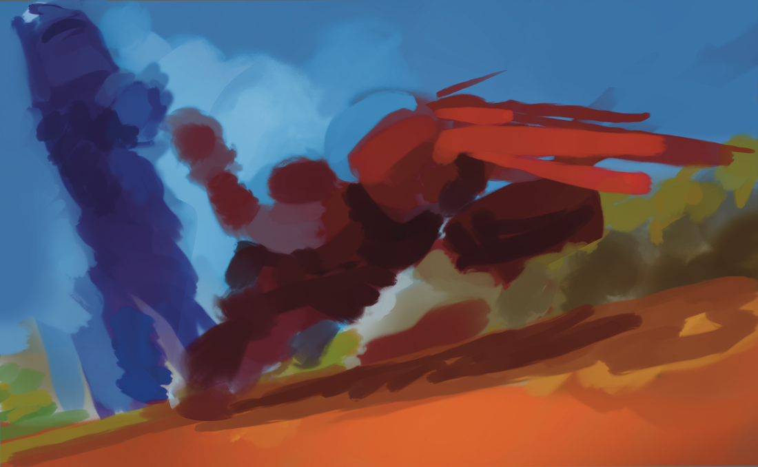
Another front cover idea- looking into a scenario that happened. Trying to involve warmer colours (that connection to hot Australia), but not there yet with the visuals.
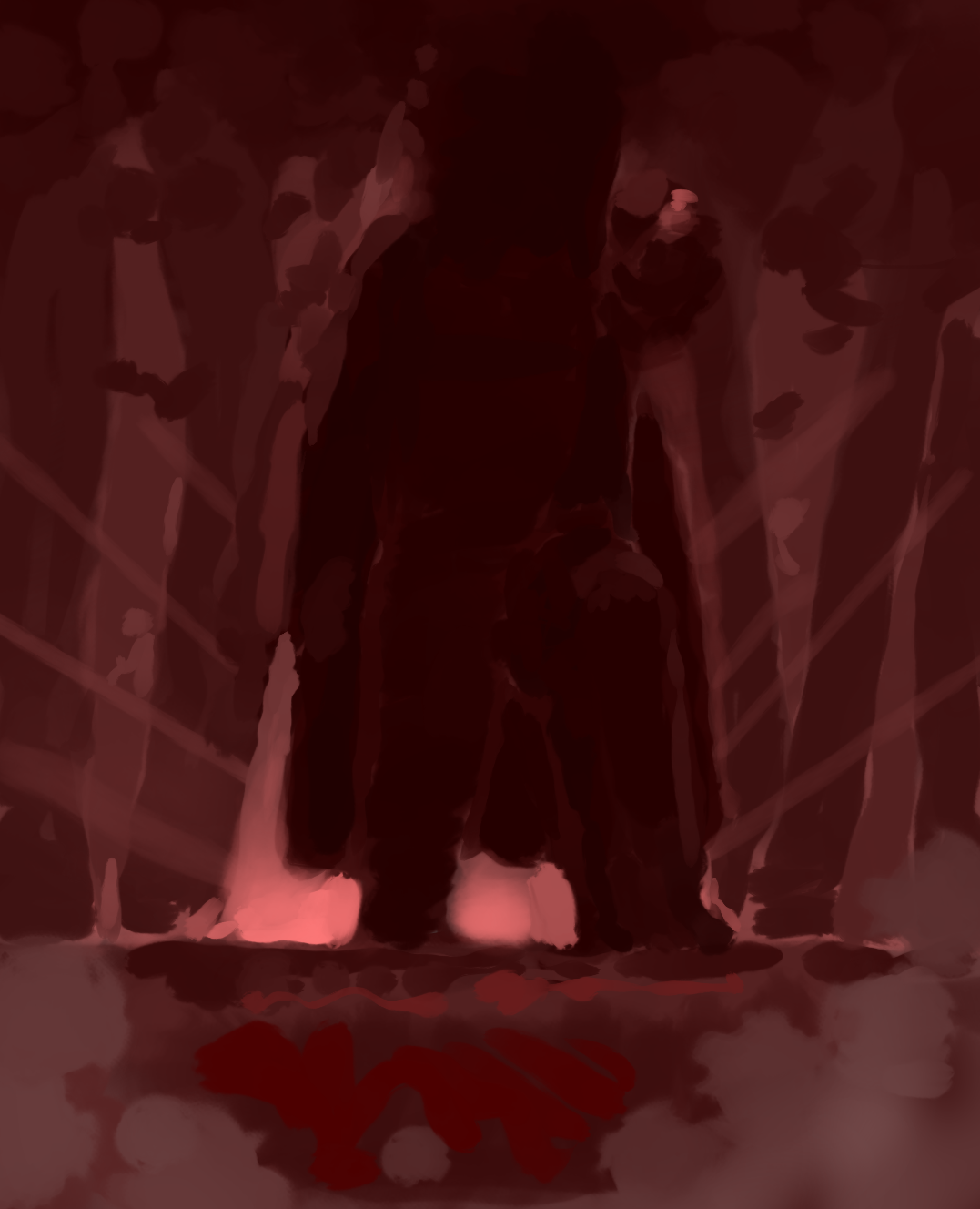
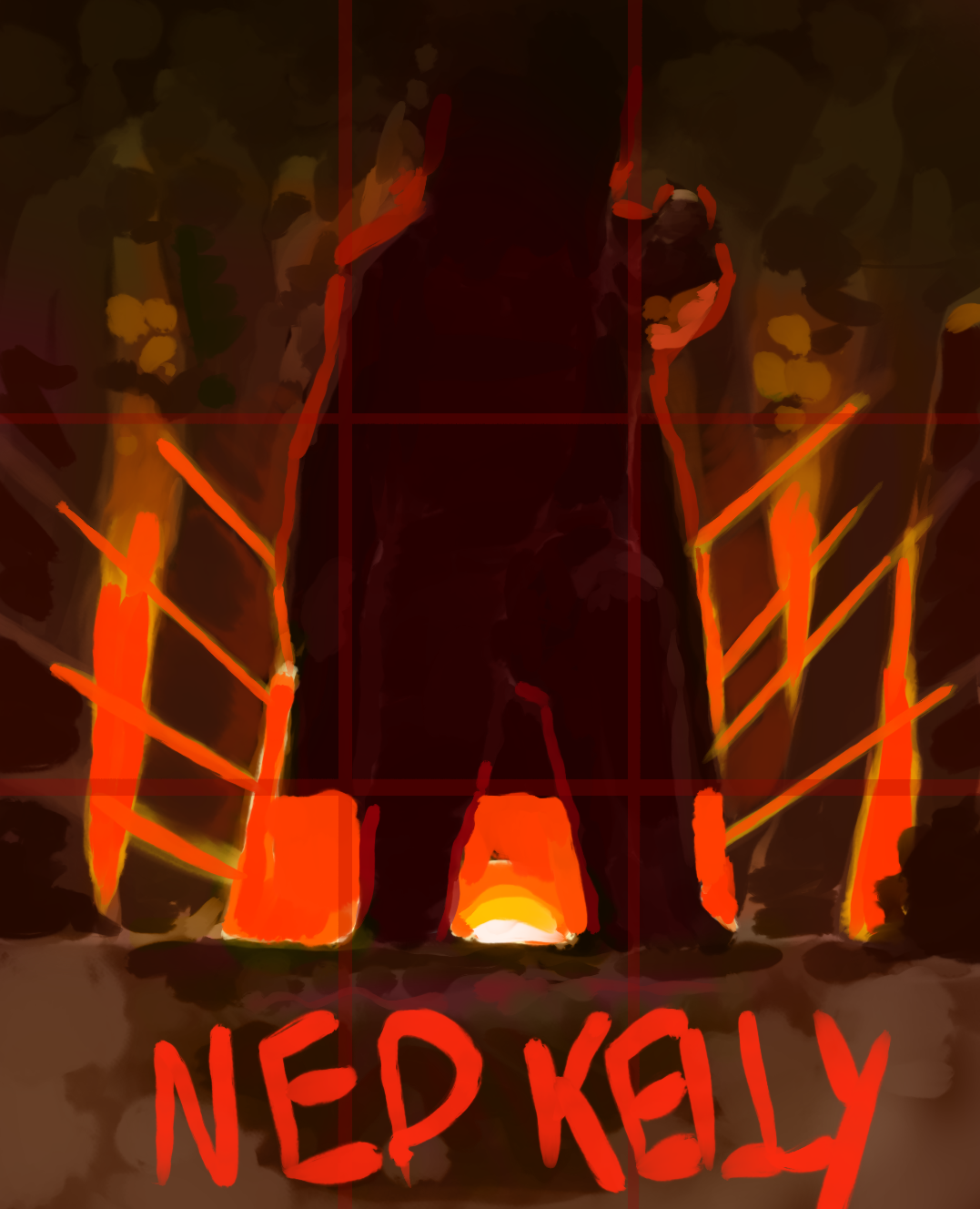
I wanted to give him a sort of ‚saviour‘ look, I still don’t think it gets across the whole Australian theme, which of course is a big part of his whole aesthetic. |
|
|
|
|
|
|
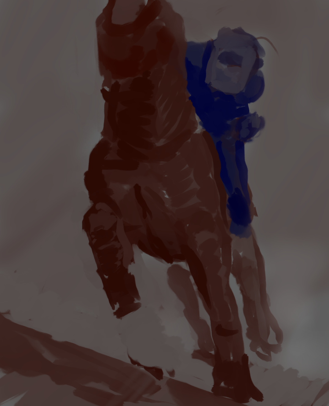
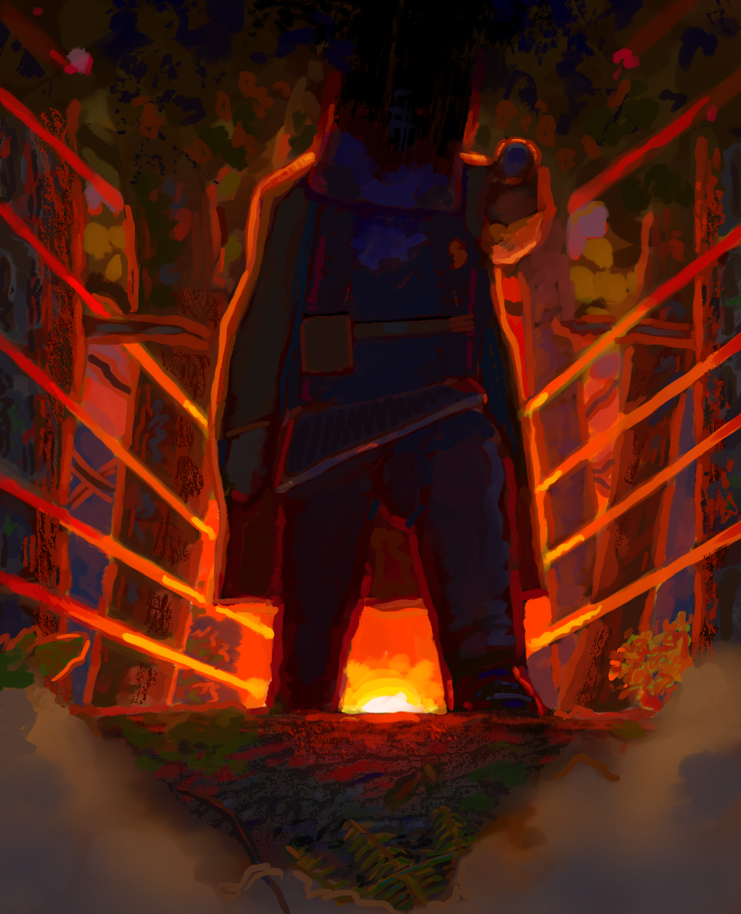
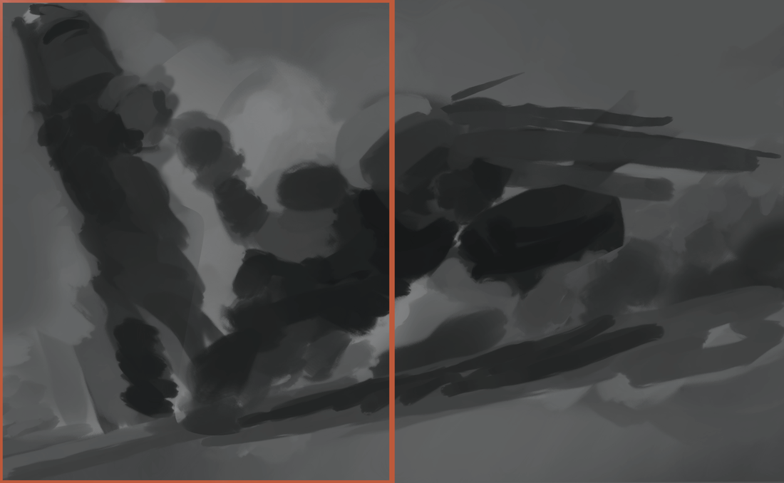
Trying to focus more on the armour and almost western sort of themes (trying to show the ‚heat‘ of the country of Australia)
|
|

FINALS