ILLUSTRATION PROJECTS
ILLUSTRATION IN RESPONSE TO A NEED/IDEA (PACKAGING)
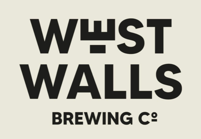
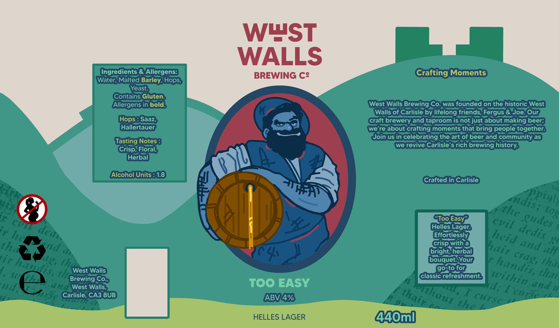
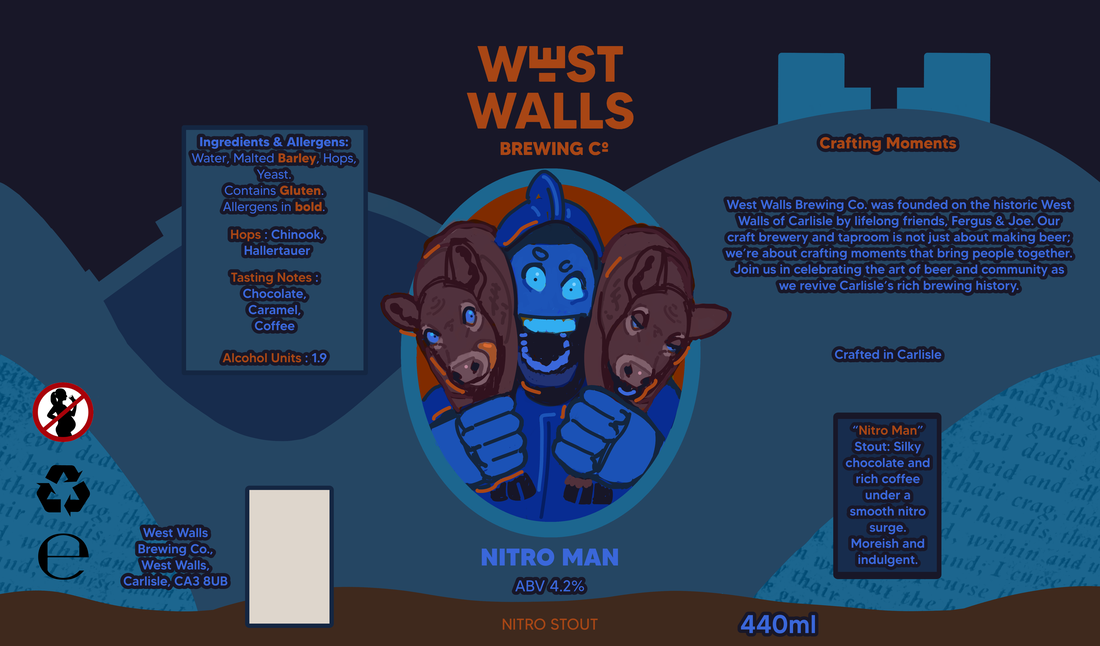
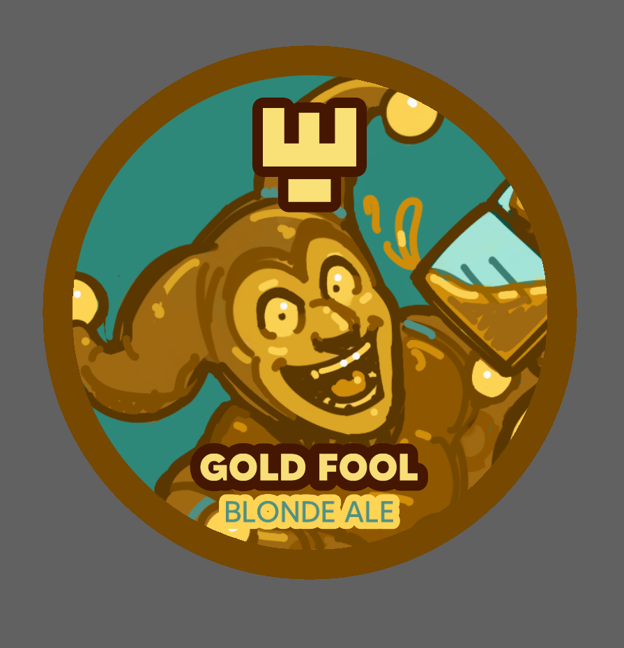
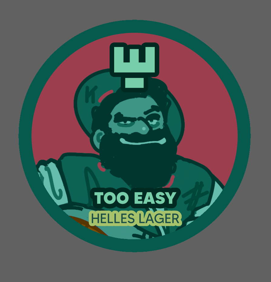
For this project, we are to create illustrations for a new and upcoming beer brewing company known as Westwalls.
|
Joe and Fergus (the creators) are looking for designs which vary for each can, that also represent the flavour/the type of beer that they are. In addition to an appearance and theme that creates a connection between the drinks.
|
|
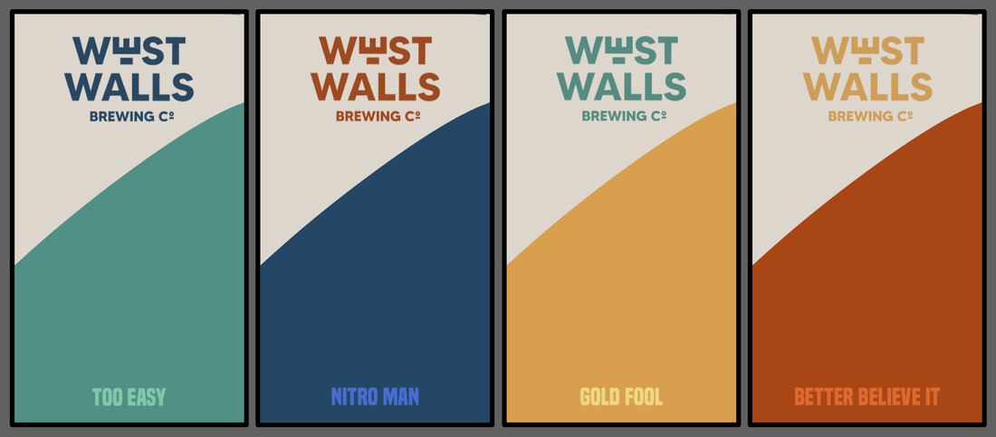
These designs are for four beers, which are:
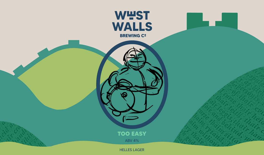
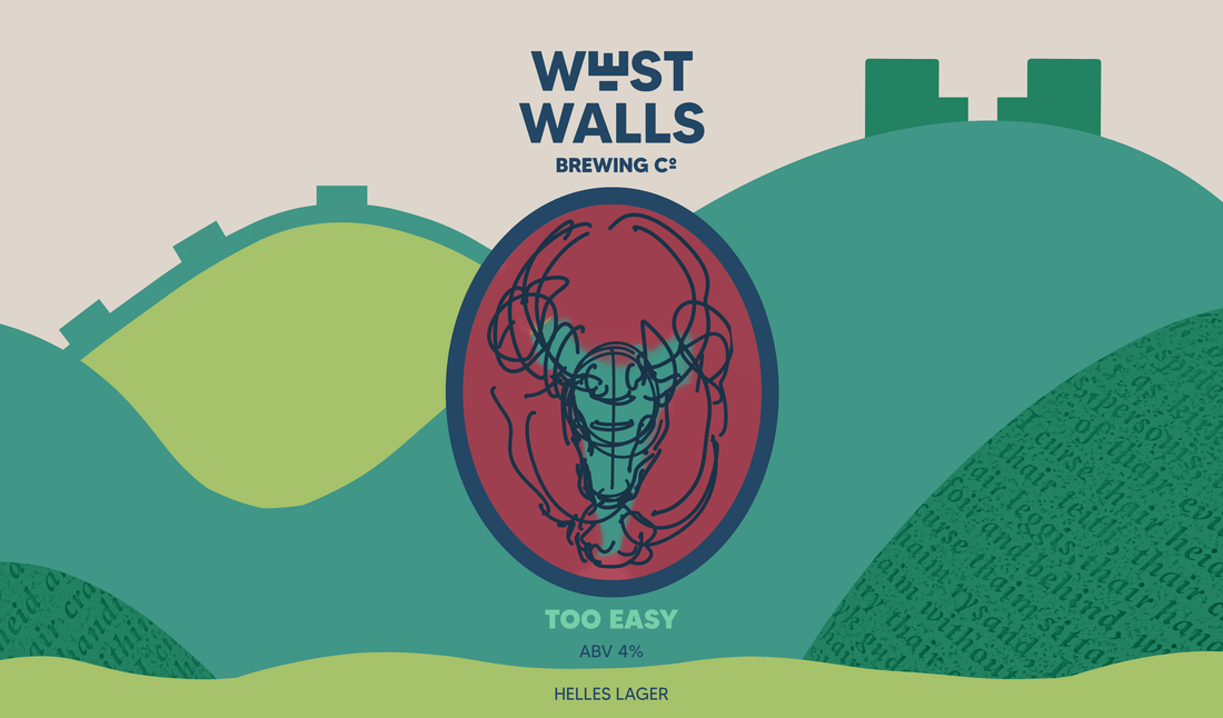
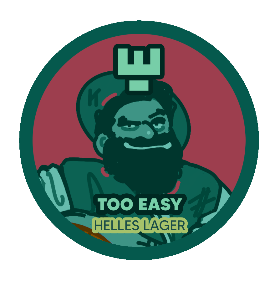
1.“Too Easy” Helles Lager (Refreshing with mild floral and herbal notes)
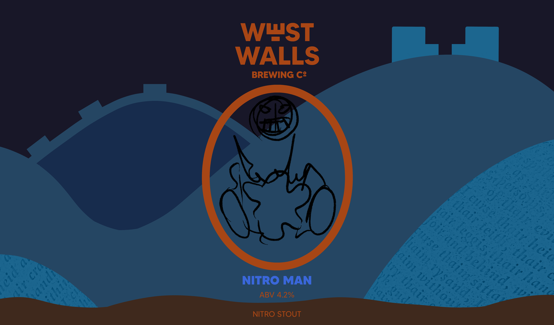
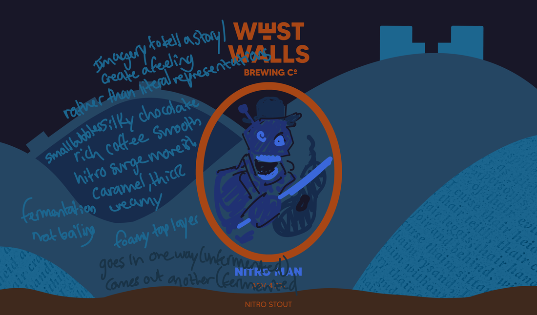
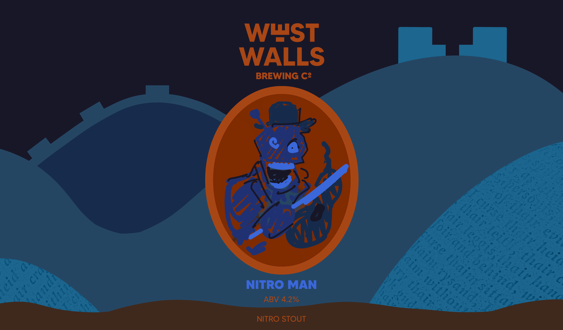
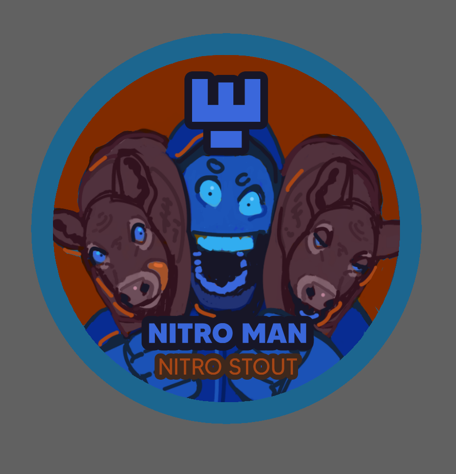
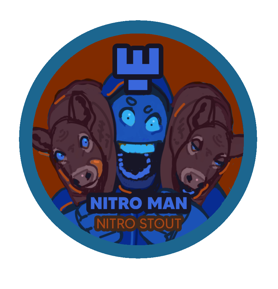
2.“Nitro Man” - Stout (Coffee, caramel and chocolate notes, nitrogenated for a smooth creamy texture)
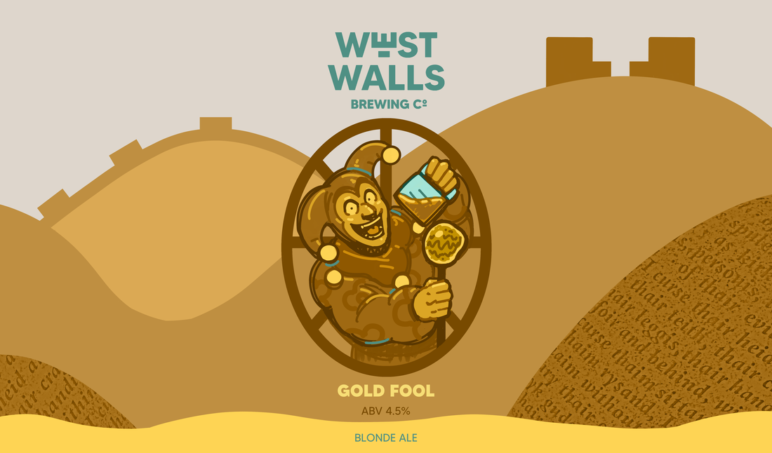
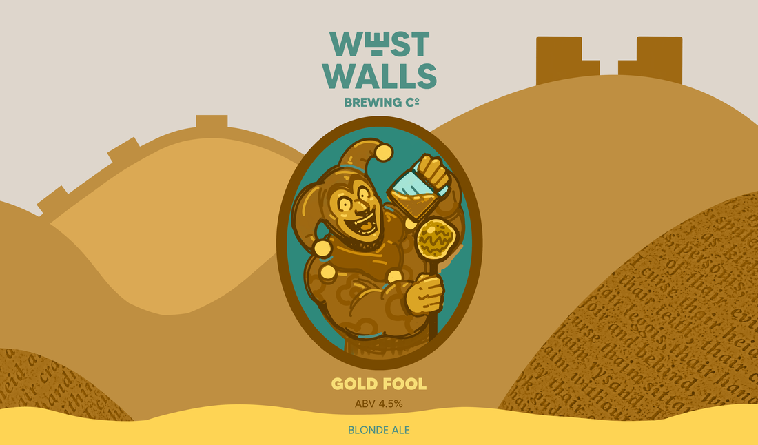
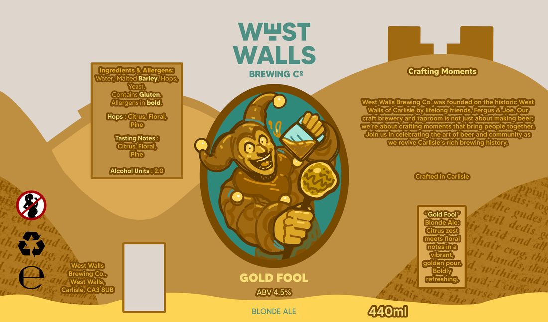
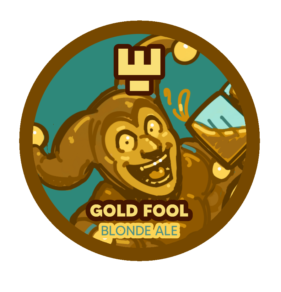
3.”Gold Fool” - Blonde Ale (Light hoppy aroma with crisp citrus and delicate floral flavours)
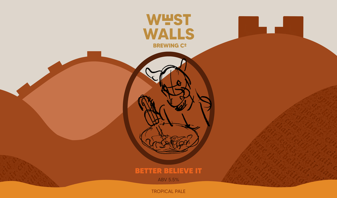
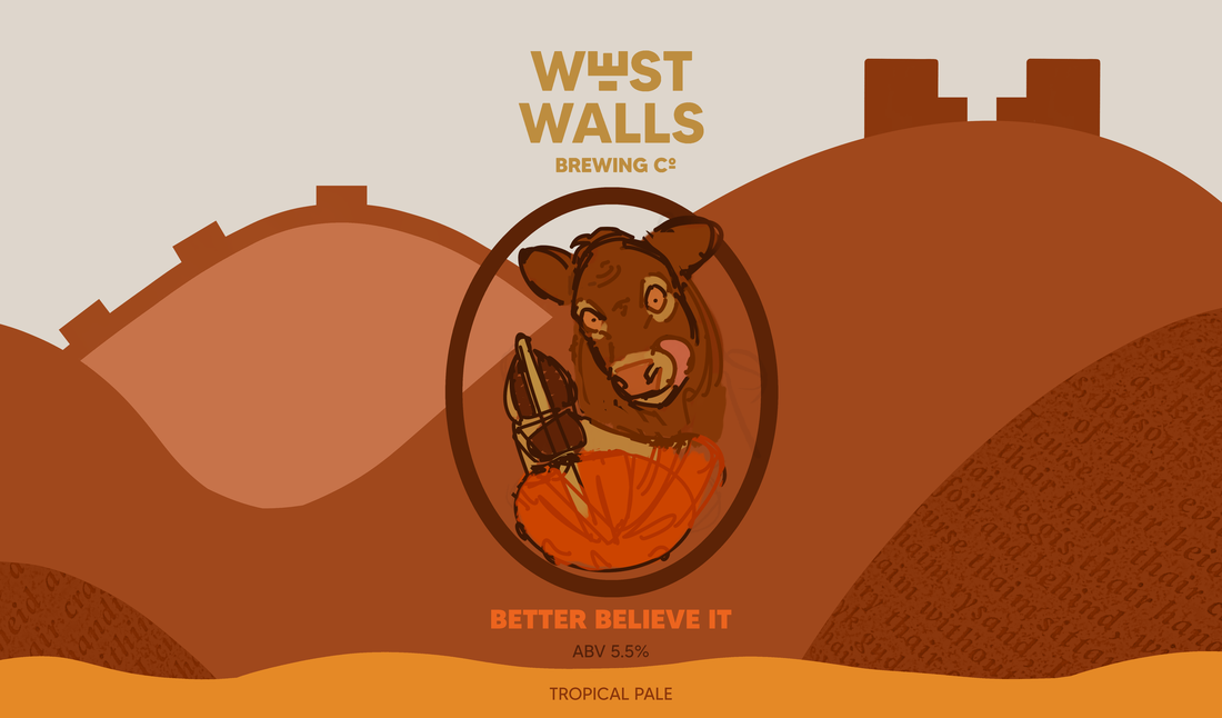
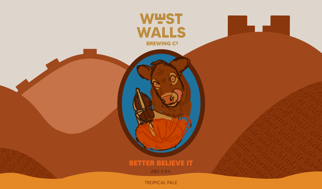
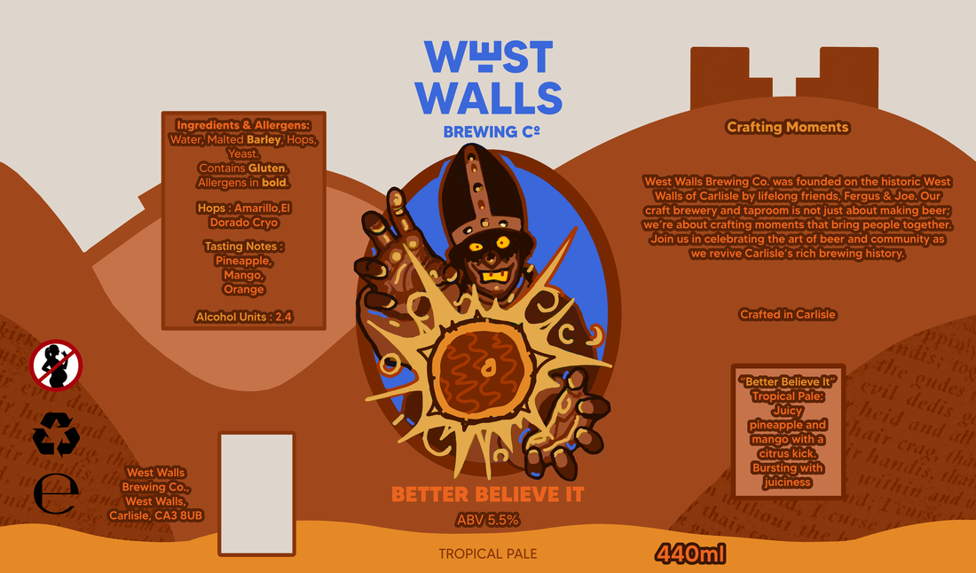
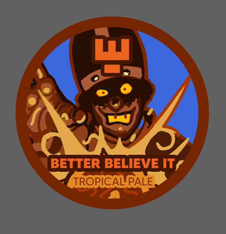
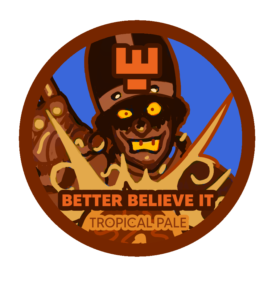
4.”Better Believe It” - Tropical Pale Ale (Aromatic, refreshingly fruity, and beautifully balanced with a solid malt backbone. Hop forward with tropical notes of orange, mango, pineapple)
1.“Too Easy” Helles Lager (Refreshing with mild floral and herbal notes)
2.“Nitro Man” - Stout (Coffee, caramel and chocolate notes, nitrogenated for a smooth creamy texture)
3.”Gold Fool” - Blonde Ale (Light hoppy aroma with crisp citrus and delicate floral flavours)
4.”Better Believe It” - Tropical Pale Ale (Aromatic, refreshingly fruity, and beautifully balanced with a solid malt backbone. Hop forward with tropical notes of orange, mango, pineapple)
DEVELOPMENT
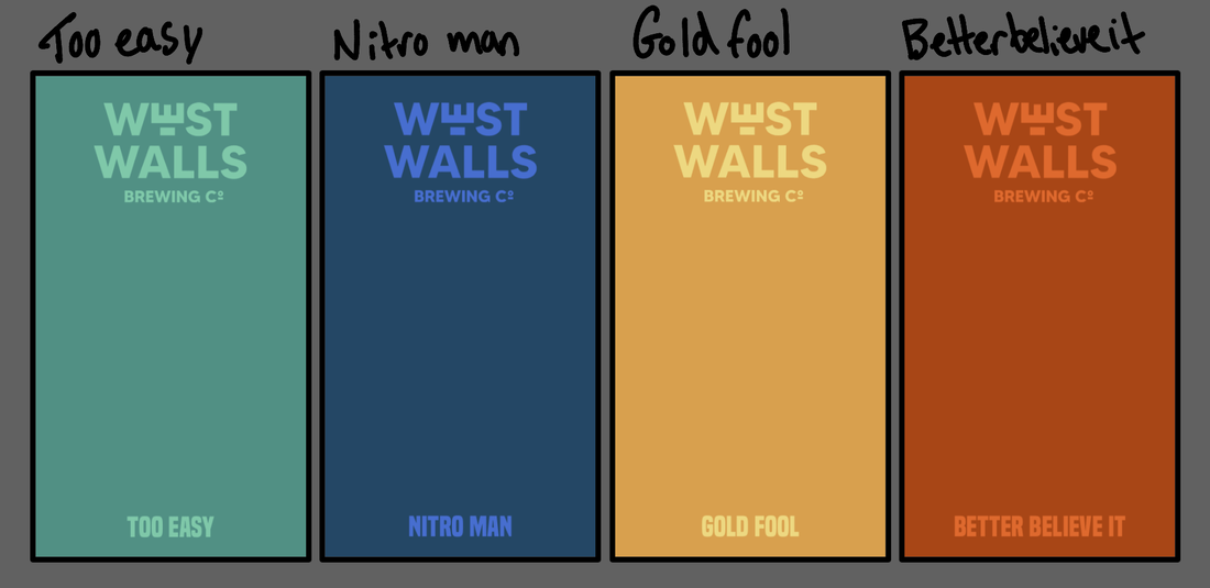
With these designs, I want to create a connection between the cans through of course the use of the logo and actual illustrations, but also, I want the types of drink and the sort of ‘mood’ they give off to really stand out and be obvious through the use of colour.
Involving the writing from the cursing stone as I think it could look interesting as an overlay/texture.
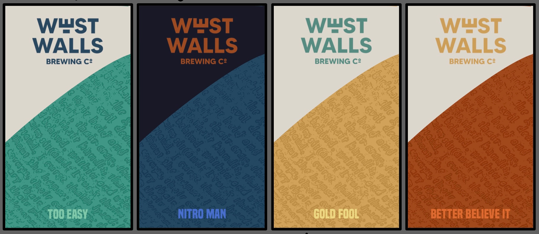
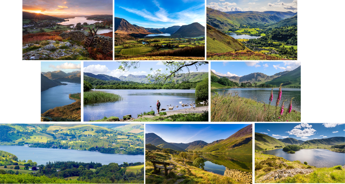
Thinking about the area that this company is located, with it being in Cumbria, I feel like a lot of people (if not a majority of them) would definitely start to think about the Lake District while being in the area of Carlisle. As within the brief they want to incorporate Cumbrian landmarks, I think involving this well known scenery in the design would be suitable.
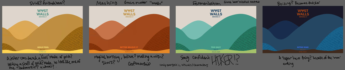
Within the brief, it was made clear that elements of the craftsmanship and beer making process are important to the cofounders for these beer can designs; for this reason, I want to involve the sort of 4 main steps that happen throughout the craft, into my illustrations.
These would be Mashing, Boiling, Fermentation and of course, Consumption.
I have it in mind to incorporate/mix these sorts of things with playful and energetic characters, in a way that’s subtle but clear.
I have it in mind to incorporate/mix these sorts of things with playful and energetic characters, in a way that’s subtle but clear.

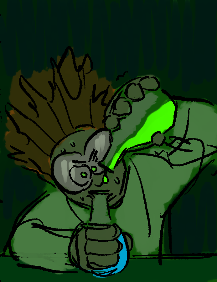
For Gold Fool, I want to have the character/mascot to be a jester as they are known to be called fools, but also, I want to create a connection to the cursing stone. To match with the name of the beer, I plan to make the character completely gold, as if they were cursed by the stone for ‘stealing’ it, like cursed treasure. The step I wanted to involve here was the consumption of the beer.
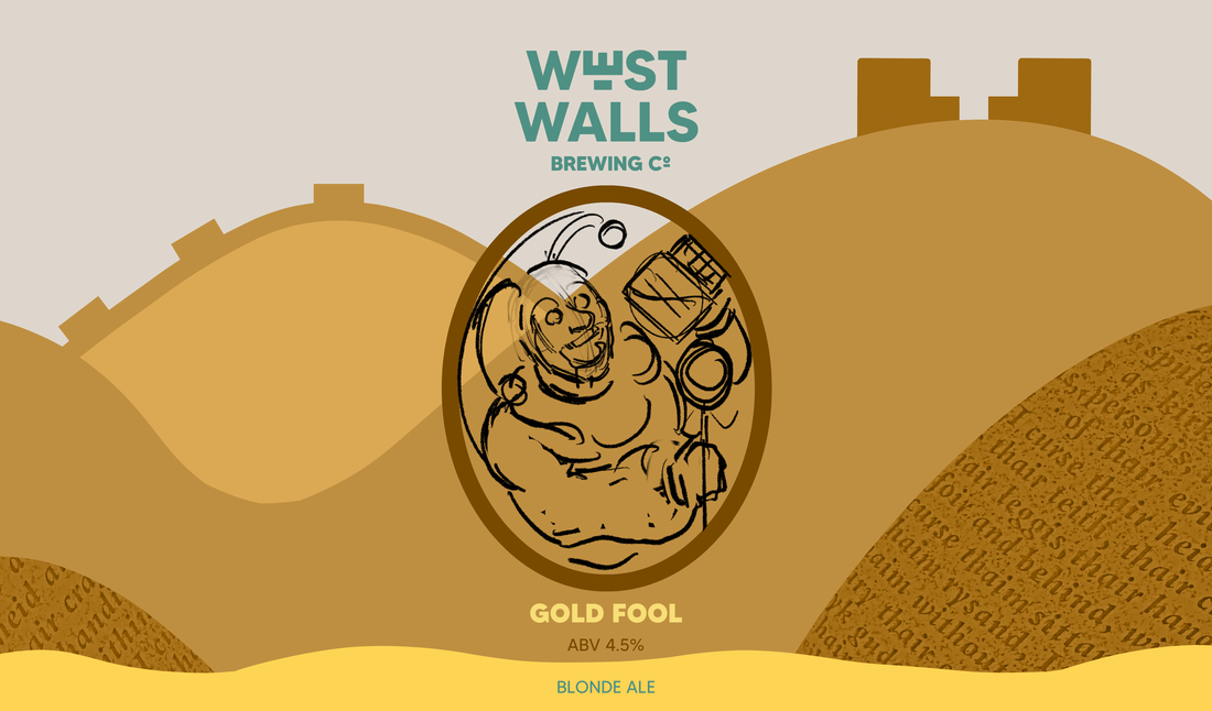
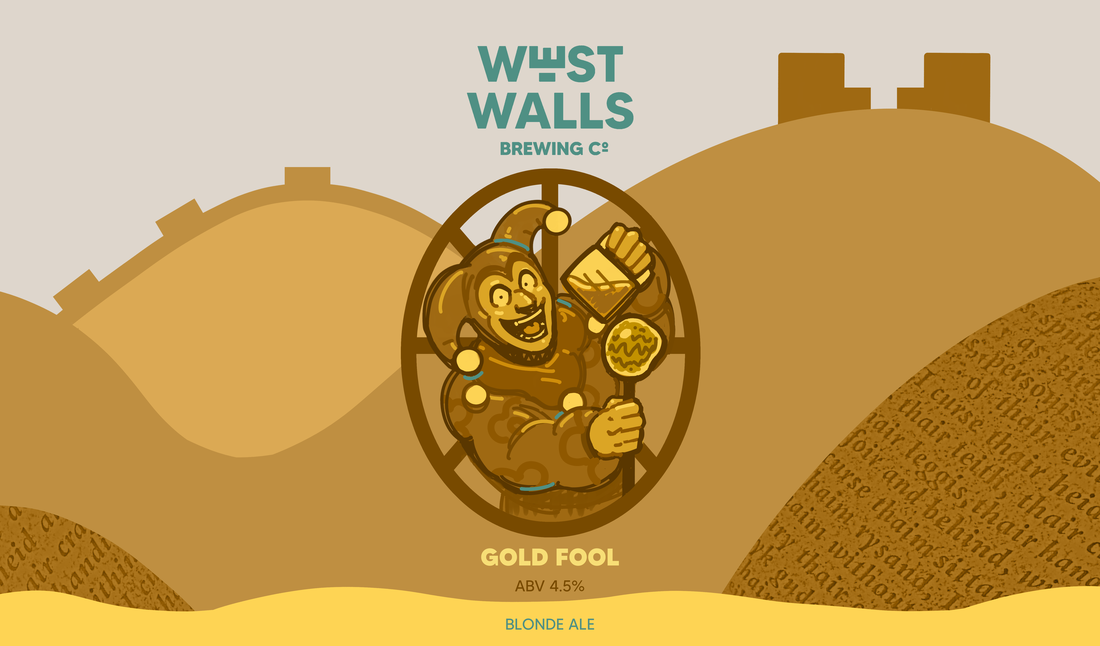
I decided to add more of the cool into the character’s cup, so that there was a bit more contrast between that and the mascot, but also, the description of this beer flavour calls it, “boldly refreshing” - the green/blue sort of colour against the warm shows that kind of ‘freshness’ a bit more.
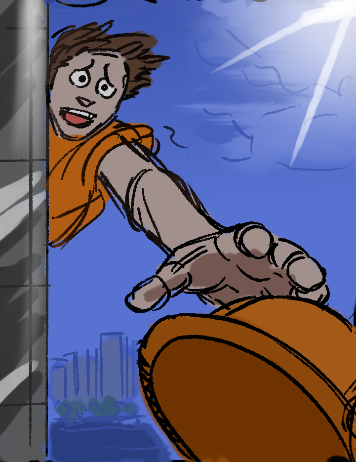
For Better Believe It, I think it would be in a way both ’funny’ and interesting to incorporate a cow as the sort of character/mascot on the can. My reasoning for this being, that of course there’s a lot of farming area within, and surrounding Cumbria, but I feel like it’s very common to see farm animals, especially cows when you’re out and about in this location. The slogan for the type of beer, mixed with the cow in the process of making the beer as an illustration, is definitely not a thing you’d see in real life - but it’s on the can so it’s like you have to believe it (so adding a sense of humour and playfulness into the design).
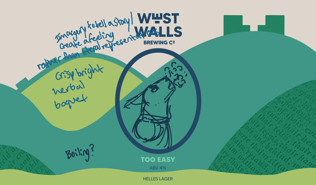
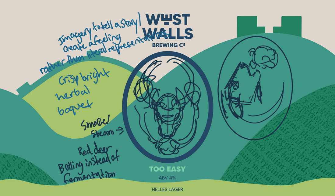
For Too Easy, I want to involve the boiling process.
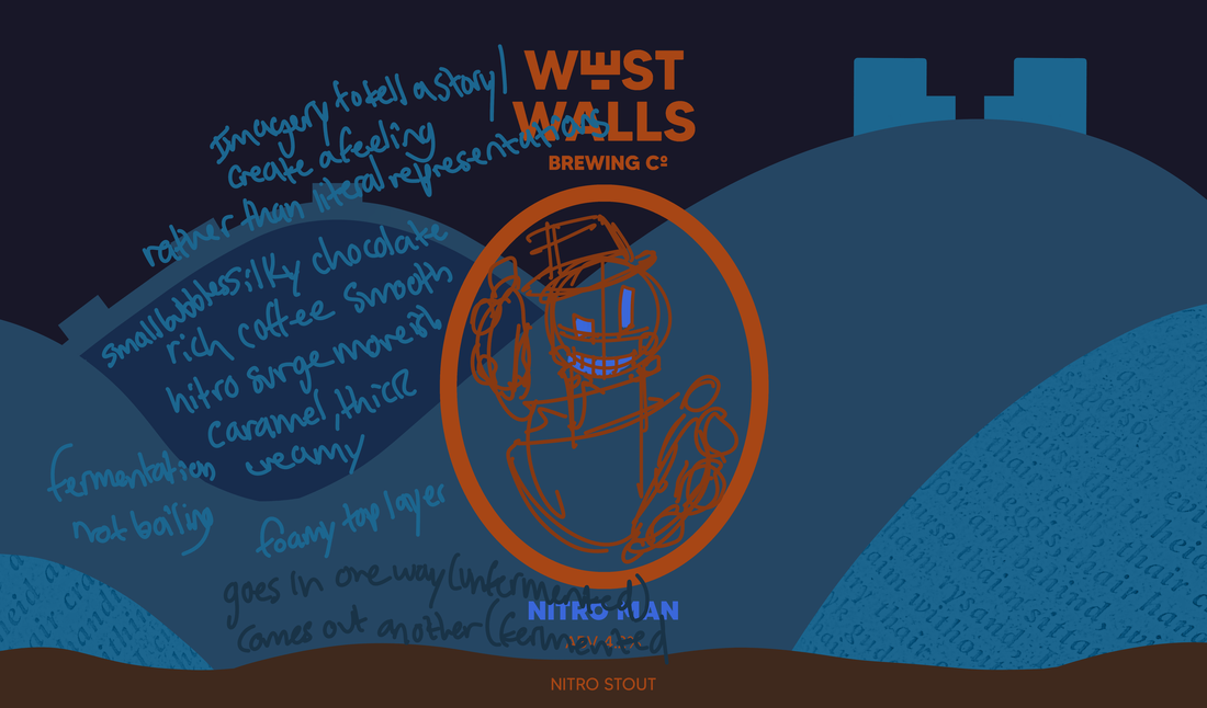
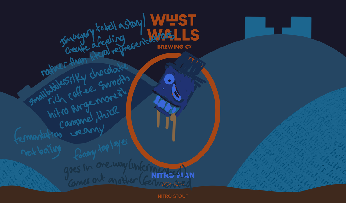
For Nitro Man, an idea that came to mind was to design a character that’s either like a sort of super hero or robot. The step I want to try and involve here is the fermentation process.
FINAL DESIGNS
FINAL (Gold Fool)
FINAL (Better Believe It)
OLD FINAL (Too Easy)
IMPROVED FINAL (Too Easy)

FINAL (Nitro Man)
KEG BADGES FINAL
|
|
KEG BADGES (Transparent Background)
|
|
ILLUSTRATION IN RESPONSE TO THE WRITTEN WORD
PROJECT 3 / THE ONE WHERE THEY PICK
PROJECT BRIEF/ INFO
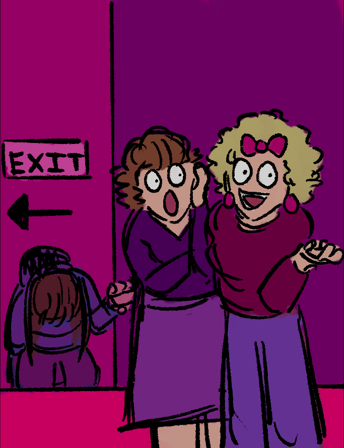
For this project, we were given 4 different routes in which we could go down, in regards to the type of illustration we want to focus on. Out of the 4, I decided to choose Picture book for early readers, in the form of conceptual illustration.
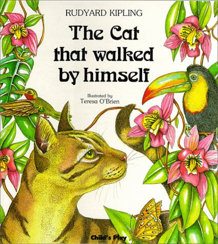
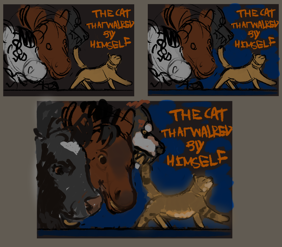
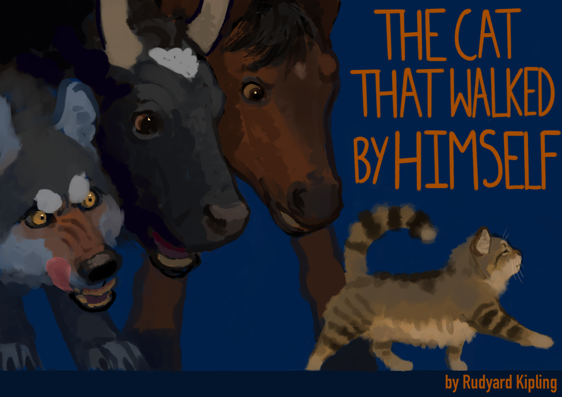
The story I decided to go with was ‘The Cat That Walked By Himself’ by Rudyard Kipling.
I am to provide 3 illustrated pages by way of ‘proof of concept’ for my chosen book a double page a single page and a front cover design.
Link to story: https://etc.usf.edu/lit2go/79/just-so-stories/1296/the-cat-that-walked-by-himself/
RESEARCH
-However the cat wants to go into this cave and be apart of this sort of dynamic - without having to do anything for the man or woman (but in the end he does end up almost doing so, as he makes a deal with the woman to catch mice and entertain the woman’s baby)
-The man and dog find out about this deal and they say the things they will do to the cat to drive him out of the cave (which for the man would be to throw things at the cat, and for the dog, to hunt and bite the cat) |
‘The Cat That Walked by Himself’ is a story that:
-Is set during the Stone Age -Includes the characters, the wild animals which are, the cat, the dog, the horse and the cow, and then the wild man and woman) -Each of the characters go one by one into the cave as they are curious about the light coming from the cave (which would be a fire set by the wild man and woman) -The dog, horse and cow end up befriending the wild people (each of them serving the man in their own unique way) 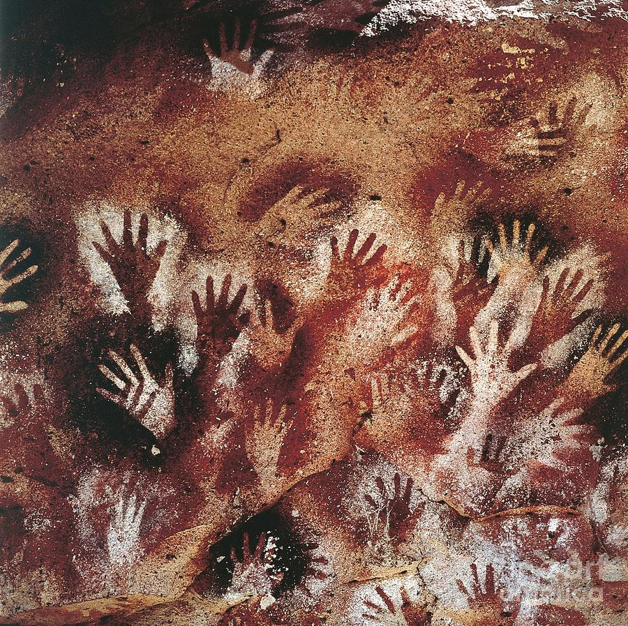
|
INITIAL IDEAS
-For the book layout, I decided to make my pages A4 landscape (297 wide by 210 high)
-For the double page, I have decide to focus on this piece of text
-For the double page, I have decide to focus on this piece of text

-For the single page, I have decided to go for this piece of text

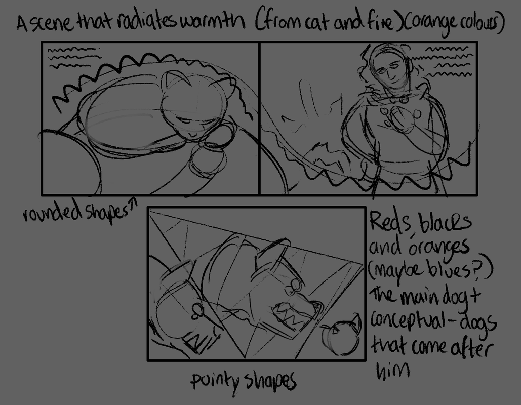
DEVELOPMENT (For single page)
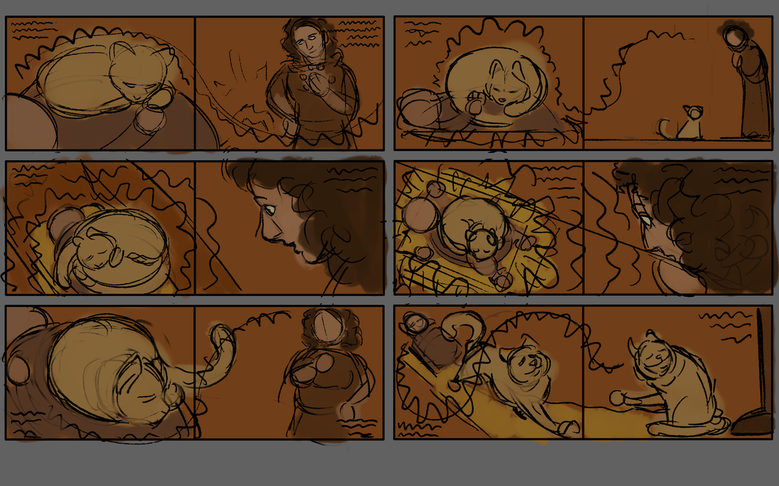
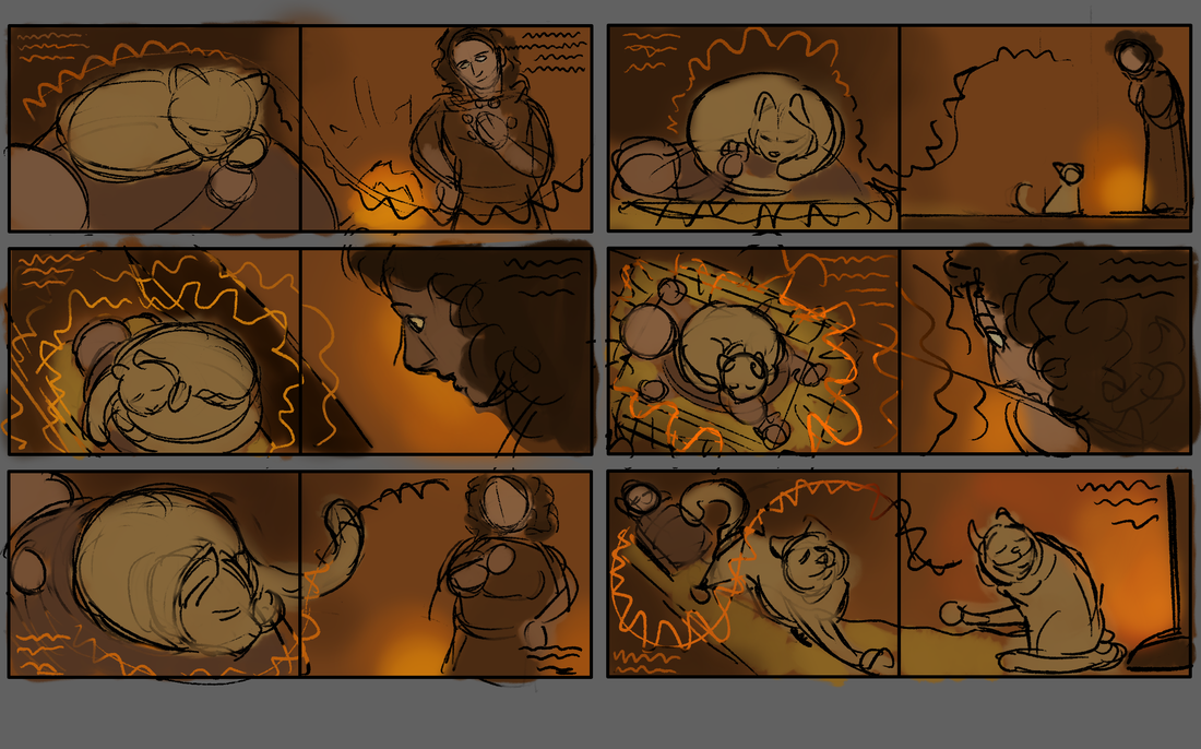
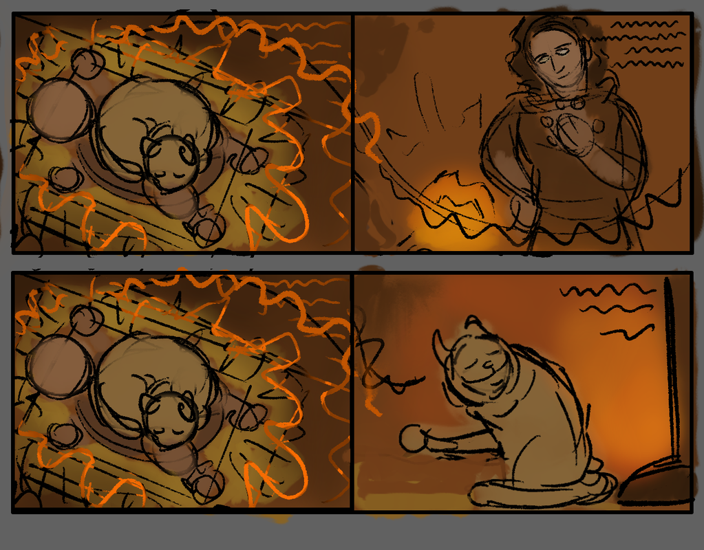
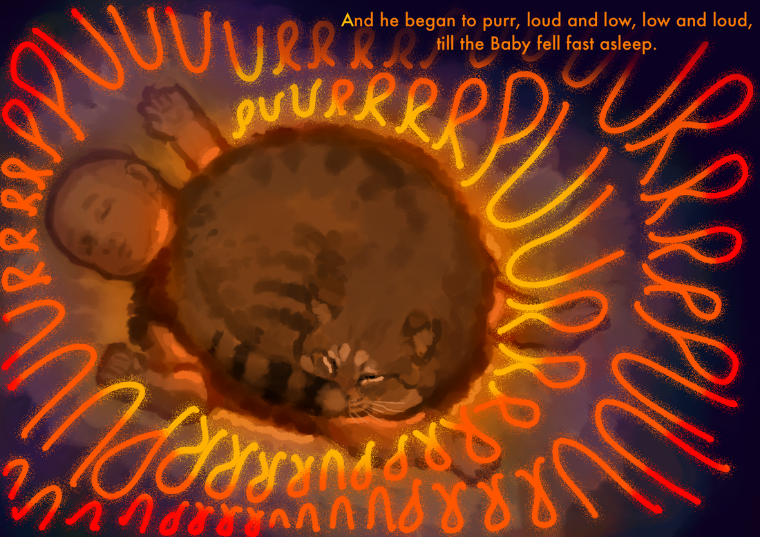
FINAL DESIGN (for single page)
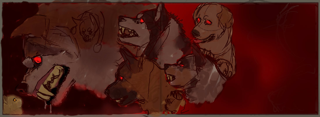
DEVELOPMENT (for double page)
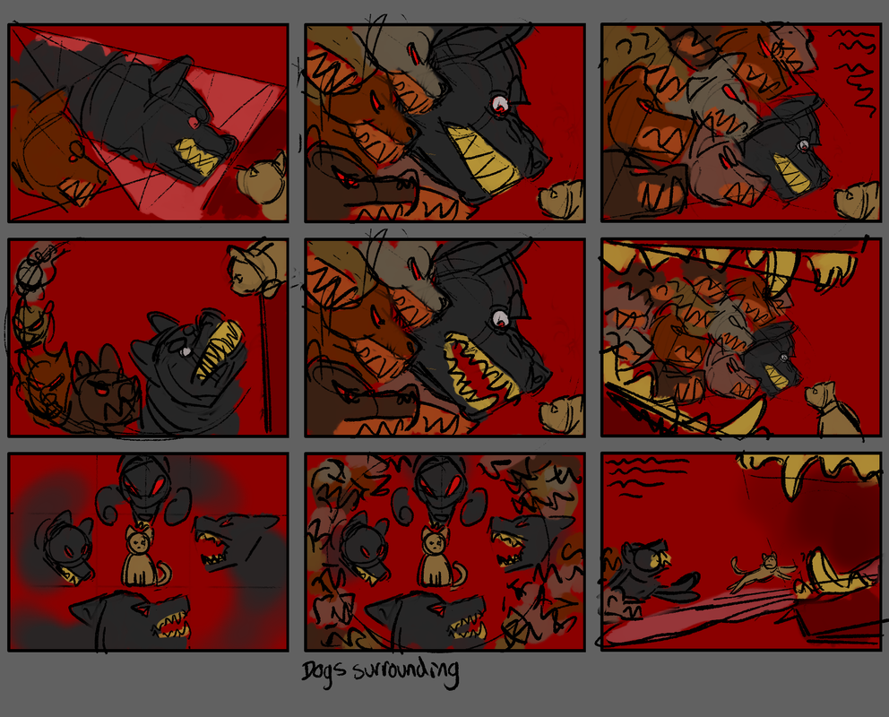
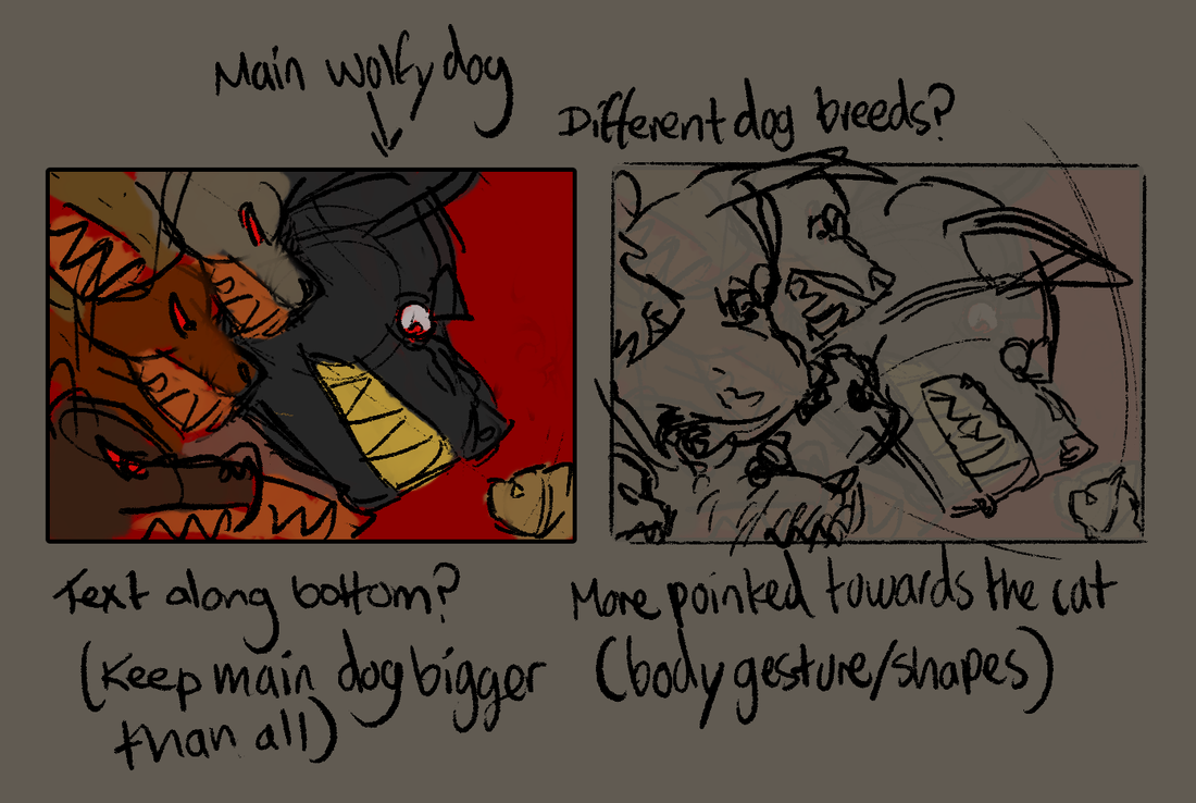
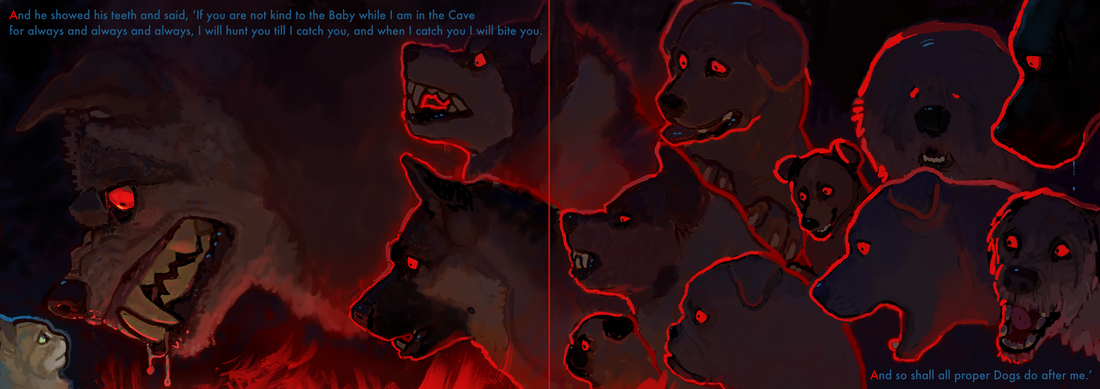
Originally, the idea for this drawing was suppose to be for a single page, but putting more thought into it, I feel as though having it as a double page (to include more dogs) could put more of an exaggeration on the wording ‘And so shall all proper Dogs after me.’ In addition to that, being art for a children’s book, this could also work to bring the reader’s attention to focus on a range of all of the different variations and breeds of dog.
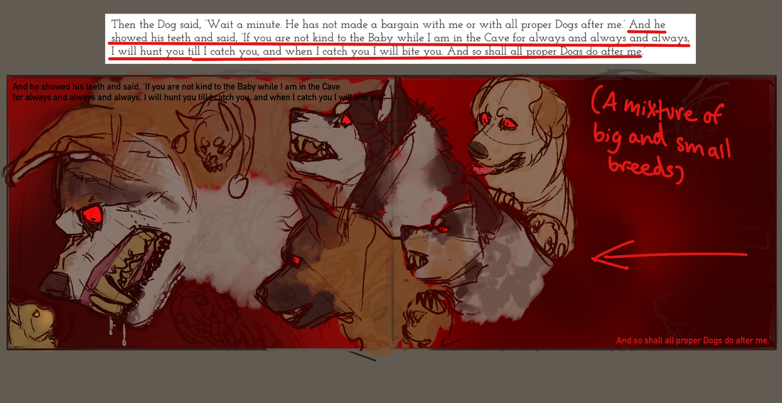
FINAL DESIGN (for double page)

DEVELOPMENT (for front cover)
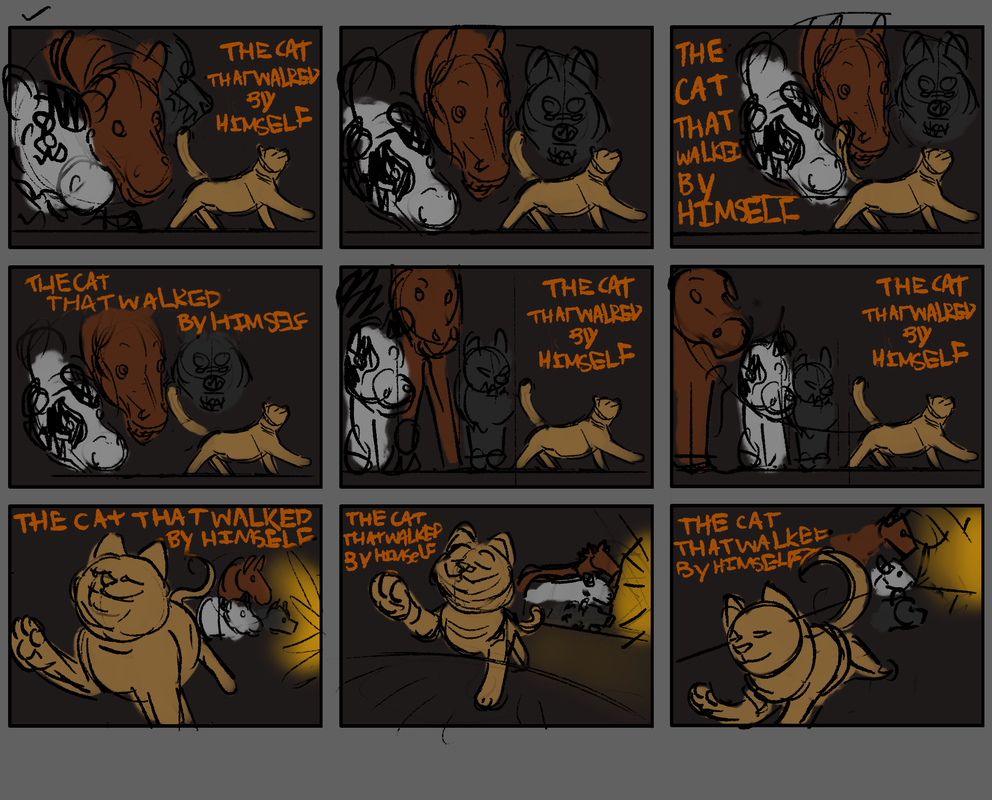
FINAL DESIGN (for front cover)
FINAL DESIGNS
|
|
|
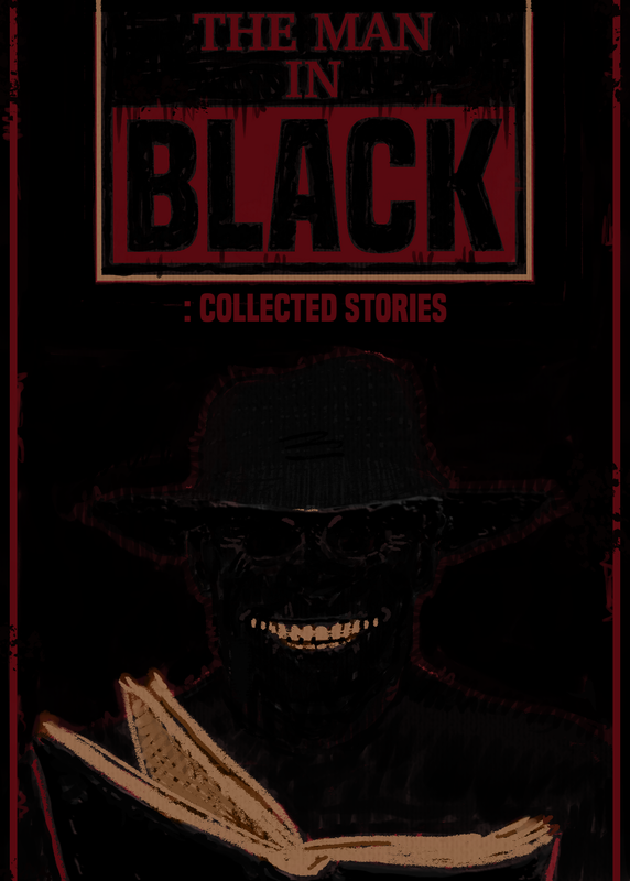
PROJECT 2 / LITERAL - THE MAN IN BLACK
PROJECT BRIEF/INFO
|
The illustrations we are having to make are a single page full colour artwork, a vignette as well as examples of the art along with a sample text of the writing from our given stories, and a front cover design for the book by the title of ‘The Man in Black: Collected Stories’ by The Folio Society.
The story which was allocated to me was ‘St. Austin Friars’ which came in audio form from a horror drama series - presented by ‘the Man in Black’, which included a range of stories that were broadcasted on BBC Radio in the 1940-50s. A programme called ‘Appointment with Fear’. |
|
RESEARCH
|
-Actor’s voices suggest story is set in the UK
-A story by the author Robert Westall (from his book ‘Break of Dark’ published in 1982) -Man becomes the new vicar at a church -People who live in this city have a fear of the church (like people being in fear of a tiger let loose) -Main characters are Mr Williams (otherwise known as the vicar or Martin), Mrs Williams, the undertaker, Drogo (William Henry Drogo) and his daughter Celicia Drogo (vampires) -Side characters would be the church wardens and the attendees (vampires) of the funeral |
-A funeral was booked a month in advance for Drogo who was still alive
-Drogo says he is actually 192 years old (when he looks 50), Celicia is 84 (when she looks 30)
-The vicar is in shock, he’s confused, he doesn’t believe them and thinks they are joking because they look young and healthy to him
-Drogo says he is actually 192 years old (when he looks 50), Celicia is 84 (when she looks 30)
-The vicar is in shock, he’s confused, he doesn’t believe them and thinks they are joking because they look young and healthy to him
RESEARCH
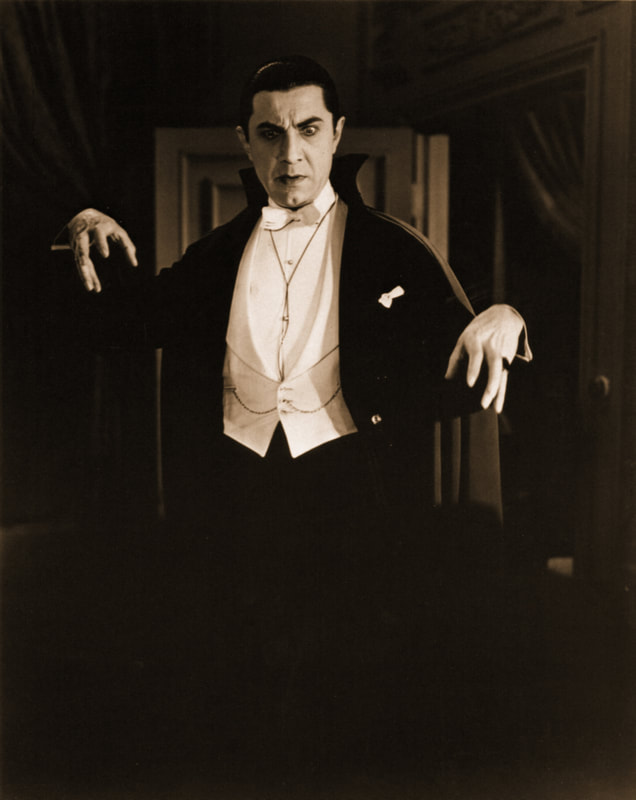
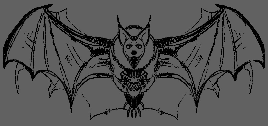
Frequently, bats are involved around these creatures to further push that idea of a character being a vampire. This would be because in some stories, vampires are known to be able to turn into bats, and because of the ways that some vampires like Dracula use their capes to pose in ways that make them look like they have the ‘wings’ of a bat. I plan to involve bats in either (or both) my vignette or full colour illustration, to really push the idea of vampires as a whole, into the viewers mind |
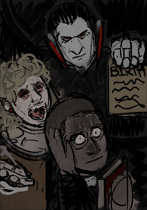
In the story, going off of the mentions of age and birth certificates, the year St. Austin Friars was set was around the 80/90s.
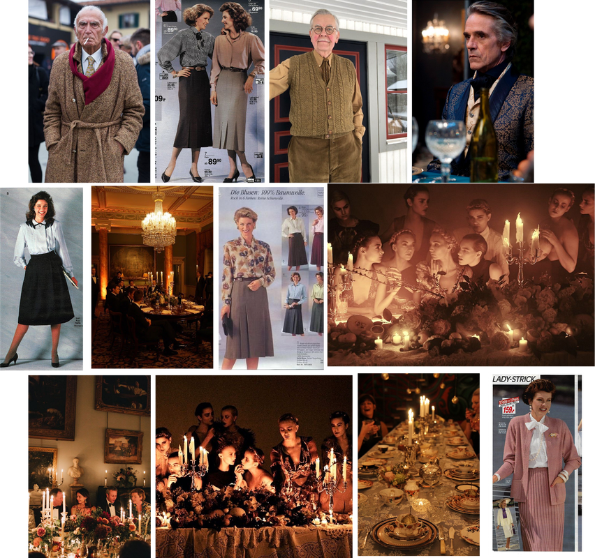
In most forms of media, male vampires (such as Dracula) typically have an appearance with these following features: -pale and white skin -long fangs -slicked back, black hair -dark clothing -a long cape (sometimes with hints of red) -pointy ears -jewellery (red?) 
|
DEVELOPMENT (for full colour illustration)
IMAGE REFERENCES/ INSPIRATION
|
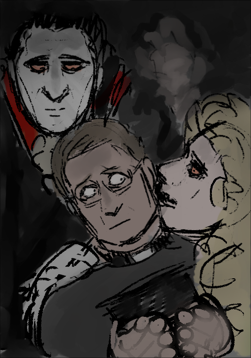
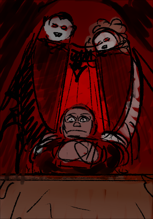
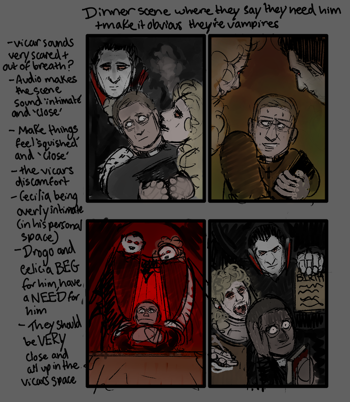
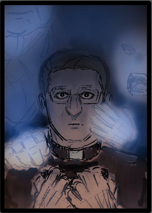
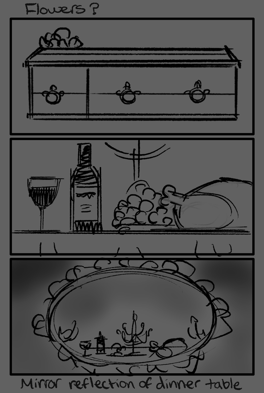
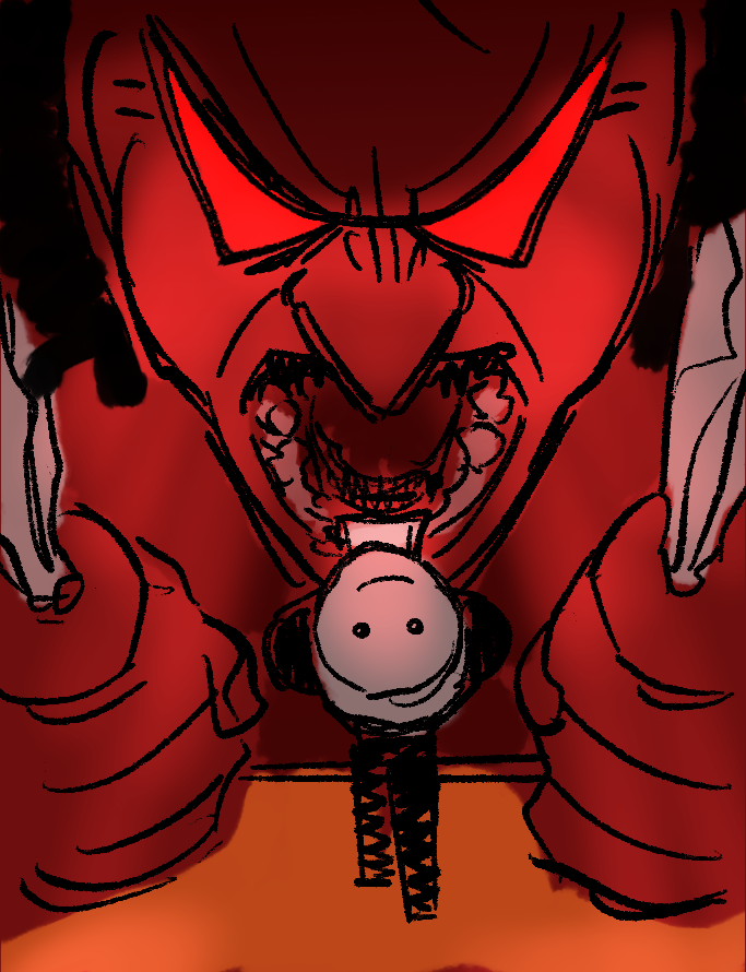
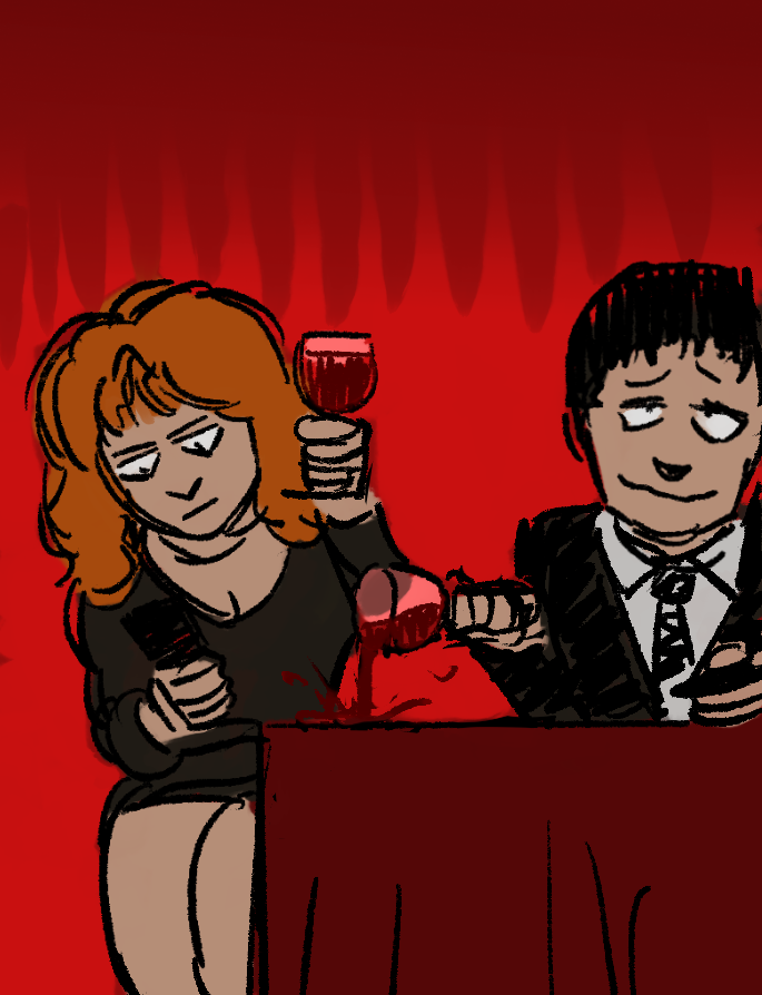
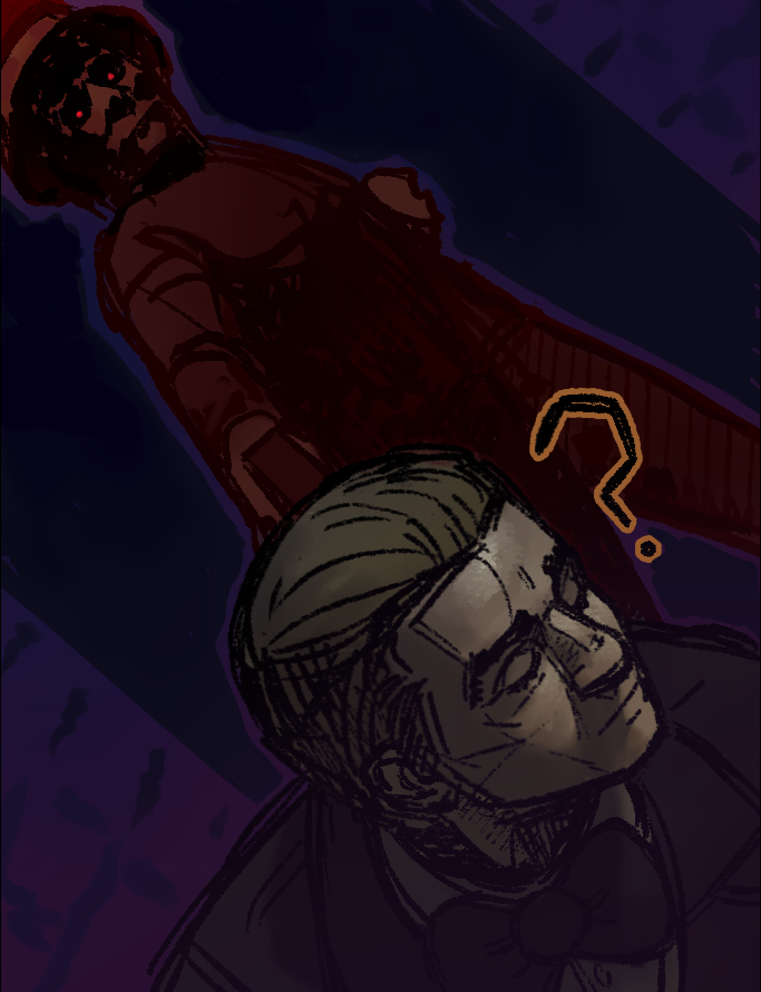
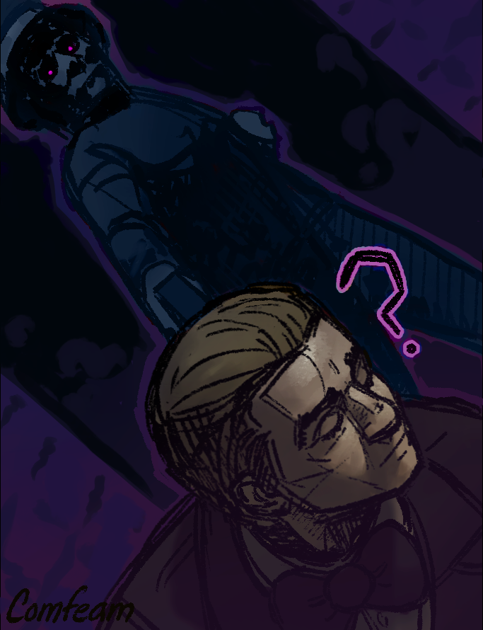
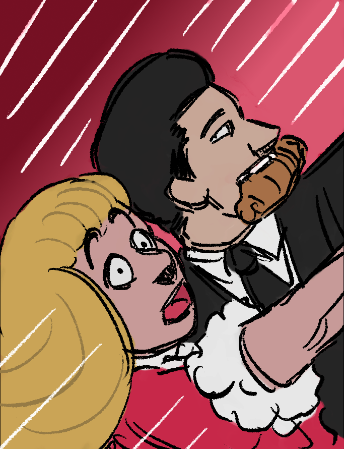
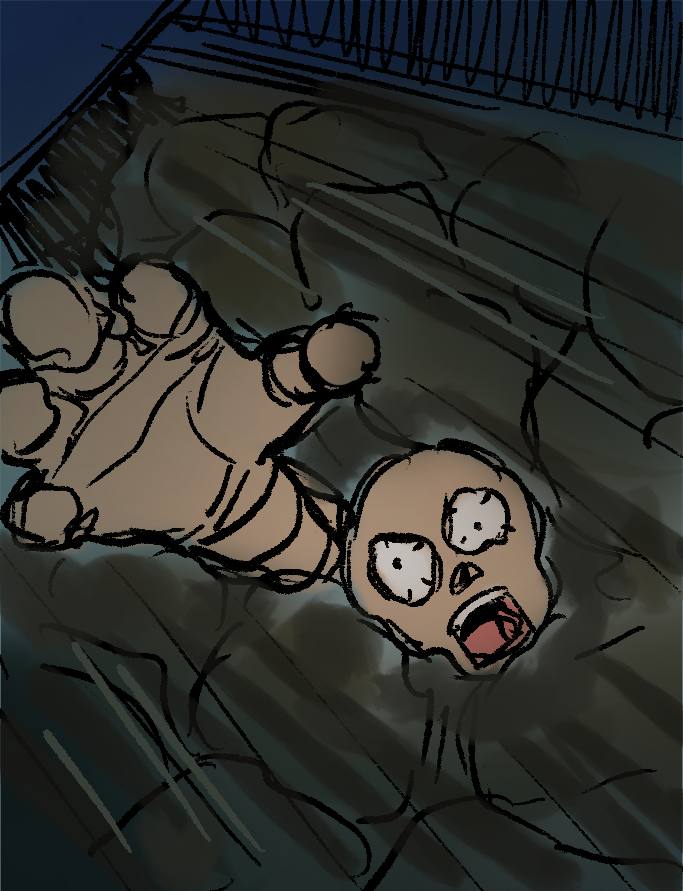
After listening to the audio, I decided that I wanted to put my focus onto a section of the story, a part which I think would work best and be the most interesting when put into the form of an illustration. This which would be with the most prominent characters - when Drogo invites the vicar to have dinner late with him and Celicia (his granddaughter).
|
The middle of the story where it is made very clear and it becomes obvious that the Drogos are both vampires (from what they’ve said, how they look and how they act).
|
|
|
|
FURTHER DEVELOPMENT (after feedback)
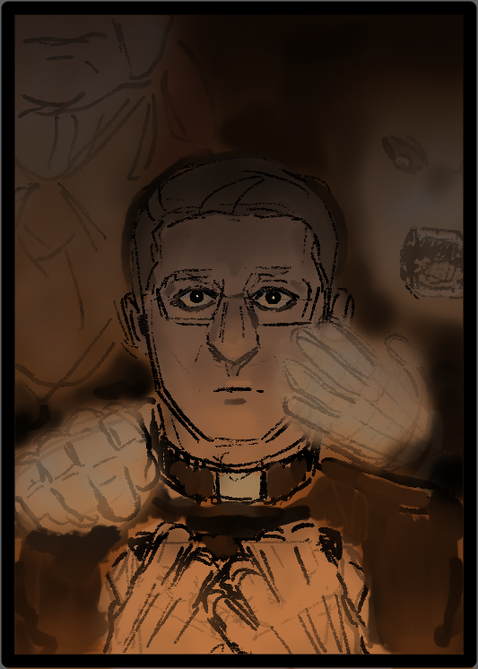
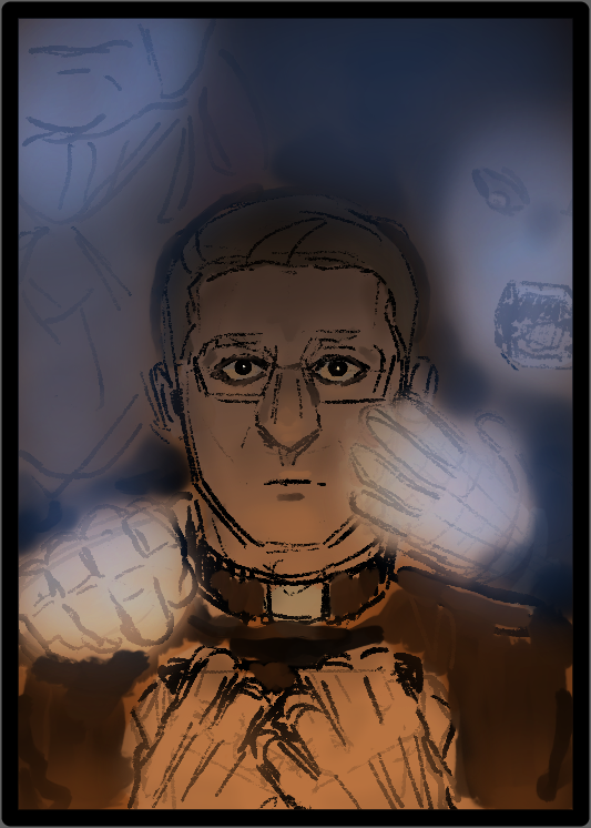
After some critique and feedback, I have created a list of details and ideas in which I plan to change and involve in my full colour illustration:
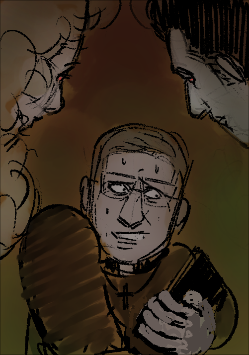
-Make Drogo and Cecilia more ‘normal’ and less vampire looking (as that isn’t obvious to the vicar at all, until they mention their actual age)
-Change clothing so it matches to the year (80s/90s)
-Servants mentioned during the dinner scene, which makes it clear that the Drogos (family name) are wealthy people
-Rich people, so have clothing that fits with that
-If in the illustration the background and setting is very visible, make sure to make the surroundings look as though they are ‘fancy’
-the atmosphere and mood of the drawing to be important
-Drogo and Cecilia to be illustrated in ways that they are visibly creepy
-The vicars face is to be blank, lifeless and drained (because of the realisation)
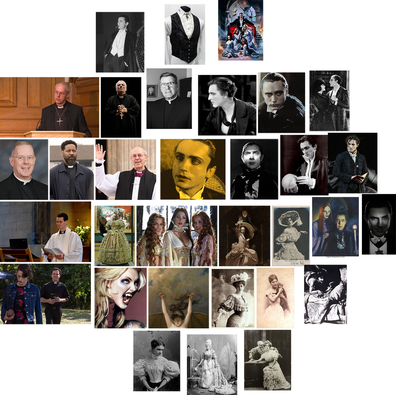
IMAGE REFERENCES/ INSPIRATION (for full colour illustration)
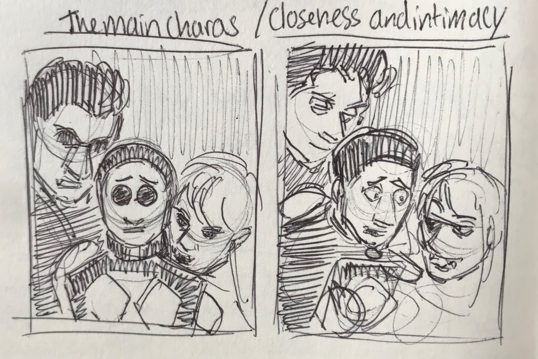
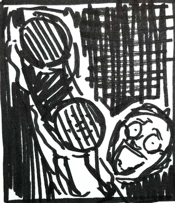
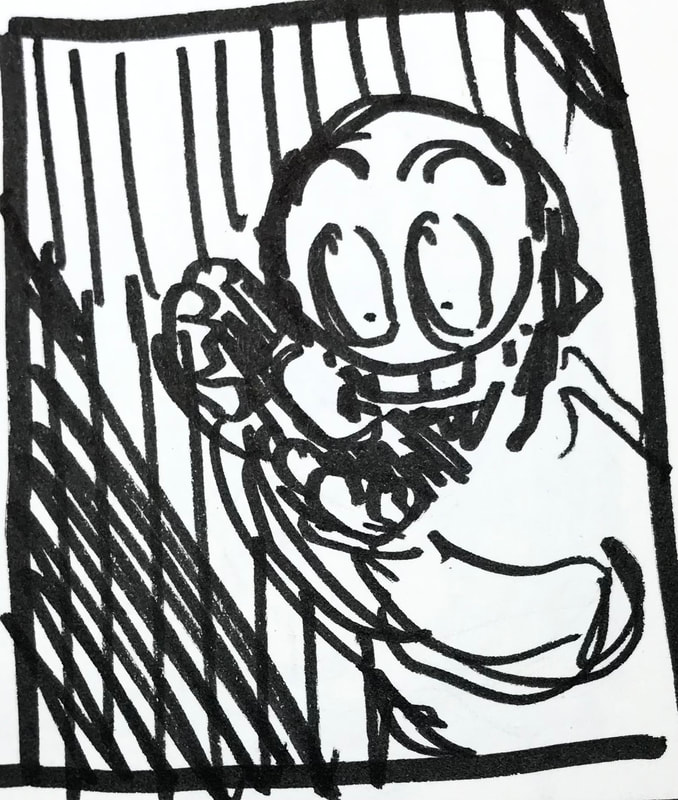
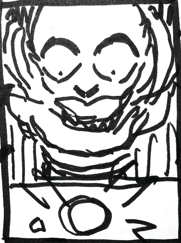
THUMBNAILS/ IDEAS
|
|
|
Here I tried to give more of a mood and atmosphere to the idea- with some variations. This could work well when turned into a final illustration, however if I was to do so, I would do a mixture of the first two, as well as possibly make the facial features on the right less visible (but still have the mouth most prominent), as to make Cecilia appear less ‘human’, and so more unsettling. Too much blue would make them look like ghosts, but in hints of it in their skin works well to give them that undead/vampire look.
FURTHER DEVELOPMENT (after feedback)
|
|
|
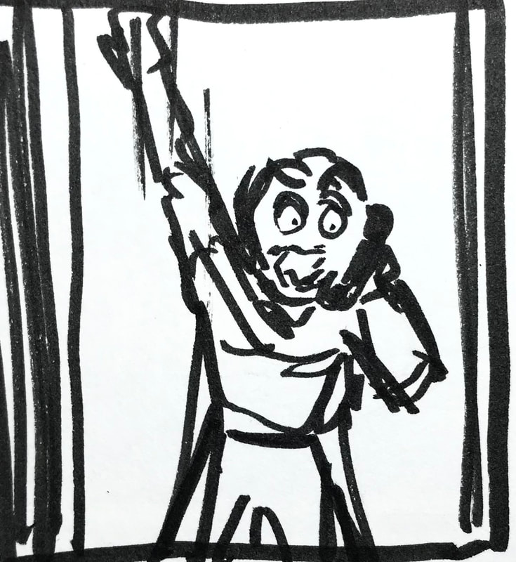
It was suggested to me that including the architecture of the church would make for a more interesting illustration, so with this in mind, I decided to try and focus on, and make thumbnails for parts of the story where the inside of the church would be visible. In addition to this, as there were no detailed descriptions as to how the main characters look, I tried to come up with some sketches where that sort of anonymity is kept.
IMAGE REFERENCES/INSPIRATION
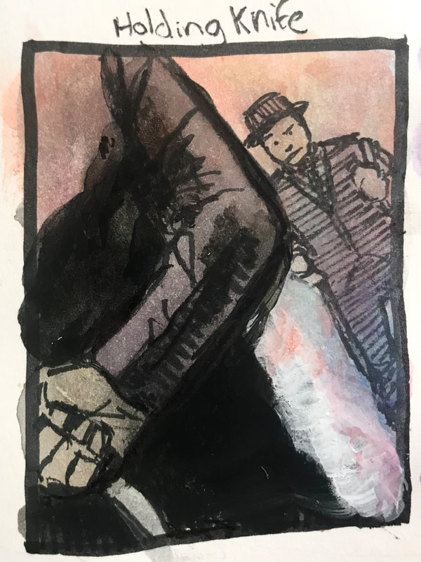
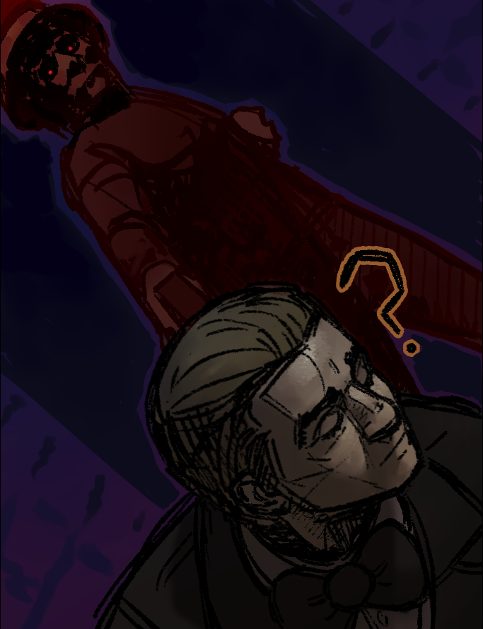
FINAL DESIGN (for full colour illustration)
DEVELOPMENT (for vignette)
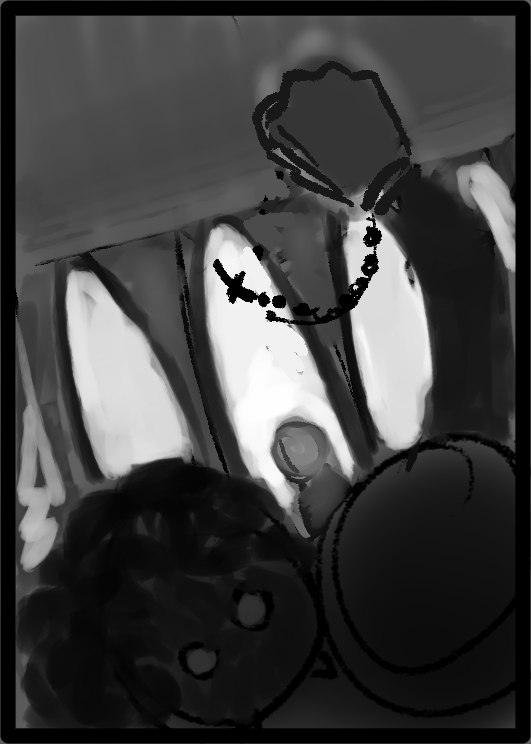
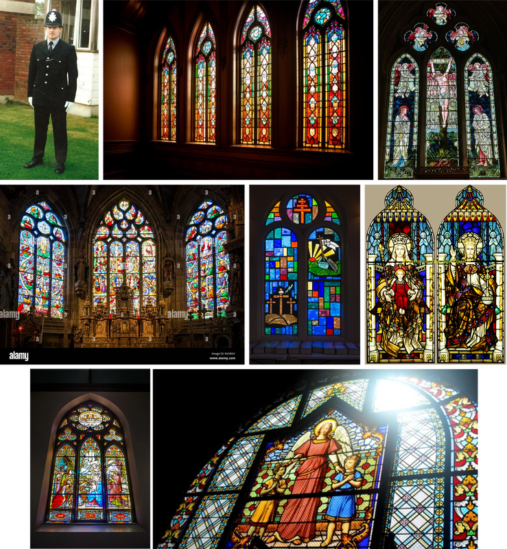
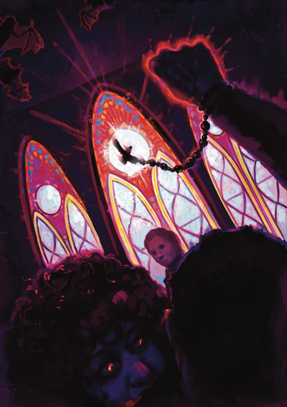
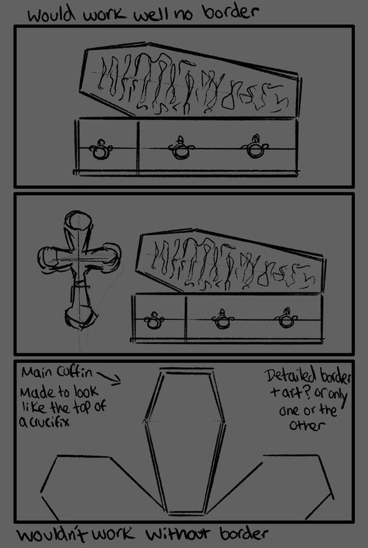
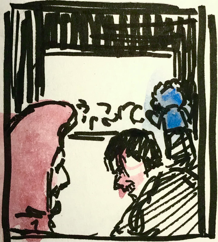
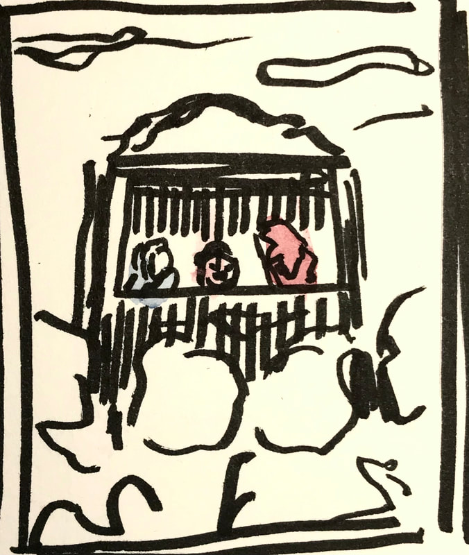
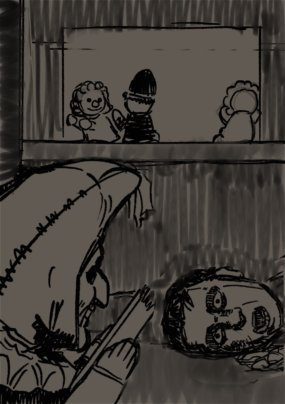
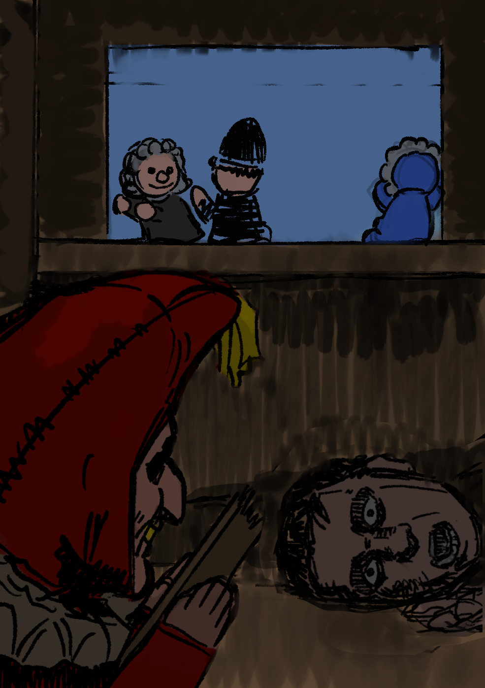
The church plays an important role in St. Austin Friars, and usually in gothic and creepy stories like this one (that mention these kinds of buildings), things like statues such as gargoyles are frequently involved. Although, such a thing would probably not make much sense to have above the text, as in the story the church is very briefly described in detail. For a vignette in relation to this story, something like a coffin (open or not) could work really well, as throughout the audio, a big deal is made out of this funeral. A detailed cross could also work as a vignette.
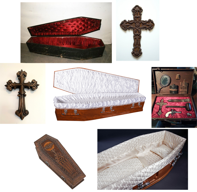
THUMBNAILS/ IDEAS
|
|
FINAL (Vignette)
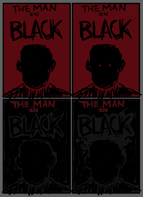
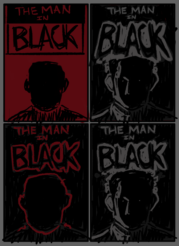
DEVELOPMENT (for book cover)
IMAGE REFERENCES/ INSPIRATION
THUMBNAILS/ IDEAS
|
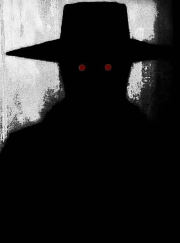
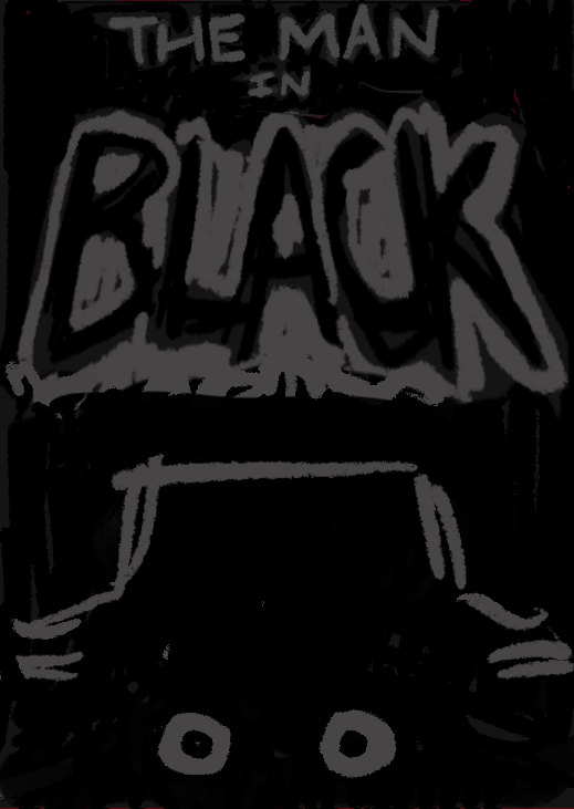
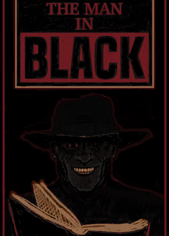
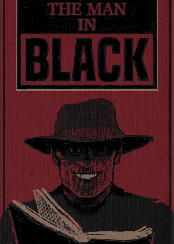
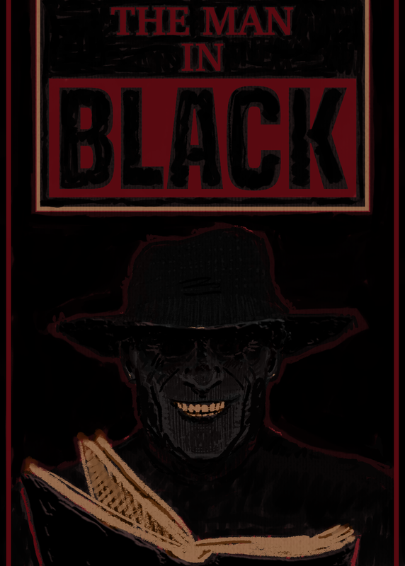
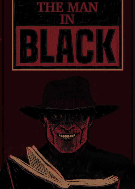
For the book cover, I plan to keep it simple to a degree, in regards to how the man in black looks, as he’s this sort of anonymous figure with no real description on his looks. The actual contents of the book only include a range of different creepy horror stories, he introduces them, but as a whole, he doesn’t really have any major involvement to them. I want to interest the viewer, and possibly hint to what’s inside, but keep it mysterious.
As dark tales are involved, I feel like giving this figure a somewhat gruesome kind of look, would really make it stand out that this book has that horror theme. Of course, as important he is, what’s being told inside, should in some way show on this cover. |
|
|
INSPIRATION/REFERENCE
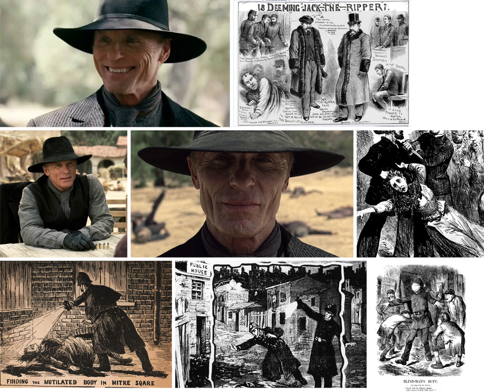
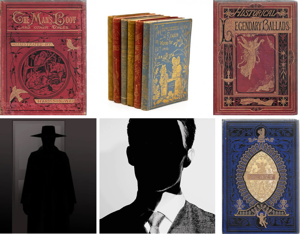
Looking into The Man In Black, I came across an actual character by the same name from the series Westworld. He has that appealing, simplistic look but also, he gives of this creepy aura, which I feel like comes from the involvement of his hat, as well as the detail in his face.
Having to research this individual, made me think about other disturbing and secretive sorts of people, one of which came to mind was Jack the Ripper. I decided to look into old pieces of art and illustrations that involved or had connections to him; a few of the pieces of art that I enjoyed, had this similar scratchy and almost aggressive, yet ghostly kind of look, which I feel could really suit what I want to go for with the front cover.
Having to research this individual, made me think about other disturbing and secretive sorts of people, one of which came to mind was Jack the Ripper. I decided to look into old pieces of art and illustrations that involved or had connections to him; a few of the pieces of art that I enjoyed, had this similar scratchy and almost aggressive, yet ghostly kind of look, which I feel could really suit what I want to go for with the front cover.
DEVELOPMENT
|
|

|
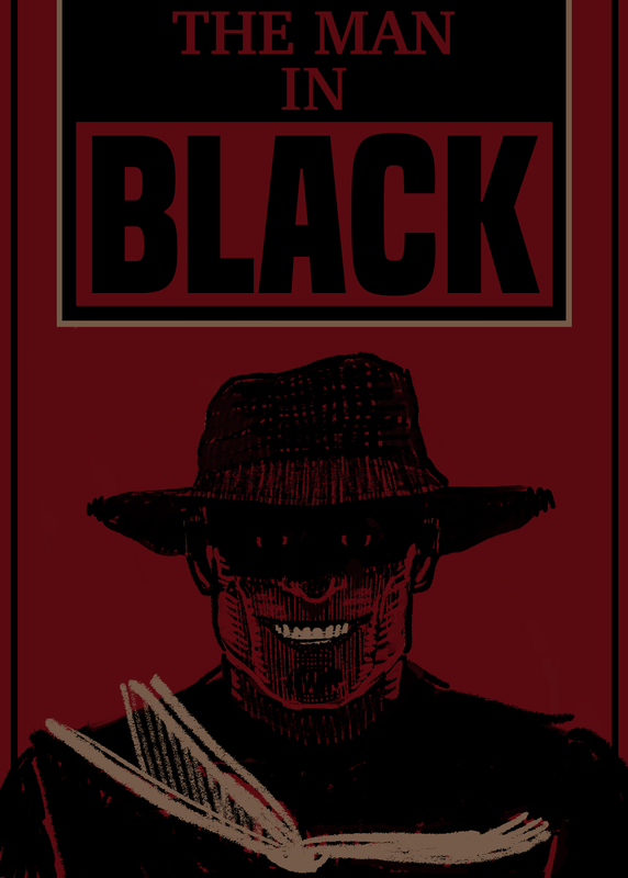
FINAL
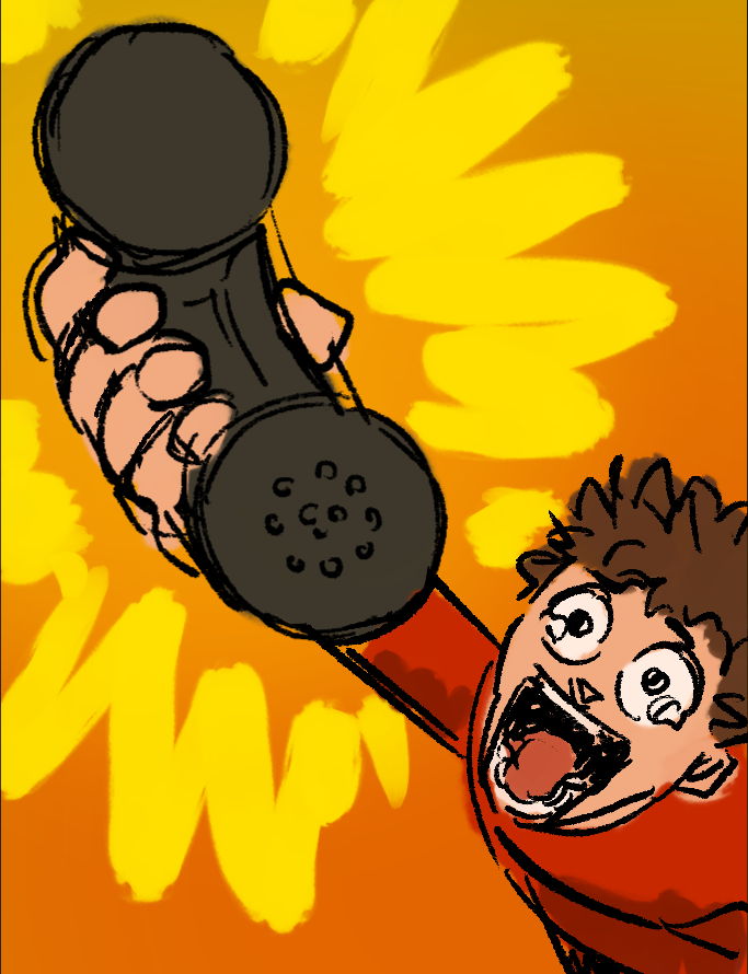
PROJECT 1 / CONCEPTUAL EDITORIAL
RESEARCH
|
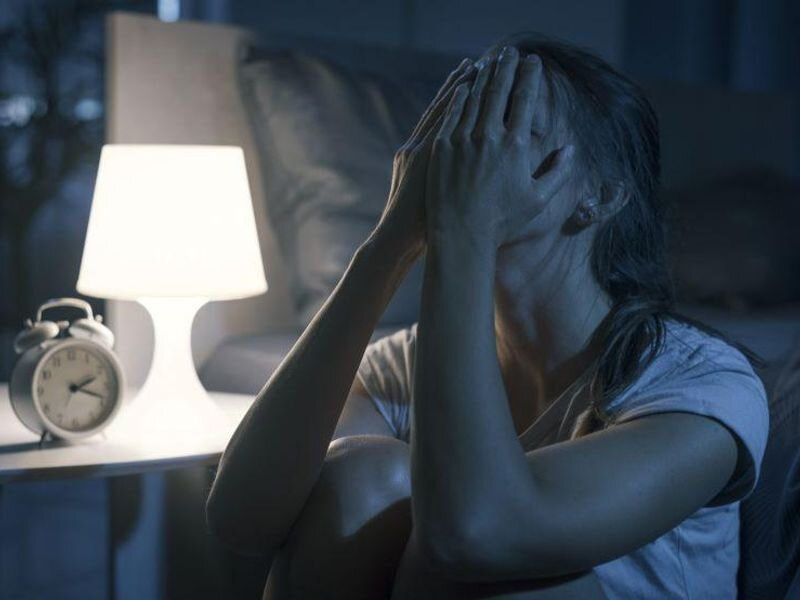
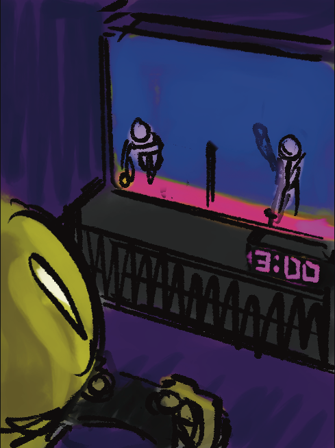
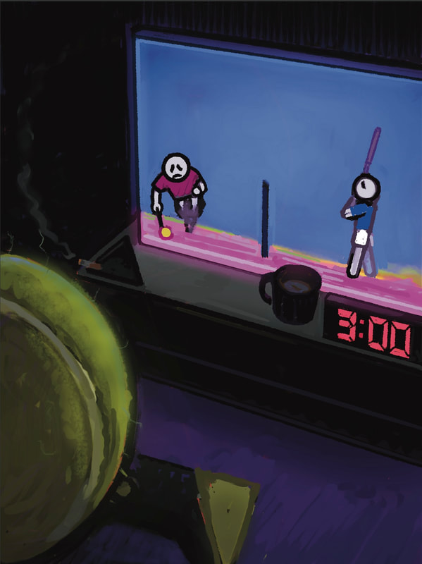
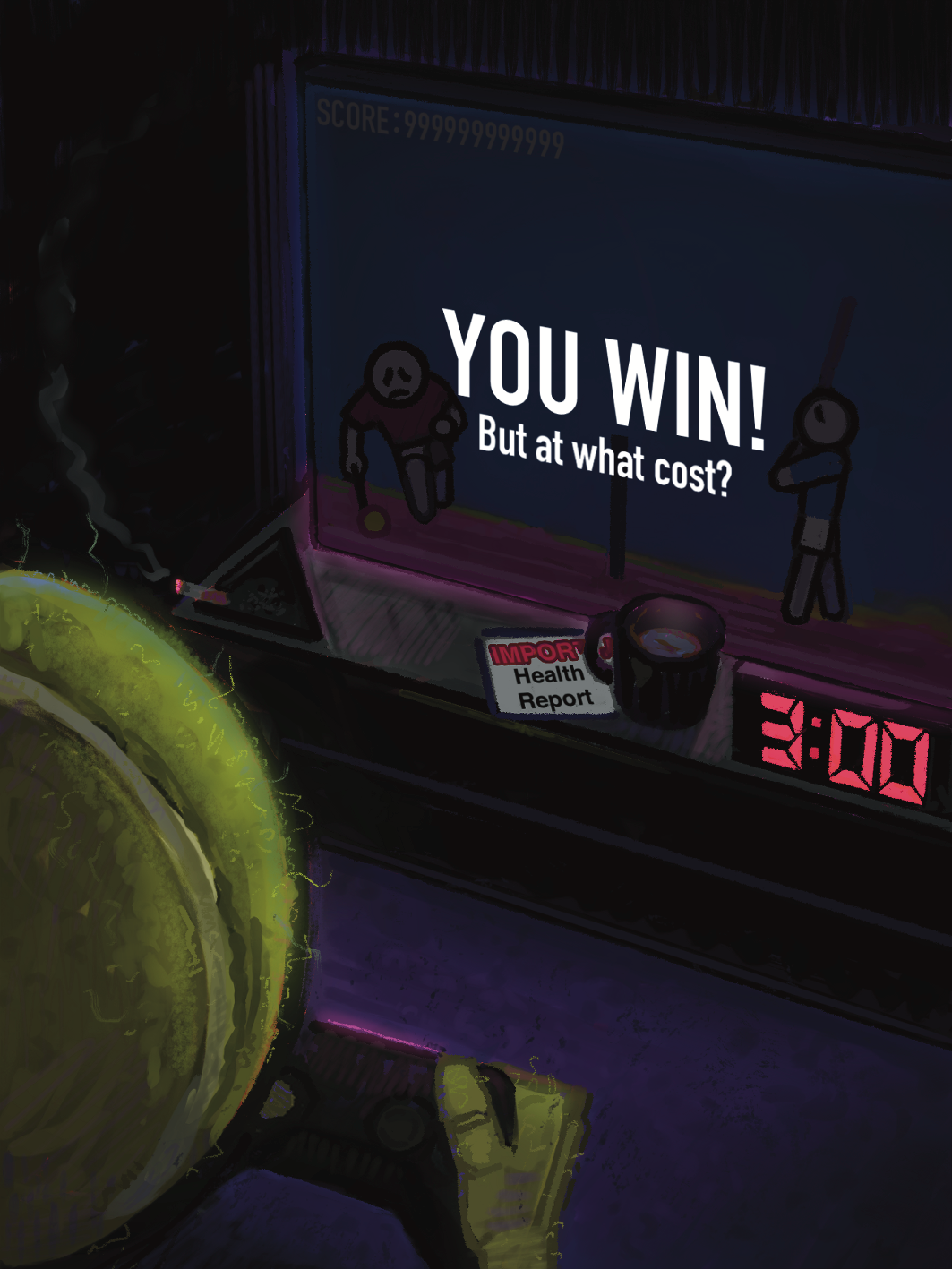
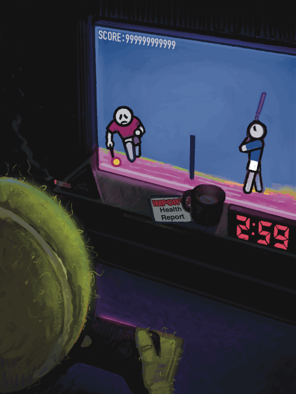
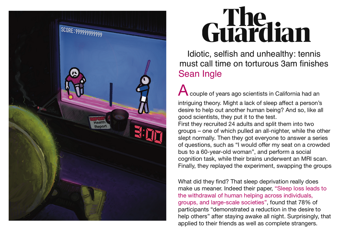
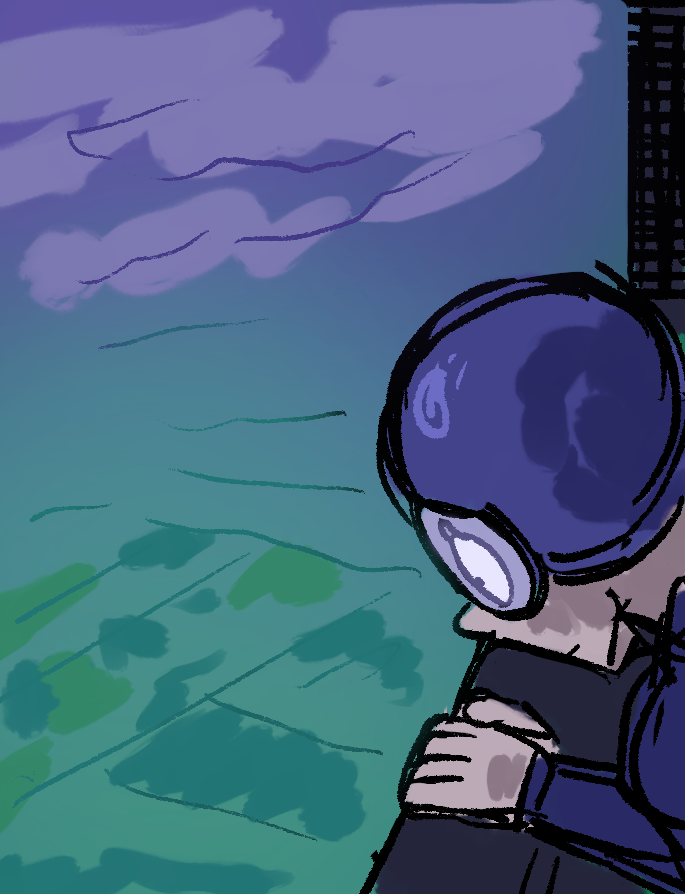
The newspaper article that I was assigned to create an illustration for, talks about tennis matches being put into place to continue late at night, till early in the morning. The article by The Guardian - ‘Idiotic, selfish and unhealthy: tennis must call time on torturous 3am finishes’, goes into detail about how it’s not healthy for individuals, both the players and the fans, to be apart of such tournaments that are seemingly arranged so late at night, as well as how things such as the weather, effect these individuals health.
|
In addition to this, the article also brings up the fact about how a lack of sleep can have many negative effects on our physical and mental health - further adding onto the writer’s reason why there should be a stop put on these games, that seem to be arranged when people ‘should be sleeping’ as they say. |
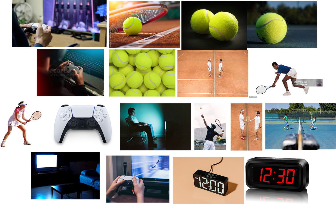
IMAGE REFERENCES/INSPIRATION
INITIAL THUMBNAILS/SKETCHES
|
|
|
|
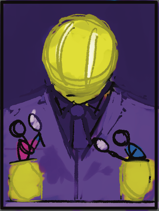
For my first set of thumbnails, I think I may have been too ‘obvious’ to give away what the article is going to be about, as much as I like the idea of the tennis ball acting as the moon as a way to suggest that it’s night, I feel as though a use of a tennis player is too on the point. From my knowledge of editorial illustration, the drawings are usually very creative and abstract - the overall image is there, yet many different surreal elements are put together to create this picture.
|
For my second approach, I wanted to keep in mind the different smaller elements (information taken from the article, like the mention of time of day - so then I would think about colours which would work to hint at those sort of things ) in which I could use and put together to create a ‘bigger picture’. As the article as a whole basically brings to light about how the game ‘tennis’ has more of a control over the people, than the people have over the game, this made me want to sort of personify that whole aspect of tennis having more authority. |
THUMBNAIL/SKETCH
|
|
THUMBNAIL/SKETCH
|
The article in which I’m having to use as reference has this whole negative and almost sad undertone to it throughout reading. It really isn’t an upbeat or happy set of writing at all. The writer most definitely wants it’s readers and audience to feel some sort of empathy for the players who are having to stay up all night, while also wanting them to hold some sort of anger for the organisers of these matches.
However with this article, it really does seem as though they’re talking about tennis, the game, the sport, as if it’s some sort of evil thing, controlling people against their will. With this in mind, for my second attempt at a sketch, I decided to play with that exact idea . |
|
|
|
|
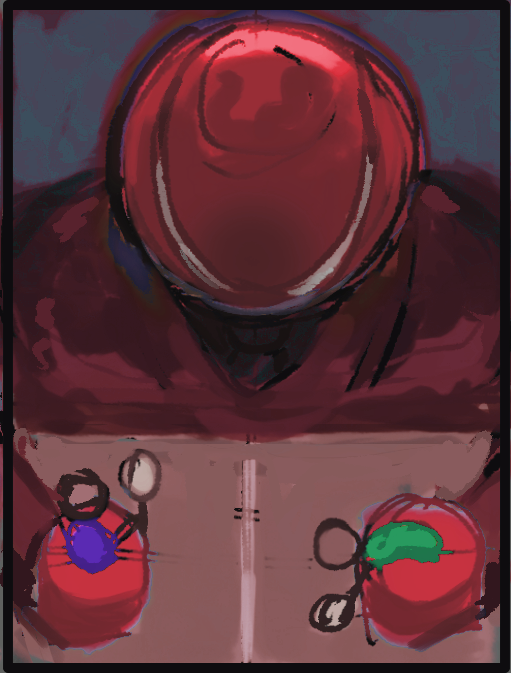
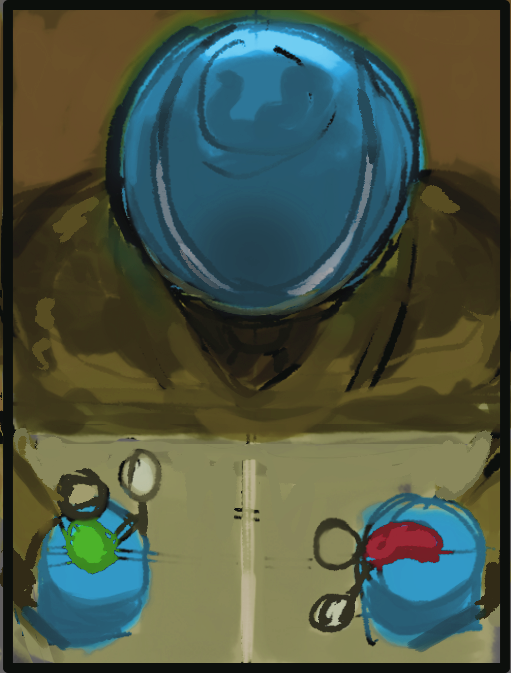
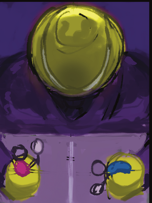
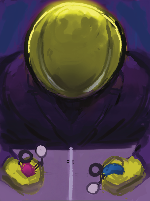
I did also try to play around with the colours/hue of this sketch, but I felt as though the yellow and purple worked best, especially as they work as complimentary colours. On top of that, I feel as though with any other colours, the image loses its meaning - the yellow communicates the tennis ball, and the purple not only helps to make that stand out, but the purple acts as that cool colour to suggest the nighttime (as the article talks about the 2am and 3am). However, with that 3rd play around with the hue, I do like undertones in the background, as well as the sort of texture that’s appeared - so I’d like to keep that in mind while advancing with my chosen sketch/draft.
OLDER
|
NEWER
|
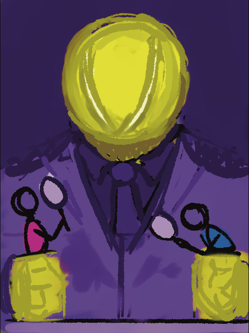
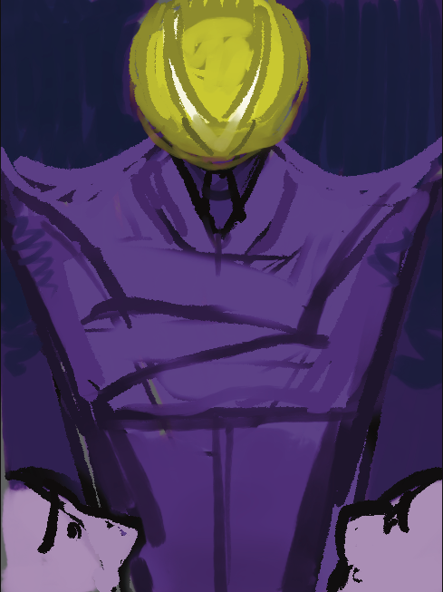
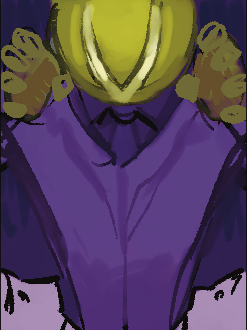
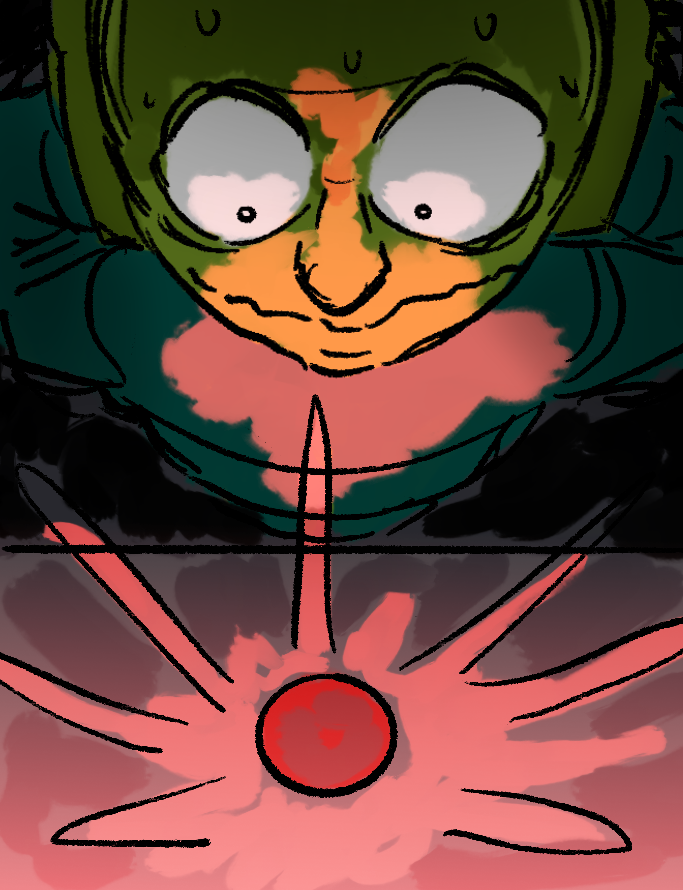
Progressing with the sketch, I decided to try and emphasise the figure more (through enlarging areas and with shading and lighting), as well as give it a bigger ratio on the canvas, as to make it seem more ‘menacing’ and bigger, adding onto the idea that they have more control. I also tried to work more with the lines on the tennis ball to bring out some sort of angry ‘facial’ expression.
|
|
|

I decided to come back to the other sketch to make some more changes, and enhance some features like the ‘face’ and the shoulders, to try and put across an emotion that I feel as though would be suitable for this figure. I Do also think that working on top of this initial sketch or with this ‘simpler’ style could work a lot better for an editorial piece (but also because the colours are more vibrant).
Along with that, this somewhat less detailed style is a lot easier on the eyes, the lack of shading makes the figure stand out a lot more. On top of this, because the character is so simple with its design, I feel as though going too detailed would maybe make the overall image hard to read and it could become too ‘messy’. If this tennis person had more of an ‘actual human’ look, more detail could work well, but giving it that anatomical accuracy, I believe would stop the character from appearing as a tennis ball (which then loses its connection to the article).
Along with that, this somewhat less detailed style is a lot easier on the eyes, the lack of shading makes the figure stand out a lot more. On top of this, because the character is so simple with its design, I feel as though going too detailed would maybe make the overall image hard to read and it could become too ‘messy’. If this tennis person had more of an ‘actual human’ look, more detail could work well, but giving it that anatomical accuracy, I believe would stop the character from appearing as a tennis ball (which then loses its connection to the article).
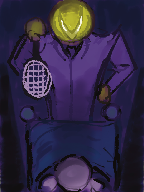
Having personified the sport into this figure, I started feeling as though using that idea almost entirely by itself, or for a majority of the drawing - that it maybe doesn’t get across the whole tennis part that is important for me to involve in the illustration. Keeping this in mind, I decided to try to involve the next major element or object which defines tennis for what it is, this which of course would be a tennis racket.
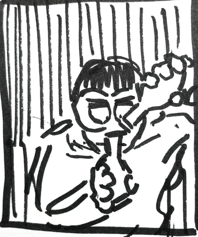
|
|
|
|
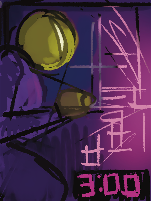
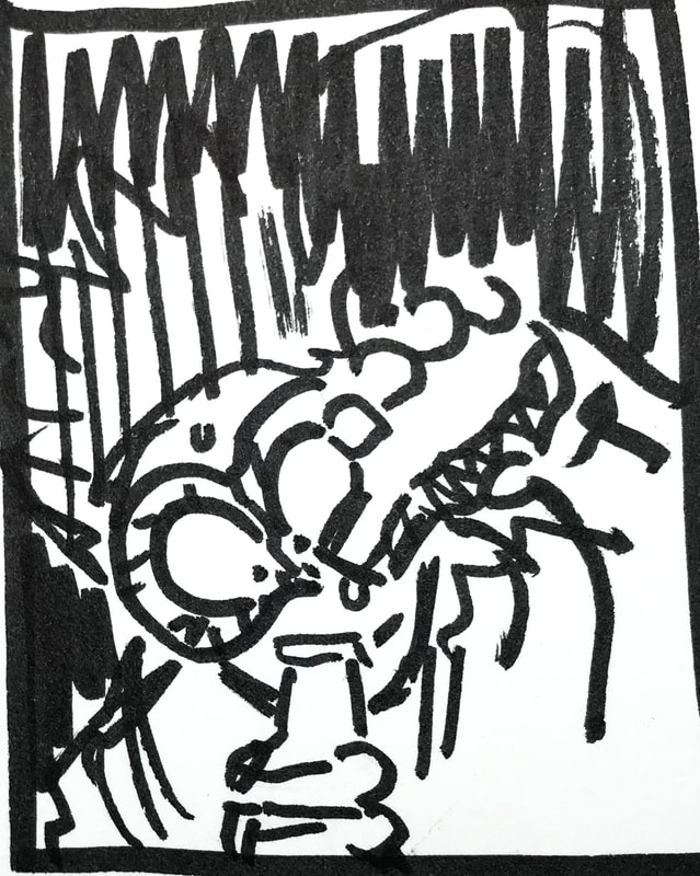
As much as I could just use colour and shading to get across that indication of time and it being late, I think that doesn’t really fully get across or put that emphasis on the time of day (something which is important in relation to the article). So with a couple of these thumbnails, I decided to involve the time through visible numbers.
|
For my next and final chosen thumbnail, I think as an idea, having this tennis ball character be visible controlling the tennis players via a game/console is good in the ways that it’s showing/representing (as it is mentioned in the article) how these people don’t really have any control over what they’re doing and being made to do.However, despite only being a rough sketch, I think it lacks a few visuals in relation to the imagery, that which is necessary in regards to how I want this illustration to be viewed, and its links to the article in which it’s based on. |
For that reason and when I move onto the development of this thumbnail, I hope to add details here to give it more of a ‘story’ or make it seem as though it has some kind of background.
Conceptual illustration (especially the art which is created for articles) doesn’t always involve and make use of every little detail in relation to the topic that it’s covering, a lot of the time, it seems to just skim the surface, covering the very basics and simplicities of a detailed and developed idea or set of writing.
With this in mind and looking back to the title of my given article, ‘Idiotic, selfish and unhealthy: tennis must call time on torturous 3am finishes’, I could just use this set of writing to base my illustration off of, but of course without taking and putting to use the details from the actual writing within the article, it wouldn’t have that full connection, and any of the research that I’ve done because of the writing - would be almost pointless. With this sort of understanding, I've came to realise how to almost ‘even’ out my usage of imagery, and put that into a kind of ratio where it gives you that basic idea of what the publication is about, but just enough so that it doesn’t reveal the finer details within it (thinking of things in moderation).
The article was wrote quite recently in 2024, so it’s fairly important to not forget the visuals which show this time period. Going back to my chosen thumbnail, things like the tv should look modern, as well as the alarm clock, the controller, and the ‘game’ should come across as something that looks like it graphically fits in with todays media.
ALL THUMBNAILS/IDEAS

THUMBNAIL DEVELOPMENT PROCESS
|
|
|
|
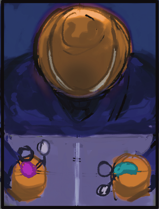
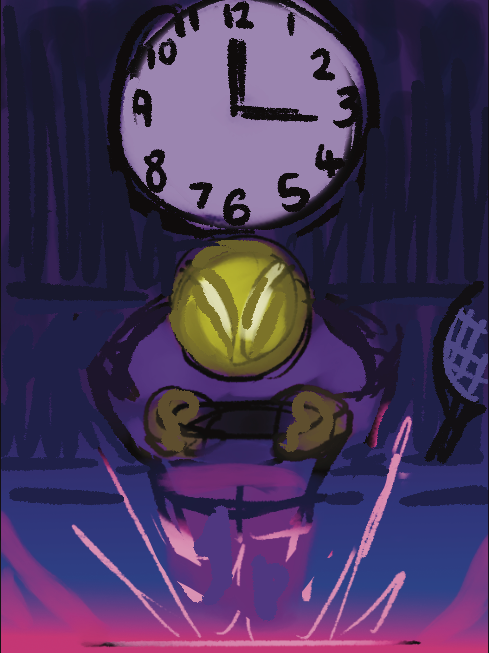
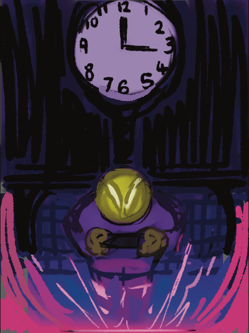
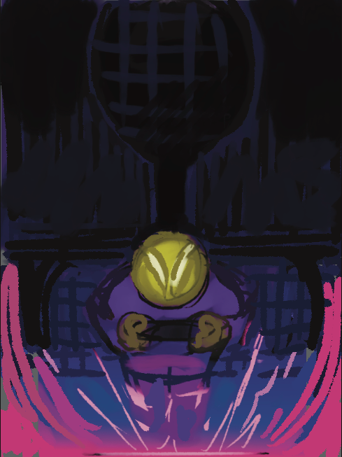
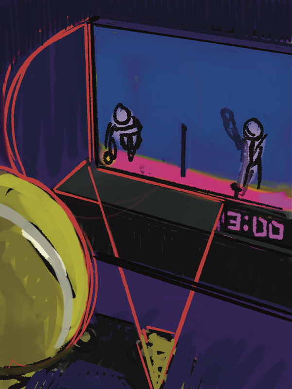
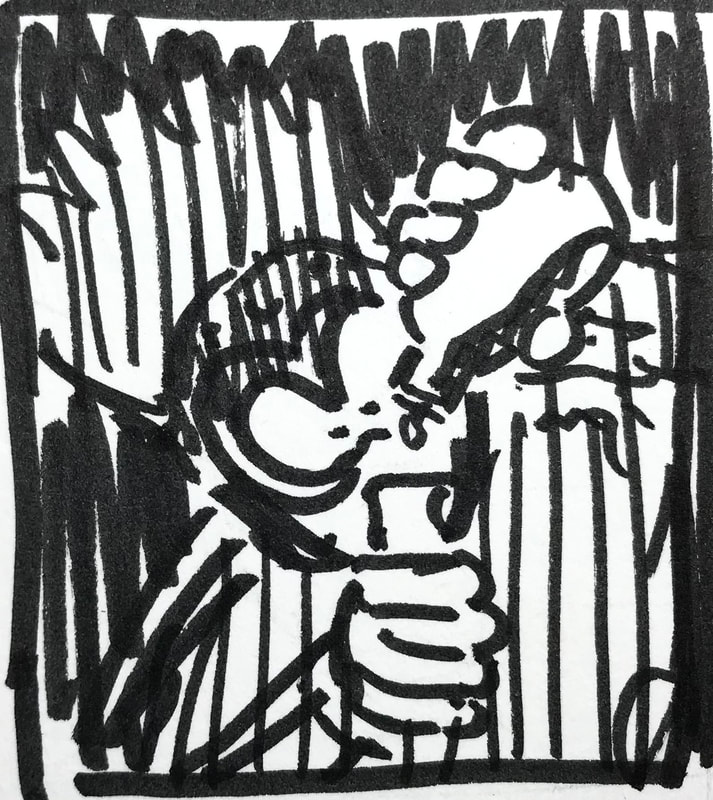
During my thumbnail process, I started to think more about the composition within the illustration, and how I could make further enhancements to my shapes that were visible and could be pushed more in the drawing. As well as adjusting the lighting and shading, to make certain areas stand out more than others - points where I’d like the viewers attention to gravitate towards.
|
|
While I progressed, I was slowly trying to make it so that the figures and objects in the drawing all shared the same sort of environmental colours, and I tried to make it so the lighting and shading looked more natural to this environment.
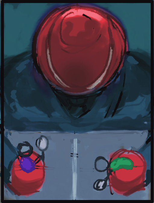
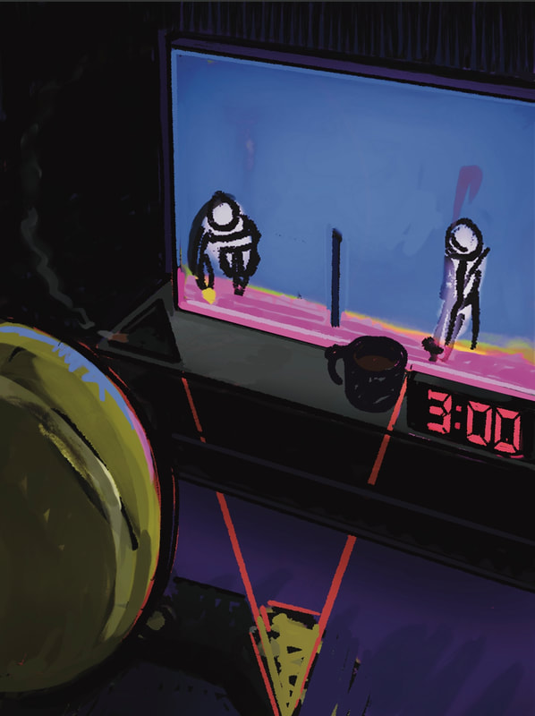
I wanted to put more detail into the surrounding area (including the tennis figure), to really make note of and include those visuals in regards to the ‘unhealthy’ and ‘selfish’ which is included in the article’s title. With more work going into these ‘outside’ parts, I felt as though having that all throughout the illustration would maybe be too much for any viewer to take in, and that it would all sort of ‘collide’ or ‘mix’ in together. Keeping this in mind, I decided to simplify the work on the tv screen.
I wanted to put more detail into the surrounding area (including the tennis figure), to really make note of and include those visuals in regards to the ‘unhealthy’ and ‘selfish’ which is included in the article’s title. With more work going into these ‘outside’ parts, I felt as though having that all throughout the illustration would maybe be too much for any viewer to take in, and that it would all sort of ‘collide’ or ‘mix’ in together. Keeping this in mind, I decided to simplify the work on the tv screen.
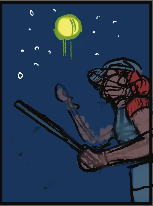
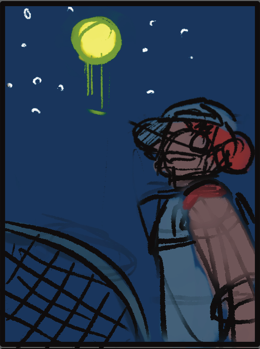
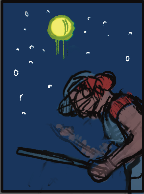
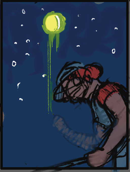
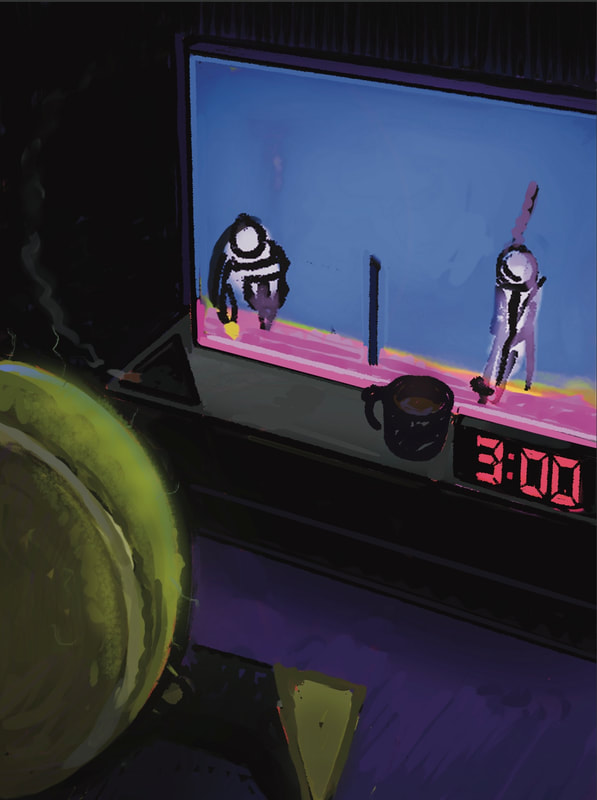
FINAL ILLUSTRATION
VERSIONS
|
|
|
GIF
EXAMPLES OF ILLUSTRATION WITH TEXT
|
|
|
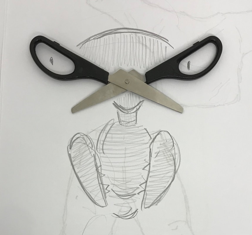
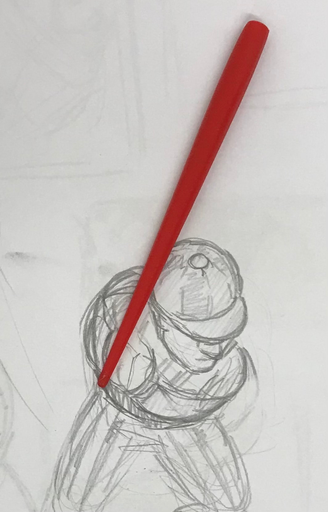
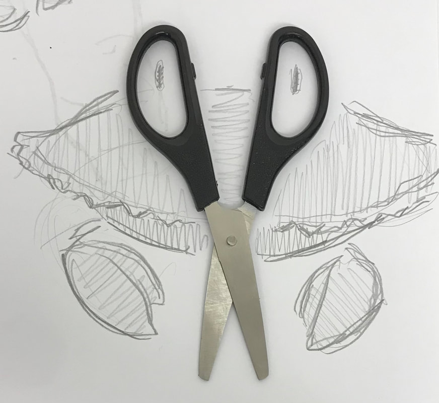
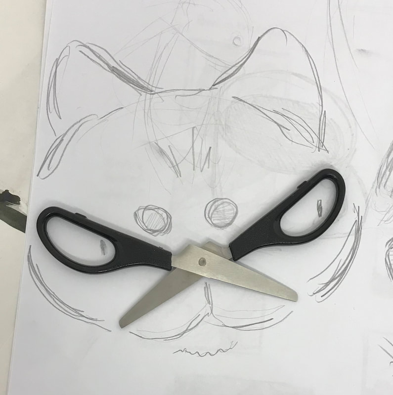
Set Task
Involving and using objects in illustration in creative ways.
|
|
|
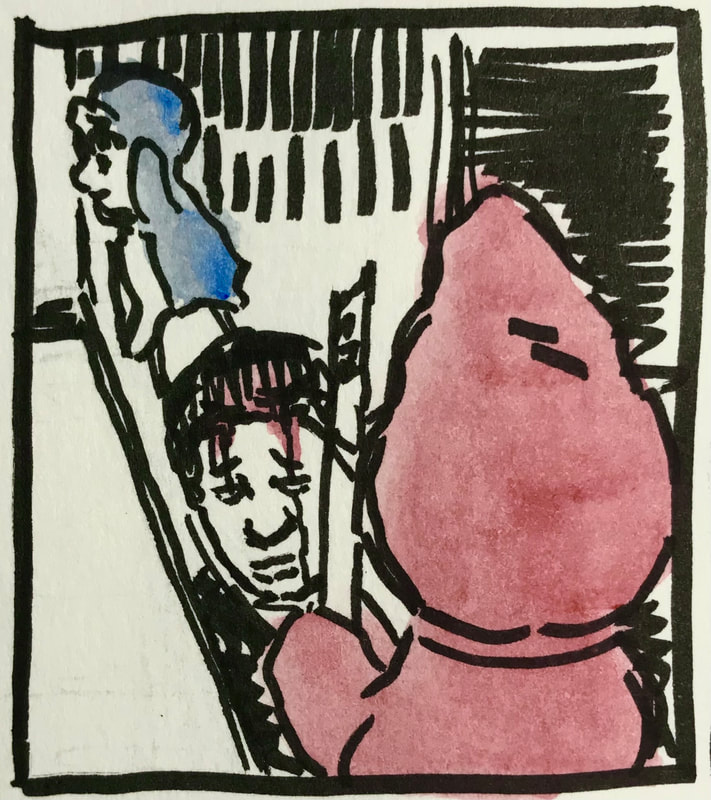
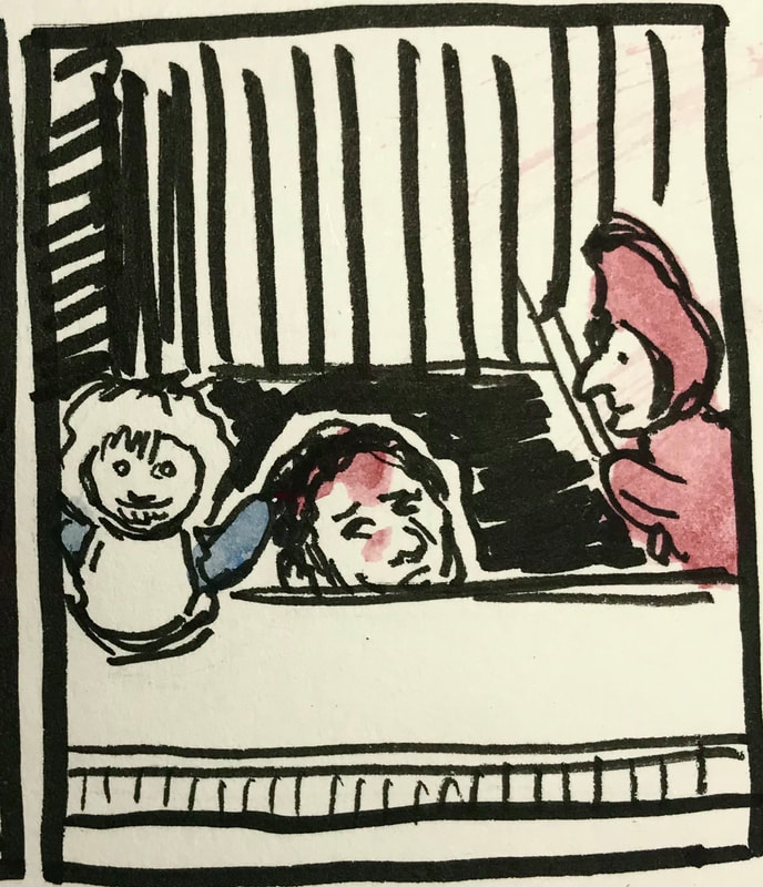
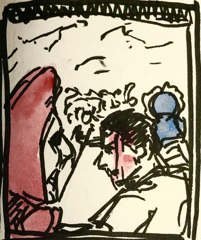
Project 3 / The One Where They Pick
Concepts-Communicative colour
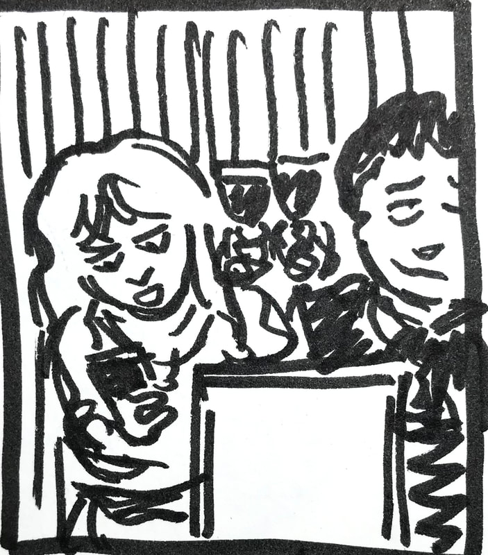
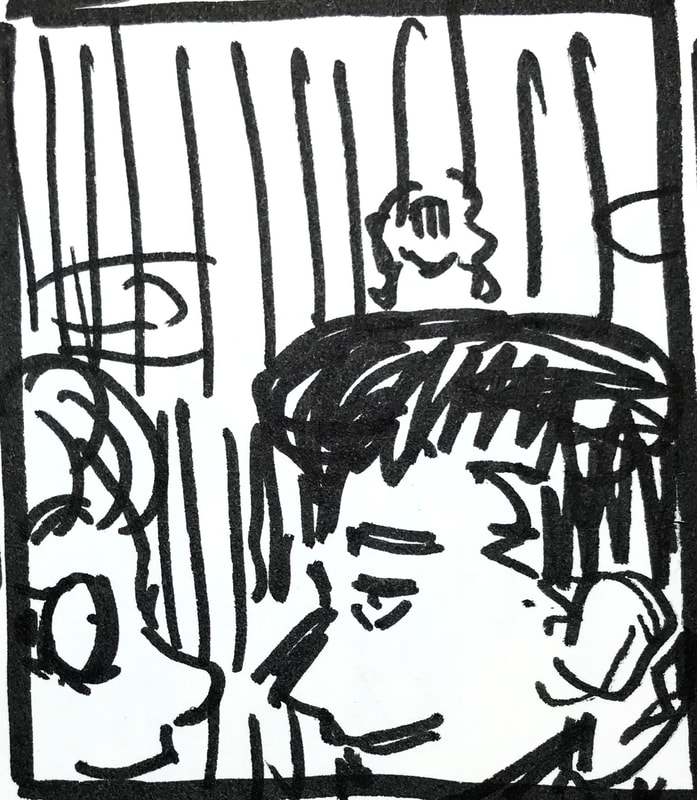
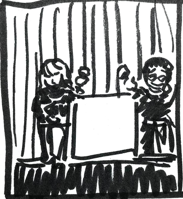
THUMBNAILS
|
|
|
|
|
PROCESS/DRAFTS
|
|
FINAL
Concepts - body language
ANGRY BOSS - THUMBNAILS
|
|
|
GOOD NEWS - THUMBNAILS
|
|
|
MUM CAN WE GO NOW? - THUMBNAILS
|
|
|
THE ANNIVERSARY- THUMBNAILS
|
|
|
THE BIG JUMP - THUMBNAILS
|
|
|
GENIUS AT WORK - THUMBNAILS
|
|
|
concepts - action
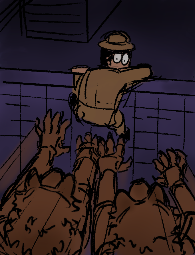
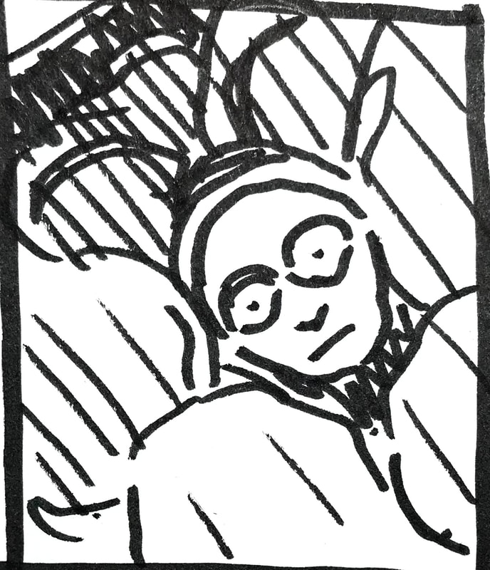
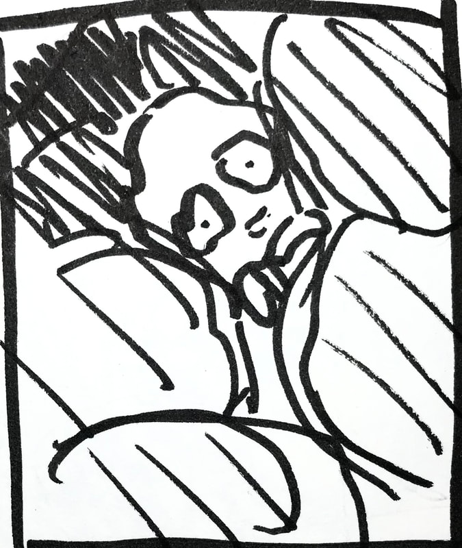
AMBUSHED - THUMBNAILS
|

|
AMBUSH - FINAL
VERTIGO - THUMBNAILS

|

|
|
|
TANGO - THUMBNAILS
|
|
|
SYSTEMS FAILURE - THUMBNAILS
|
|
|
A GIANT LEAP - THUMBNAILS
|
|
|
JANUARY SALES - THUMBNAILS
|
|
|
Sketchbook
Drawings of 10 things from memory.


Drawing 10 things from life.


ILLUSTRATOR - Enamel badges
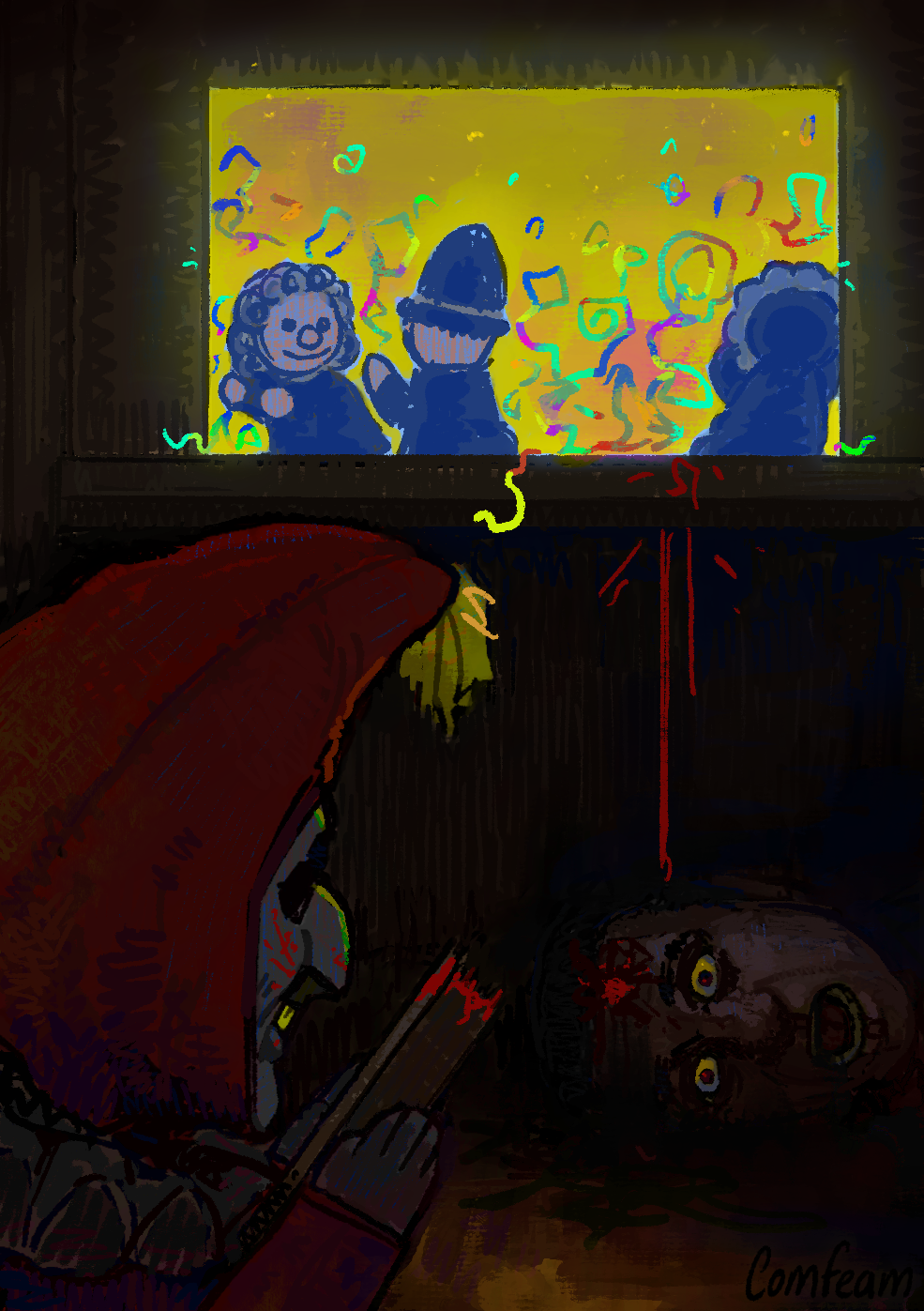
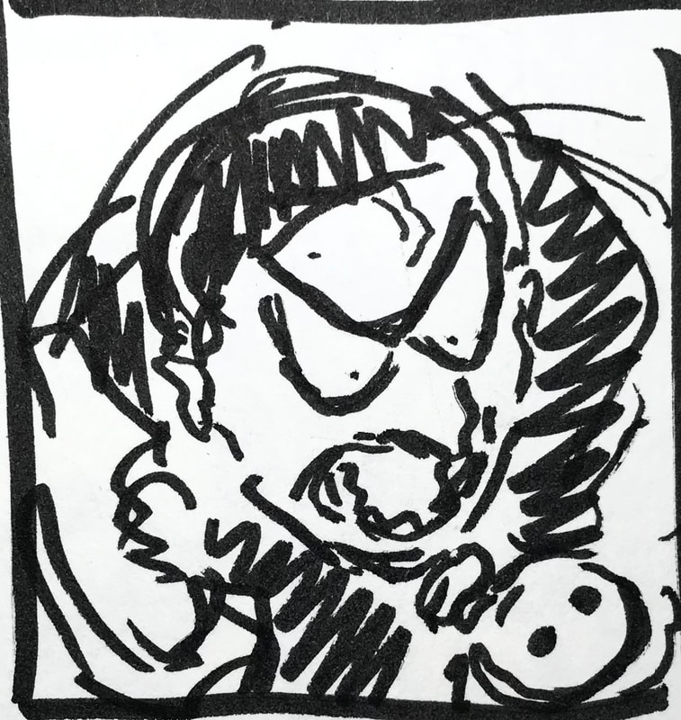
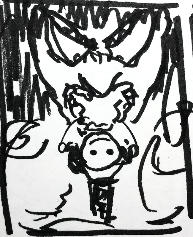
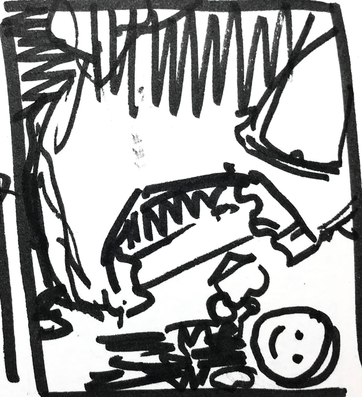
For this task as we were given the freedom to choose a subject that we favour, I decided to go with a clown theme. I chose 3 well known characters that come from movies, tv shows and cartoons, these individuals which would be The Joker, Pennywise and Art The Clown.


After looking around online, I came to the conclusion that when creators and companies would make their enamel pins, the ones I personally found that looked best would be those which were compact, and what I would describe as being ‘whole’; meaning that I didn’t find the pins with extra bits of metal sticking out (not meaning raised), as well as having holes within the work, to not be very appealing, or as nice to look at. For these reasons, I decided to put the focus for my designs - on the heads of my chosen characters. By doing this, I could keep everything almost circular and ‘full’.
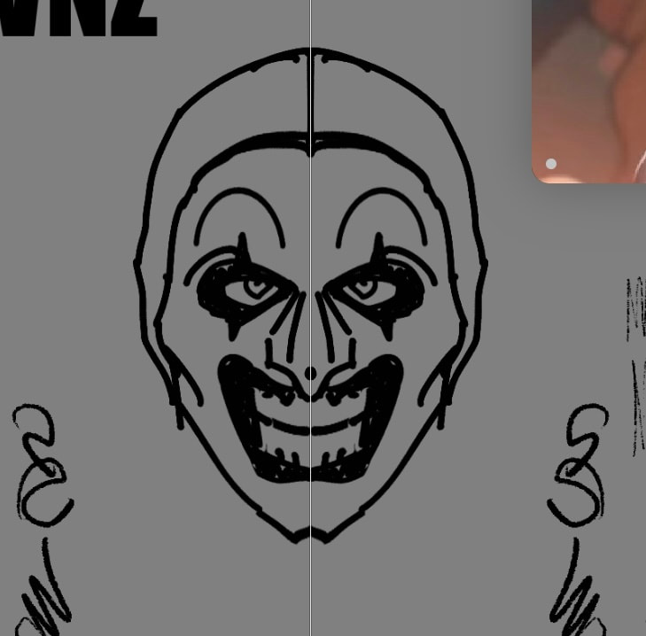
I used the symmetry tool to make the faces more balanced and hopefully more appealing to look at. I went straight to the line art without making any sketches as I could be a lot quicker, and any adjustments I needed to make - I could just use the elastify tool.
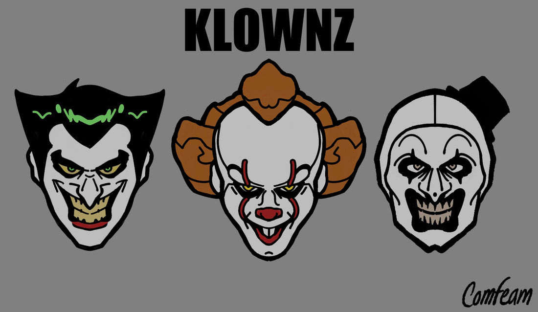
After completing all of the 3 designs, and because I worked on a grey background, I then started to think about the sort of overall theme and colours which I wanted my pins to work with.
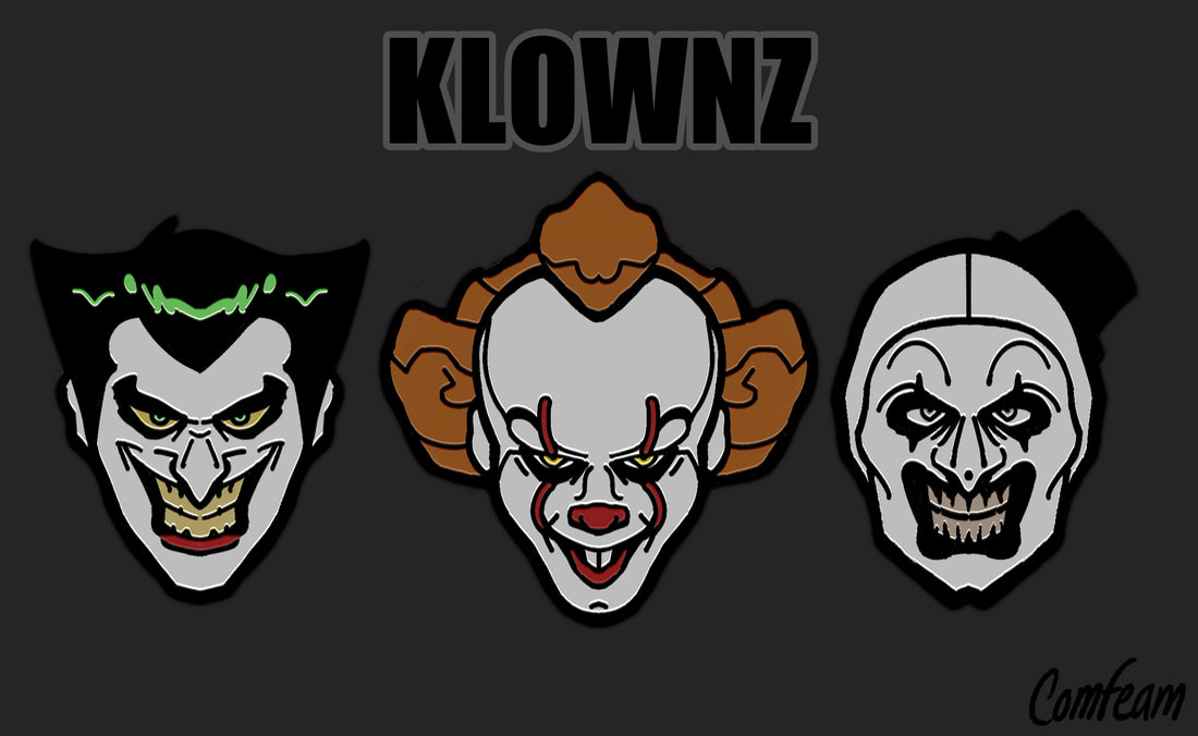
With some of the colours included on the character designs being so saturated, I didn’t exactly want to take the attention away from that, so I decided to keep the background\backing card dark, so that those colours, as well as the whiteness of the faces could pop out more (this being why I also kept the title simple and not to stand out too much).
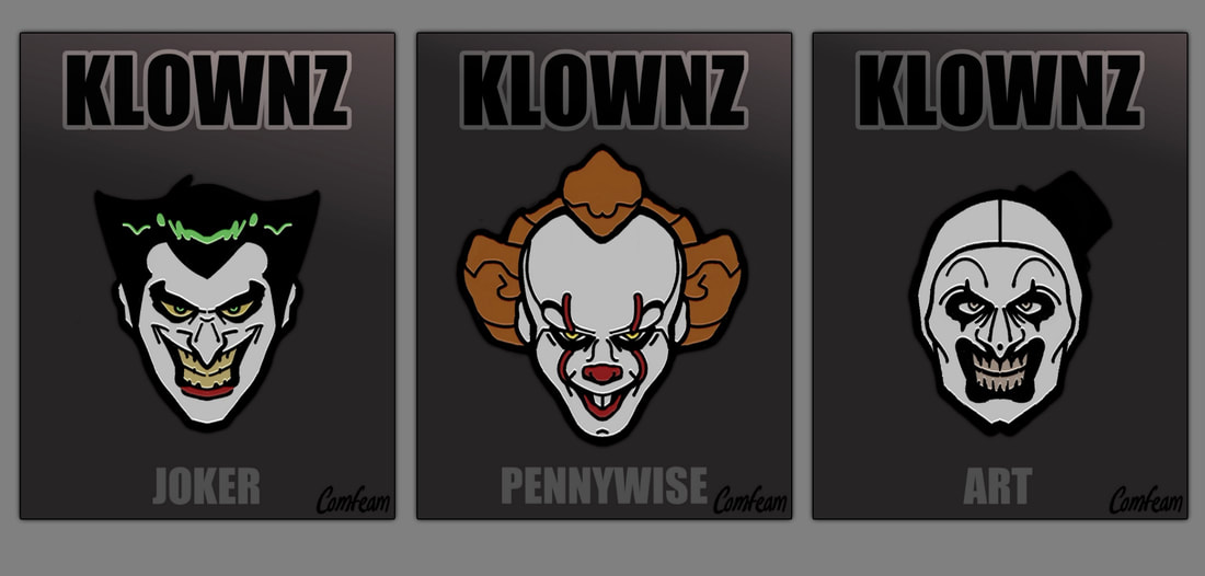
In addition to that, I thought that because the characters themselves are so sinister, a dark theme would work more in their favour.


PHOTOSHOP - Band posters
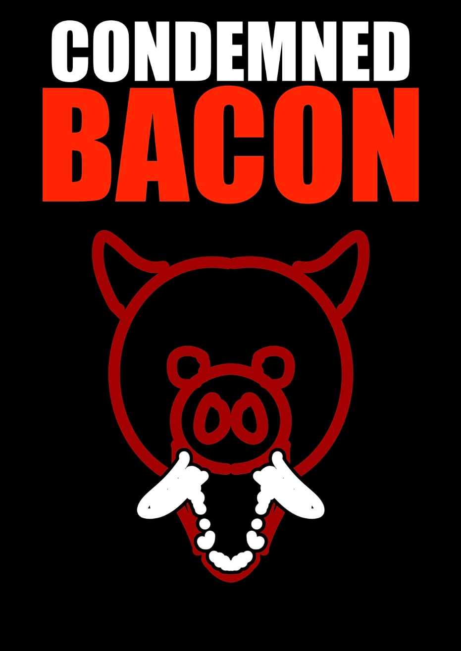


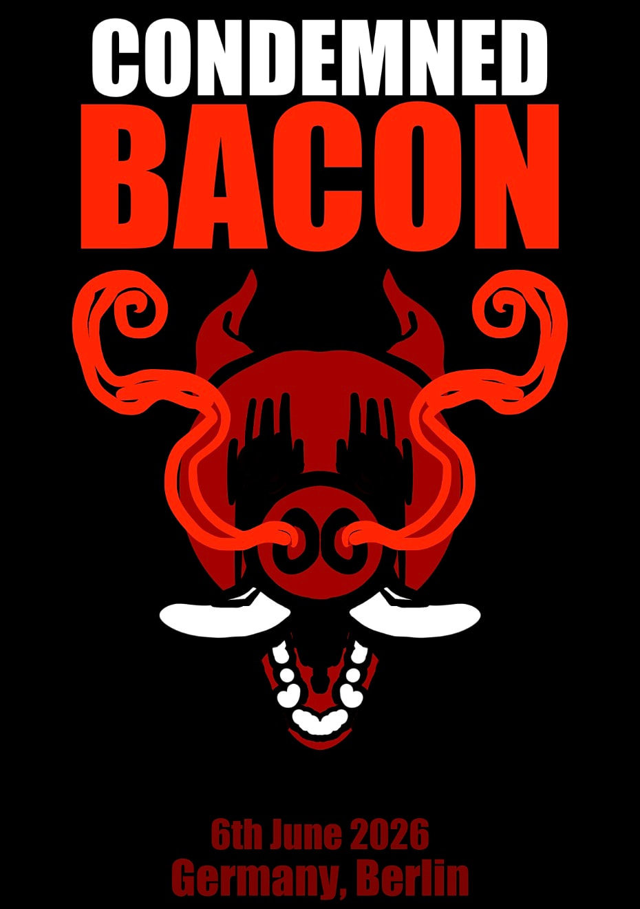
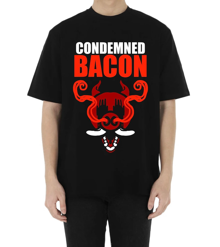
|
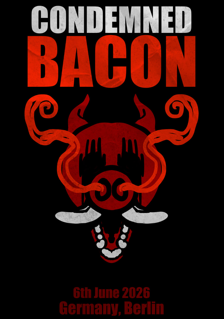
|
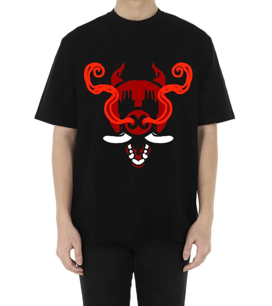
|
SET TASK
|
|
Paint


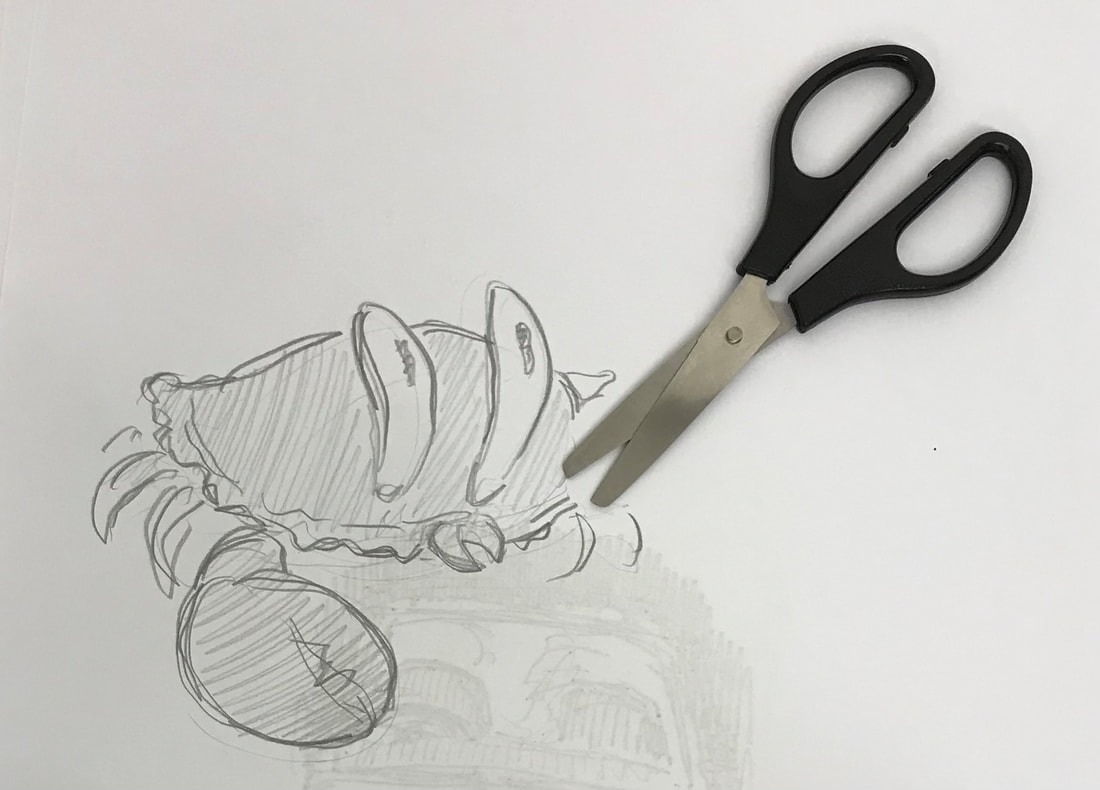
Rubbish animals


PEN AND INK


2D
Basic research/sketches and ideas
Further research/developing ideas
3D
Trying out materials and looks for the logo and writing
Making the logo more accurate out of clay + attempting to come up with more ideas
Taking photos of other 3D objects and pieces in studio to use and maybe incorporate (+texture?)
Playing with lighting + perspective and seeing what works
Random (for more texture/overlay?)
Rain, rain, go away.
Thumbnail Visuals
Sweeney Todd